The eye catching graphic designs can help in giving the best impression to any new client or customer thus showcasing some of the best appearance, which motivates these people to check more about your company or brand. Such graphic designs help in creating a sense of loyalty, familiarity, trust and pride. Therefore you are able to effectively communicate your ideas, which can easily portray all your messages across your target audience. Whether you have incorporated the eye catching graphic design in your company logo, site or at any other similar thing you use for your marketing, it will certainly help in expediting the load time of your site in a great way. Hence when you choose to design, you are supposed to check some vital tips, which could help you in designing some of the best and eye catching graphic designs. A few of these are discussed as under, let’s check them out:
Think about the subject first
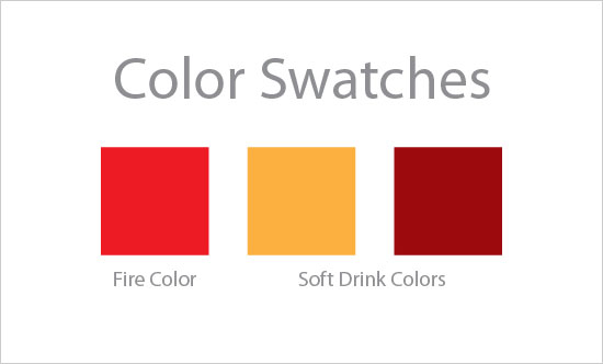
Make sure you always keep in mind that your graphic designs would advertise, represent and talk about you and your brand. Hence consider the voice tone, which you look ahead to showcase your target audience. Considering these elements would certainly help you in the long run. As being a designer you have fair amount of idea regarding the design layouts, colors and fonts. However, when you learn the art of using them together smartly then only you get the eye catching outcome. For instance, if you are planning to make a Label design for a soft drink, you need to visualize the company that deals with it and the way it has portrayed itself to the market. You also need to check the colors that are associated with its flavor/ingredients and the best example could be red, yellow or maroon. Lastly, you also need to think about your personal feeling regarding the subject you have in your hand since by adding some personal touches will always give an edge to your graphic design.
I recently designed a cola label for a company so today we are going to experience the whole design process of a soft drink label & I named it “Cola”.
There are so many things you need to address before starting your new design. Take your time to look around & get some inspiration. It is always a good idea to relate your design through different resources.
Product: Soft Drink
Brand Name: Cola
USP (Unique Selling Point): Quench Thirst
Market Competitors: Coca Cola, Pepsi
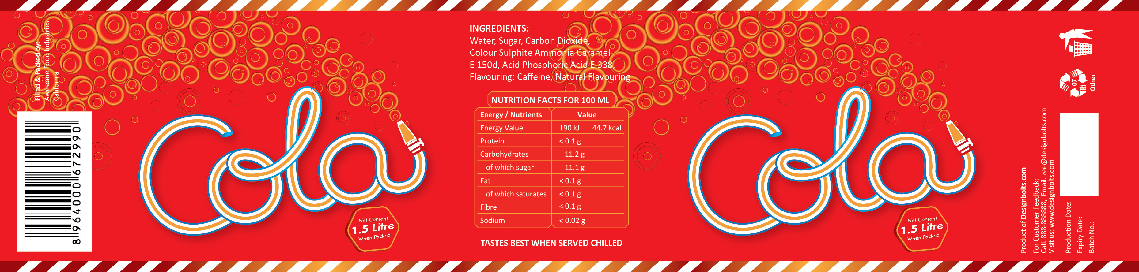
Label Size: 315 x 75 mm
Grammage: 1.5 litre Bottle
Lets brain storm here for a while and then we will switch to our design process.
Usually all soft drinks quench thirst what we can do here is to think a little deep to get things going.
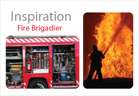
Quench Thirst = Extinguish fire (Think big :D)
So our final line will be “Extinguish Your Thirst”
Let’s get some inspiration
Before going to design anything
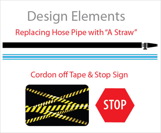
Sketch, doodle and plan out your design
These could be called as the primary elements of any graphic design project. You need to check out as many ideas as you could. You simply have to get down to these things and start thinking about the way it works. Make sure you develop all the ideas, which you carry over your sketching till you end up getting the right idea or design. Keep doing it till you get some of the best designs. At times you could think of restricting to less in your design as at times doing things the less could give you effective designs. Now you have selected some elements make something inspiring.
Setting up the design document
This is an important tip, which you are supposed to consider seeing what actually you want to see in your design. Right now you are going to design for print. So your document should be 300 DPI or above it. Don’t forget to set up your document for the CMYK colors these happen to be standard colors found in any printer.
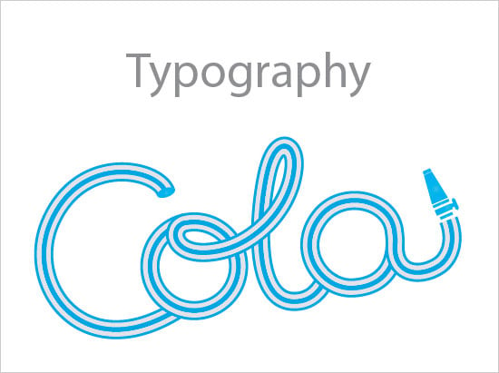
Another Bold Tip is to Try Make Your Own font
As we all know typgraphy is really very important element of any graphic design project since this is something, which everyone would come across while reading or seeing your design. You are supposed to choose the right style, which can easily suit your design requirements along with keeping it legible. No need to use fancy kind of fonts since people may find it difficult to read. It has to be readable and eye catchy.
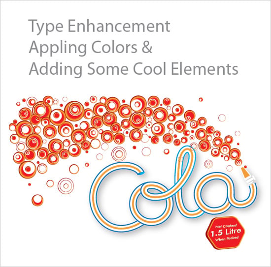
After doing several sketches i came up with a nice typography. I designed it on illustrator with the help of a brush tool.
Final outcome:
Color Selection for the rest of your design.
Adding effects
Once you carry out the above thing, you then have to ask yourself whether you now want to try complex kind of elements or simply go with extremely simple design. It is all upto your taste.
Final Label Design with Mandatory Elements
(Click to zoom)
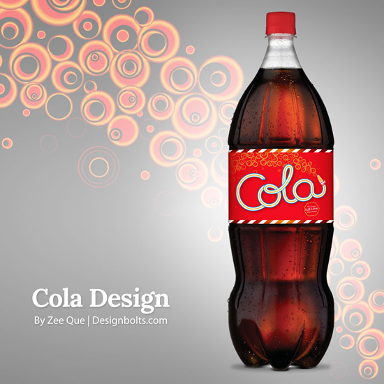
Presentation:
Final word
By considering these tips, you could certainly end up creating an eye catching graphic designs. Though every designer seems to be different from others, yet by abiding by these tips, you could get the edge in your graphic designs for sure.
Label designed by: Zee Que (Graphic Designer) | Designbolts.com
Post Contributor: Kelly is a writer/blogger. She loves writing, travelling and reading books. She contributes to Campus California
Image Courtesy: fireman battling against raging fire, firefighting truck, caution tape
More Graphic Design & Inspirational Posts:
- Killer Tips For Beginners How To Handle Graphic Design Clients
- A Showcase of Creative Wedding Invitations
- 20 Beautiful Business Card Design & Brand Identity Projects For Inspiration
- 20 Cool & Creative Food Packaging Design Assemblage For Inspiration
- A Showcase of 18 Realistic Vintage App IOS Icons For Inspiration
- 20+ New Beautiful Corporate Brochure Design Ideas / Examples
- 30+ Simple & Creative Postcard Design Ideas
- 20+ Simple Yet Beautiful Brochure Design Inspiration & Templates