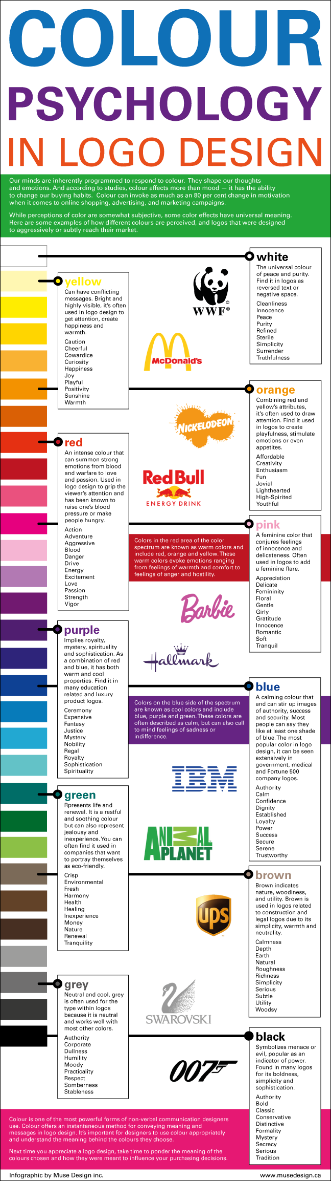
Every color comes with its own psychology. It has a meaning of its own, a message to impart and a thing to show. It is actually a channel through which communication becomes avid without verbal utterances. Colors are significant when it comes to any art form especially in graphic designing.
In logo designs, colors are the main fundaments of the whole thing, they carry out message and meaning all the same. So a graphic designer is always prudent enough to pick an apt color for a logo design.
Colors influence moods too, dull colors depreciate the spirit, vibrant colors uplift us and give us positive vibes, and we are responsive towards colors’ influences equally. They shape our thoughts and knock at the door of brain’s thinking capacity.
Here comes a post for you about color psychology in logo design—infographic October 2013. Look through the concept, meaning and analogy drawn about colors, what they stand, how they work and what they are capable of displaying. Have a look!
Colour Psychology in Logo Design [Infographic October 2013]
More interesting and cool infographics
- Where Do Ideas Come From? | An Infographics About Creativity
- Top 5 Tips For Your Online Marketing Success [Infographics 2013]
- Top 5 Tips For Designers While Dealing With Clients [Infographics]
- A Complete Introduction To Despicable Me 2 Minions | Infographics
- Fun Facts About Geeks & Nerds [Infographic]
- How To Work With Your Graphic Designer | Infographic 2013