A lot has changed in the past few years. Trump is contesting for President, cloud computing is the new buzzword, and Jon Snow has died and come back.
If you launched your website prior to all this happened and haven’t made any major changes since then, there could be a problem. With the internet world jam-packed with websites, and of which some could be your biggest competitors, there is a need for constant makeover and upgradation.
Here’s looking at a few ways you can change your website for good. Note that, not all of these points could be applicable for your particular website but most of it would be.
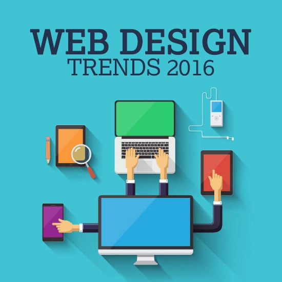
1. Consider the Current Trends of 2016
i) Parallax Effect:
With websites going a dramatic change over the years (bye bye flashy texts) you need to think about evolving with the trends. The latest trends to storm the website designing world is the Parallax effect. This effect principally works on different loading speeds for the foreground and background rendering a 3D feel to the page. Do read 50 great parallax scrolling websites
You can use this effect and change the theme of the website giving it a complete makeover or use it selectively for products and certain pages. When you use Parallax scrolling for specific products, it automatically makes it look like it is in 3d making it a great cost saving tool too.
ii) Ken Burns Effect:
Another trend is the Ken Burns effect. The documentary filmmaker’s eponymous effect adds a panning and zooming quality to any still image, thereby drawing focus and attention to where you want it to be. This again could be a website background theme in itself or be subtly used in sliders.
iii) Flip Book Web Design:
The third new trend, and one that would remarkably well if yours is a magazine or a periodical-centric website, is the Flipbook. Flipbook, as the name suggests, is like flipping through a book. And more than adding a visual appeal to the website, it is a great way to keep the reader for a little longer on the page. It’s intriguing and it’s interactive, so if you are looking to present lengthy content or a gallery with your best portfolio work or product images on the front, this is a trend you should seriously consider.
iv) Video Backgrounds:
Video backgrounds are again the in-thing now. If you thought putting up a nice image in the background will do the trick, then that’s seriously 2010. Video backgrounds are known to boost click-through rate and retain the reader for a little longer on the website. In fact, it can even tell your brand story in a creative way, there are just so many possibilities if you know how to use it creatively. However, make sure that you don’t take the focus away from the website by making it too distracting, use it to aid the objective of your site, not work against it.
2. Images are paramount
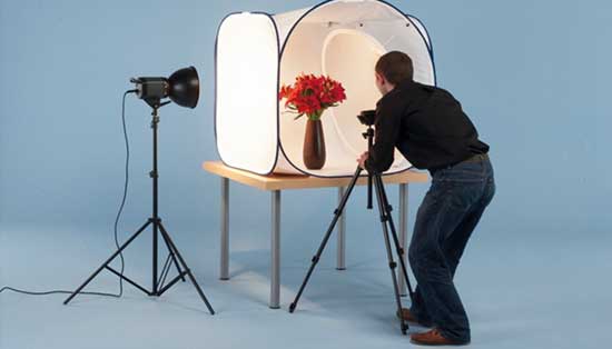
Gone are the days when you could put up pixelated generic stock images. Today with the rise of image-centric social media platforms like Instagram and Pinterest, images need to be given due consideration.
Whether yours is a product-based website that features tons of product photos or a service-based one you need to pick high-resolution superior quality photos that are both visually appealing and add an individualistic touch to your site. In fact, the ideal person to click these pictures are you. You have a vision for your website and generic stock photos would never be able to bring that vision out cent per cent. If you have a DSLR and basic knowledge of photography, there are a lot of resources and tutorials that can help you become a pro at clicking images.
If you cannot click them yourself, hire a professional but make sure you invest in images and have a good chunk of quality images on your site. At least for your products. Unless the products on display are enticing enough, your prospects won’t be interested or convert.
3. Small changes that go a long way
The aforementioned trends are something that would dramatically give your website a makeover. If you want to take it slow, here are some changes you can make either by itself or collectively.
i) Custom login page
Really? Who does that? Custom login pages are like the point of contact between you and the customers. And it’s an excellent but untapped area for branding. Use this opportunity to tell your brand’s story or simply make it resonate with your brand ethos. The idea behind staying ahead of competition is to not fade away. And if there’s anything that helps with keeping your brand top of the audience’s mind, you should definitely look into it.
ii) Fonts
A small but powerful way to create a difference is by changing the fonts. If your readers are used to the old and boring, a different font would bring a refreshing change to your website. It’s a great way to start small and experiment.
iii) Increase social sharing
Social is the word now. Unless your website also has a strong social media presence, you are not tapping into thousands of prospects. Social media can help you to reach out to prospects all over the world, or if yours is strictly a local business, it can at least help you to strengthen your branding efforts.
One way to increase your social media footprints is by encouraging your website audience to share content on social media. Have a great How To blog up? Or a video that’s guaranteed to evoke a few chuckles? Make it easy for your audience to instantly share content with a social media plugin.
iv) Icons are evergreen
![]()
You probably did use icons on your website even if you launched it a couple of years back. Icons are such an integral part of a site and they can help convey messages faster, break the monotone, and overall add a visual element to the page. And icons have come a long way too, these have evolved into something a lot better and come in an eclectic variety now. So you can do so much more than just use these for basic communication.
v)
The animation world has evolved leaps and bounds. With Star Wars re-entering the sci fi zone and so many superhero movies being made, you can be sure of just how much the VFX industry has advanced. And while we aren’t going to go all heavy animation on the website – not yet – a subtle inclusion will add an element of surprise and delight for your readers.
Animations like the snow effect or the rain effect adds mojo to your site and could even be in tune with topical trends and seasons.
vi) Timer plugin
We hope you’re convinced that a change is in order. And while you go about giving your site a makeover, do not take your readers for granted and keep them in the dark. Use a timer plugin to keep them informed of the duration for which the website would not be accessible. These keep them informed and also builds curiosity if you pair it with the right text.
P.S. the timer plugin could be used in myriad of other ways too – use this to announce a sale, to build urgency during sale, and to count down to your next post update.
Recommended Posts:
- Top 14 Best Web Tools of 2016 for Graphic & Web Designers
- 50+ Creative 404 Error Page Not Found Designs for Inspiration
- 12 Useful Web Tools For Your Upcoming 2016 Projects
- 25 Creative Yet Funny 404 Error Page Designs for Inspiration
- Simple Beginner’s Guide to Start A Design or Tech Blog in 2016
- 10+ Absolutely Best Web Resources for Web Designers
- Ready-Made Website Design Giveaway from MotoCMS
- 10+ Awesome Resources for Web Designers & Developers to Improve Workflow