A brand or a company owner’s first hand choice is to make its existence noticed and considered, for this the owner tries his level best to come into terms with a graphic designer who could make a perfectly apt logo design according to the owner’s requirements that completely syncs with the attributes his company owns.
A logo design of a brand is actually its spokesperson, through the design of the logo; the characteristics of the respective company are easily gotten across. Several things are to be kept in mind when the designer is about to implement what he perceives to depict in the logo. Today I am unfolding before you 11 steps that should be followed while making a logo design.
Try simplifying things; don’t open up Pandora boxes of complexities. A logo design should be made in a way to get understood by the masses, it should not be adding the elements that are unnecessary or burden the eyes. Sometimes too much use of colors lessens the logo’s appeal.
Moderate things should be chosen by the graphic designer to come out with effective results. Try making and assuming the logo design, ‘vertically’, ‘not vertically’, ‘with/without box’, your eyes are the best judge if the chosen option is not accepted by your own sight, don’t go with it.
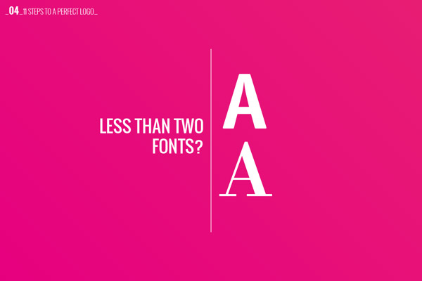
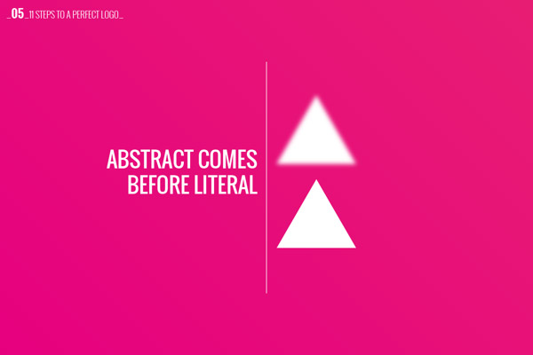
Finalize the perspective and overall look, which soothes your own aesthetics. Don’t play with many fonts, stick with the one font you think goes with the logo design, too much abundance of everything usually creates havoc. Bear in mind that if you give a random and abstract look to the logo design, a common eye of an average intellect person won’t comprehend the meaning behind the logo design.
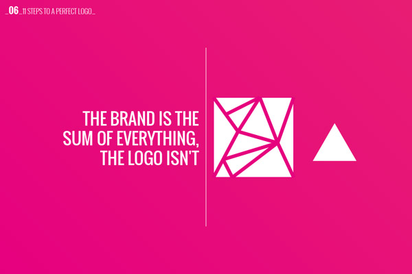
A logo should be vocal enough to impart the foot holdings and forte of the organization. Of course the brand has plethora of elements which yet cannot be put together in a single logo design, make the logo a super condensed emblem that the moment viewer sees it, he at least gets the exact idea, that what, where and how the brand/company deals with the tasks and pursuits.
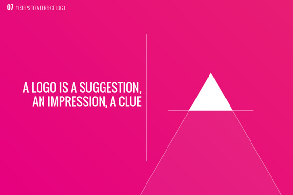
A logo should be a clue, suggestion and an impression of the company/brand, so people would understand it. It gives a mirror image of the brand so make sure it reaches the masses.
A logo should be trendy enough to attract the eye and technical enough to define its brand. In the end, after doing with the logo design, keep the negative and positive remarks of others coming in, it will give you the idea how you made it and also build your confidence if the logo design is appreciated. I hope these few steps can make you do best with your upcoming project of logo design. Scroll down to get the gaze of the points you should eyeball while making a logo design for a brand/company/organization.
Recommended Posts for Graphic Designers
- 30+ Inspiring Typography Quotes For Creative Professionals
- Icons That Screw Your Mind
- Amazing Animal Typography in Alphabets by Marcus Reed
- 40+ Hilarious Slogans for Famous Brands
- Real Tips: How To Be More Creative
- Watch Out! Some Logo Thieves are Exposed
- Irritating Questions By Clients | A Fun Project by Jonathan Quintin
- Copywriters Vs Art Directors | A Tale of Two Gurus
- How To Work With Your Graphic Designer | Infographic 2013
- Fun Facts About Geeks & Nerds [Infographic]


