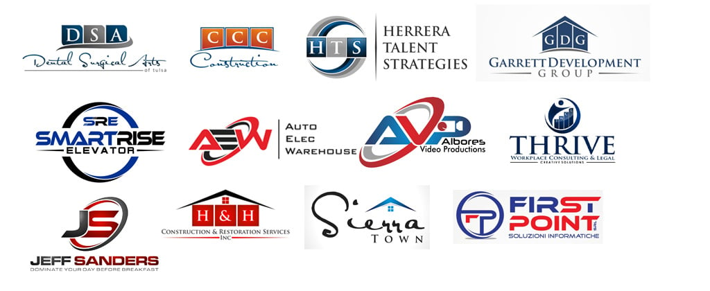
Before making others know what your company owns and hold under its designation, you at first try to capture the best impression through your logo design. Some people make silly errors and downright low mistakes that can hardly be accepted. A logo should be unique; it should never be a second class version of itself or mere copy/imitation of other logo designs. Check out some perfect Examples of How a Logo Design Should Be Made
A logo should be creative and vocal. Let’s just think about it that what would you communicate to people through a stereotype logo design which has already been used by some other company? It is actually a disgrace to your own organization, it merely devalues your foundation because some day or the other, it can be pin pointed that the design was slightly altered and reused by you. It would repel your impression, and restrain you to fetch your forte any longer.
Make sure to approve of a logo design which is different and would earn itself a trademark. It is a wakeup call for a designer who composes such logos that are below standards and cannot come up on the surface to get noticed also they cannot be distinguished from the other logo designs. They look like twin logos. So don’t cheat with your own intellect and capability, stop following the generic logotypes that have always been existent and being already used massively elsewhere.
Logos make or break the significance, potential and pursuits of companies. They make the worth either so deep or absolutely shallow. I am unfolding before you most common logo shapes that should be avoided in first place.
Be open to new ideas, accept taking challenges on yourself, and learn to ponder out of the box, move ahead of your comfort zone, and reach out to the brainy nerves that bustle on thinking hard. The core element of the logo shape should be impressive, unseen, unperceived and completely up to the mark, it is only then, when making your recognition and value would become possible and probable. Have a look, be cautious and avoid stereotyping logo designs.
Lets check out some overused logo examples
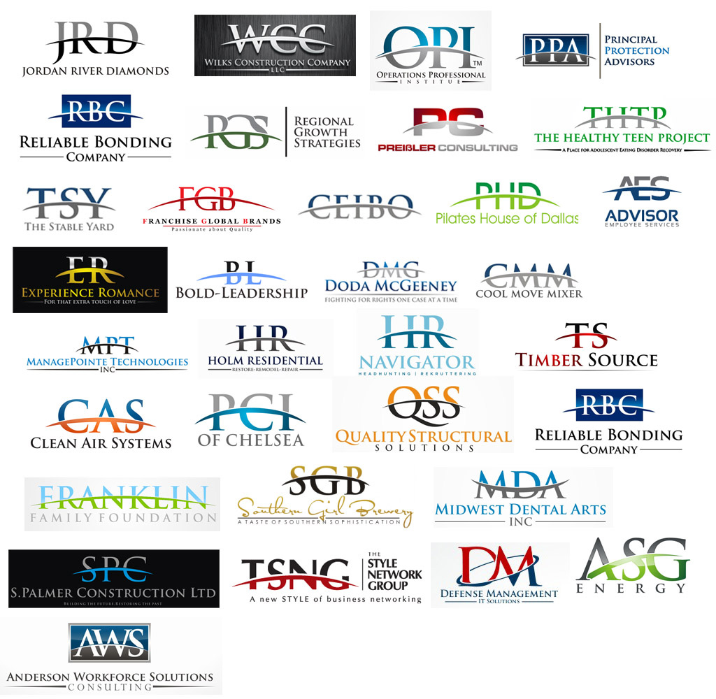
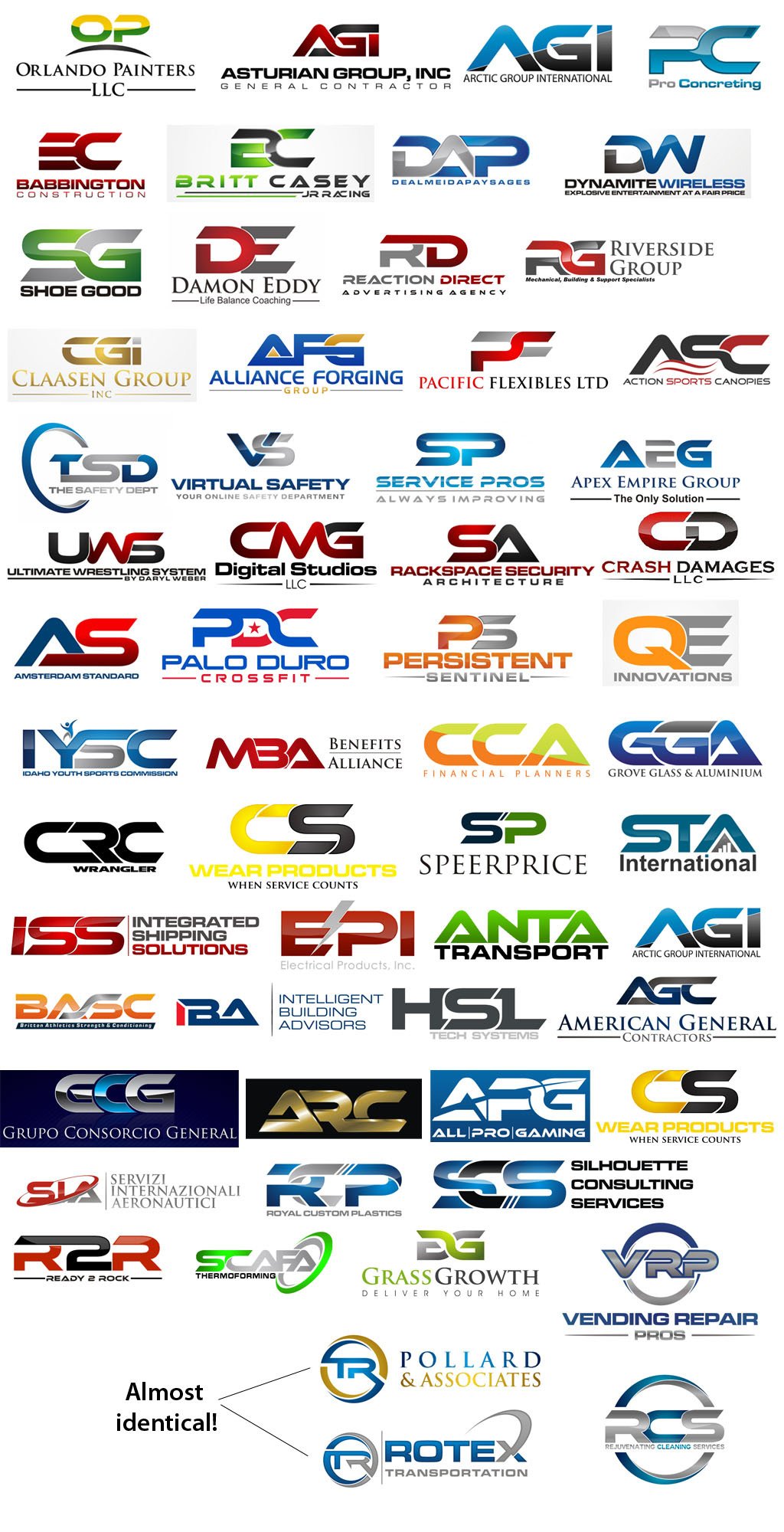
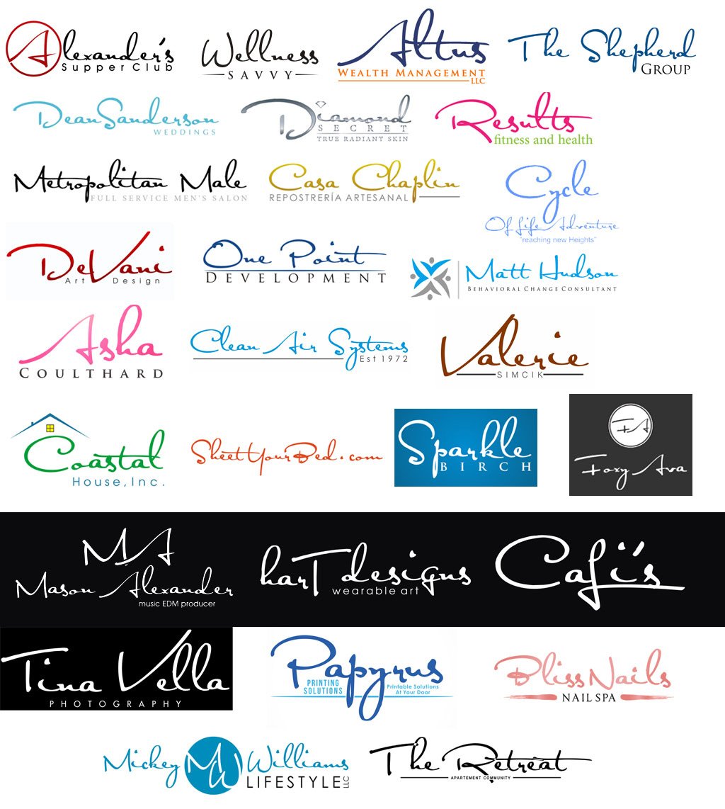
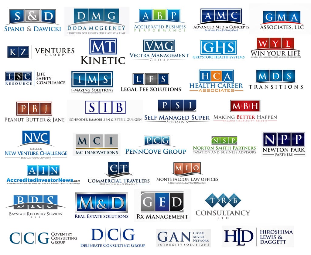
Original collections of overused logos by GT Designs
1. Arc Logo
This example has been used numerous times. Logo is cut into two portion with an arc.
2. Ethnocentric Font Logo
Excessive use of Ethnocentric font separated or united.
3. Two Circle Logo
This type has also been used massively, cutting two circles and placing the name in between.
4. Satisfaction Font Logo
This is the most basic handwriting logotype that should also be avoided.
5. The Box Logo
Boxes used individually and with arc making them simple and generic.
6. Sphere Wrap Logo
The acronyms of the companies are wrapped up with a circle and fancy gradients give it sphere look.
7. Roof Construction Logo
Company name is written in mostly Sans Sarif font with the roof element on the top.
8. Stylish Car Logos
The outline of the car is used to get rid of any further element and give out a car impression.
9. People with Trees Logo
V shape element along with leaves are too common to be used
10. Leafy Logo
Swoosh men, V-men and leafy men. All has been done numerous times.
11. Rainbow Circle Logo
What an idea of rotating single element! I wish, i would say it a 10 second logo.
12. Growing Towers Logo
This is less of a logo design than a bar chart.
13. Swoosh Lines Logo
Does crisscross lines ever make a good logo design?
14. Water Drop Logo
When they have nothing to make, a drop is deadly impression to ruin a logo design
15. Joining Dots Logo
How common these elements are available in free logo templates
16. Gears Logo
Add a gear element and the logo is ready.
17. Mixed Cliches Logo
How clever, only this was left to bounce all elements together and give it a go.
Excellent examples of logotypes and logo designs for inspiration:
- 25 Cool & Creative Fast Food & Drink Logos For Inspiration
- Difference between Pictogram, Logo Mark & Logotype
- 25 Music Logo designs for Inspiration
- 30 Health Care, Pharma & Hospital Logo designs for Inspiration
- 20 Beautiful Examples of Paint Effect & Water Color in Logo Design
- Good Sketching Skills Make Great Logos


