Unless you limit your web browsing experience to a couple of sites per week you’ll have no doubt noticed that here in 2015 there is a particular trend that certain websites follow in terms of their design and how they deliver their content. Perhaps pigeon holing them into a single design trend is unfair but there is most definitely a common look and feel across most of the websites we come across. In particular, those designed and developed on the past year.
Common Trends
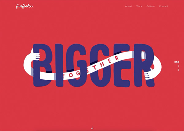
They say that “bigger is better” when it comes to 2015 Web design and it seems that a lot of people have jumped on that proverbial bandwagon. This isn’t a particularly bad thing or good thing, it depends what your preference is and how desperate you are for the information provided. Sure, in terms of design, the bigger is better style is far more superior but if you want to find the information you’ve searched for, having next to no content above the fold can be a bit frustrating.
The bigger is better approach tends to begin with a large stock photo or introduction area (if you’re lucky) that explains what’s on offer. A bit like a book cover to use a real world example. Now this is great if you have time to browse and appreciate good design but if you’re looking for something in a rush and have just arrived via a Google search it can be annoying. Sometimes it can be difficult to find the navigation also. I can perhaps understand hiding it to save space but hiding it for the sake of hiding it when you’ve clearly got a full screen of real estate to make use of seems a little bit anal.
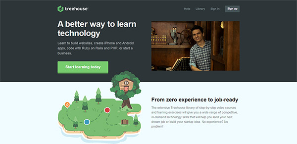
Examples of Bigger Images used in Website Design
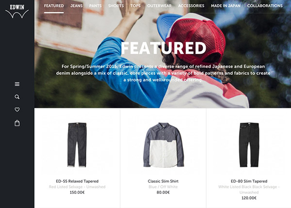
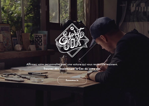
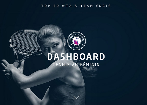
More examples here
Frameworks
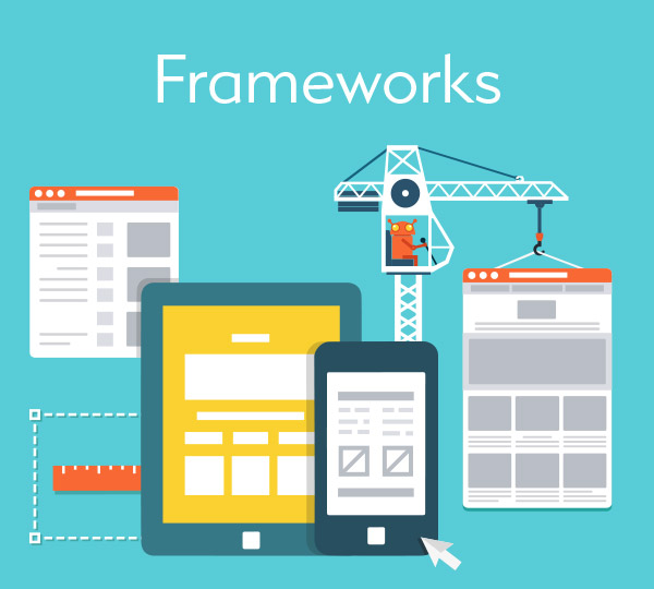
One advent that I am a fan of 2015 frameworks. Whether you’re an avid boilerplate user or have jumped on the bootstrap trained you’ll find frameworks in general a god-send. Frameworks do not only improve your core CSS coding, they allow you to stack elements so they become responsive i.e. scale/stack up and down depending on the size of the viewport in question. In days gone by, you’d make your site a fixed with of a certain amount of pixels or you’d make it fluid so it filled a certain percentage of your screen. This was fine back then as most people used a desktop computer with a common screen resolution.
These days though, we consume our web content differently. We access websites via phones, tablets, pc’s, laptops, smartwatches or even via our TVs. It’s impossible to have a fixed design which looks great on all of these viewports so building on a framework is most certainly a must. Something like Bootstrap is handy also as it comes with a hell of a lot of components which means doing chores such as styling forms, making drop down navigations or other usually monotonous tasks is now extremely straight forward.
Flat Design
Flat design is another common trend that we’re seeing in 2015 and have been seeing more and more since around 2012. Of course not everyone got on board so quickly but these days it’s gaining prominence. Gone are those awful glossy web 2.0 icons that were found on every website a few years back. Gone are the heavy gradients, glows, drop shadows and any other Photoshop effect you can think of. These old photography styles have no place on the web anymore and their replacements look here to stay. Simple but contrasting colours still work if used correctly and you can still get away with a subtle gradient or shadow here and then if you don’t go overboard. You’ll find that a flat design is significantly easier to build also as you won’t be wasting your time slicing and cropping your artistic creations from Photoshop. The advent of CSS3 has meant that you can pretty much recreate any flat design style or element without even opening your graphics package. Creating gradients, shadows, borders, glows, buttons and even icons has become simple and all can be done using solely your text editor.
The good thing about the above is the sheer amount of information out there on it. Search Google for any CSS3 tips, techniques or tutorials and you’ll be inundated with matches. Anything you’ve seen on other peoples websites, anything you’ve read and pretty much anything you can dream up you’ll no doubt be able to find a tutorial for it.
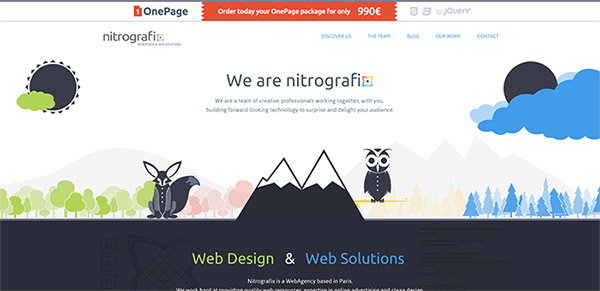
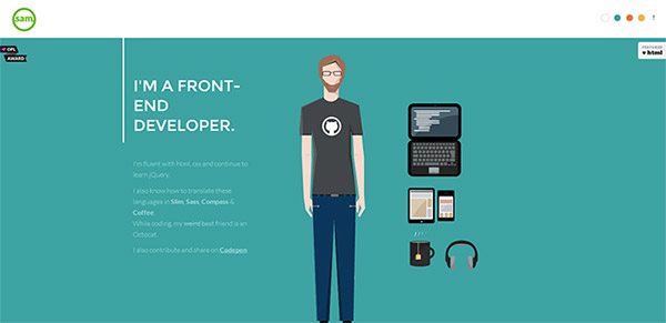
Flat Website Design Examples:
Advanced Interaction / JQuery / Ajax
Seldom will you find a truly static site anymore. 10 years ago, databases did away with that. Any big site would be running a database of sorts and with the introduction of content management software such as WordPress, this became more and more apartment. Online today, you’ll rarely see a website which doesn’t have something interactive or database driven powering it.
Ajax has been around a while and most of the hardcore developers out there would frequently create forms that didn’t need you to reload the page to retrieve data or loading spinners whilst you’re waiting for that big table to load. Stuff like that has been common for almost 10 years now but with the introduction of jQuery and it’s relatively ease of use, we’re seeing much more of it. Nowadays people will animate anything and anything they can from buttons, to navs to entire content areas. There is nothing wrong with this of course providing it’s done right but you can go over the top with it like any design element. If you’re intending to use jQuery make sure it’s to enhance the users experience, don’t just use it because you want to do something cool as you may end up annoying the user rather than providing them with a better user experience.
Conclusion
If you really want to follow the trends there is a wealth of information out there for both the designer and those who want to tell their designer what they require! A good discussion on specific trends can be found here and I also found a good read on HostPresto which is an easy list of the top 10 design trends we’re seeing. In reality though, there are so many design elements that make up the overall “trend” you could probably write a top 100 rather than a top 10!
Recommended reads regarding web design 2015:
- 10+ Awesome Resources for Web Designers & Developers to Improve Workflow
- Landing Pages in WordPress: Creation, Optimization & Examples
- A New Exciting Website for Web designers and Developers to Submit Web Design News
- Top 12 Awesome Web Tools and Services of 2015
- 4 Web Fonts That Make Your Website Look Amazing!
- 9 Awesome Tools That Pro Web Designers Use
Tags: web design 2015, web design trends 2015
i believe, mobile friendly sites are mostly trends now a days. after the major update in google alogritam.