Before the invention of graphic design tools such as Photoshop, design of websites was through browsers. Tools like Photoshop that were meant primarily for graphic design and not necessarily web design added a lot of functionality and artistic creativity with what could be done on web pages.
Nowadays, browsers and online web design tools have become very powerful and it is therefore making more sense to do most of the required web design work online or in a browser. This is in order to:
- Achieve the desired results without having to go through extra steps or processes using an offline graphics editor like Photoshop and
- It is easier to make a web pages design more responsive by using the browser
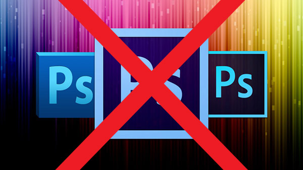
Disadvantages of using offline graphic design tools like Photoshop
- If you have to make changes to a graphic image using Photoshop or similar desktop applications, it can be a very time consuming process. For example, changing the color of some text in Photoshop as opposed to changing it in a browser using code can be very complex.
- Photoshop and similar desktop applications force you to use a fixed-width-canvas. This is a disadvantage because responsive websites, which are the preferred method of designing websites, require graphics automatically to adjust to available screen sizes.
- As good as Photoshop and similar desktop applications are, they are just not optimized for content meant for web browsing. A good example is if you use a certain font type and manipulate it in Photoshop, you do not have the assurance that it will look the same while being viewed on a browser. Editing and manipulating a web element like a font from the browser where it is supposed to be viewed will give you the exact desired results every time.
- Photoshop and similar desktop applications, do not allow the designer to get a feel of how the graphics will respond to user interactions while on a website.
- By manipulating your graphics initially in Photoshop and similar desktop applications, you may be unnecessarily adding an extra level of work for yourself because you will still need to manipulate the graphics by the coding in the browser.
- With Photoshop and similar desktop applications, the focus is more on design work and less on the content and layout of the website. This is not a good approach because at the end of the day, a websites audience will focus more on the content of a website and not the aesthetic beauty. Design within a browser gives the content the priority of attention that it deserves.
The slow death of static web design
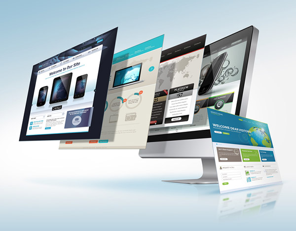
Due to the different media devices through which users view or use web sites and portals, responsiveness has today become the most dominant web design methodology. It therefore does not make sense to create websites using a maximum fixed width (measured in absolutes units like pixels), but rather use dynamic measurements like percentages that can adjust themselves based on the size of the screen where the content is displayed.
This implies that we are most likely witnessing the slow death of static websites.
As shown above, preferences are tilting more towards using a browser to finalize the web design work and achieve the desired results.
However, the disadvantages of Photoshop and similar desktop applications when specifically designing websites, does not mean that you should not use such applications at all. It just means that you have more options to get the desired work done.
Photoshop still has some advantages
Photoshop and similar desktop applications can still be useful to web design work. You will find that there are instances where CSS is just not good enough to achieve the results that you want.
In such cases, you should have Photoshop or similar desktop applications open alongside your other responsive web design tools.
Before you use a responsive web design tool…
You will need to map out your design approach. This means having a good idea about which components and elements you intend to use while designing your website. This will make you more efficient, by being able to for example, create re-usable code that needs very slight altering for use at different instances.
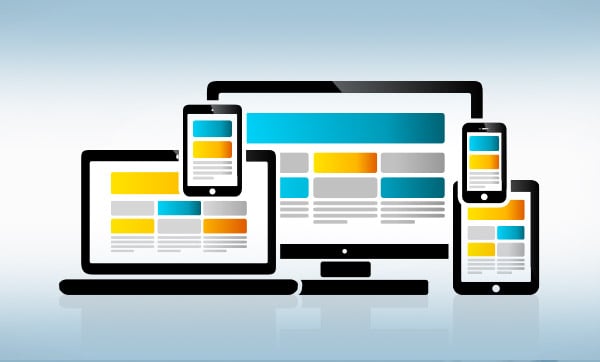
You will need to consider your sites layout, and choose the best solution based on your target audiences use. This means that if use of your website will be mostly on a mobile device like a Smartphone or tablet, you will need to make it responsive enough to adapt dynamically from a larger screen to a mobile screen.
Such responsiveness will give your website the robustness that it needs for easy consumption of your content between different devices.
Tools used for in-browser web design
Examples of tools used to design websites in a browser include:
Overkill use of responsive web design tools is causing neglect of design aesthetics
Regrettably, the effective and efficient advantages that responsive web design tools bring to play, means that more and more web designers become caught up creating web sites in record times, by speeding up web design workflows and spending less time in actual design work.
You will find that web designers focus more on optimizing web designs viewable on different screen resolutions and less on the aesthetic beauty of the design work.
Conclusion
The trend in web design tools used, seems to be more of a fragmentation of big software’s like Photoshop and similar desktop applications into smaller more responsive based applications that have specific role. This is organically happening to make responsive web design more efficient with the use of light and specifically oriented tools.
This is why it is becoming more and more important to map out the design approach that you intend to use based on the most common use case for your websites content consumption. This implies that you should have an idea of the elements and components that you will use before you begin designing your site. This will make your workflow more seamless and efficient.
—
Contributor: Jack Dawson is a web developer and UI/UX specialist at BigDropInc.com. He works at a design, branding and marketing firm, having founded the same firm 9 years ago. He likes to share knowledge and points of view with other developers and consumers on platforms.
Recommended Posts:
- Web Design Trends in 2015 – Are they Necessarily Better?
- Beginners Alert! Things to Know Before Creating a Portfolio Website
- 10+ Awesome Resources for Web Designers & Developers to Improve Workflow
- Landing Pages in WordPress: Creation, Optimization & Examples
- A New Exciting Website for Web designers and Developers to Submit Web Design News
- Top 12 Awesome Web Tools and Services of 2015
- 4 Web Fonts That Make Your Website Look Amazing!
- Funny Yet Creative CSS Puns by Saijo George
- 9 Awesome Tools That Pro Web Designers Use
- 10 Of The Most Anticipated Web Design Trends To Look For in 2015
Credits: responsive design, web templates | Tags: web design, no more photoshop