We all believe in change, and we must evolve with time so to take up the new challenges of life and do better things than the past. Trends no matter what transform every now & then and when it comes to the graphic world, you can always expect something different, creative and top-notch. Designers and artists can never hold onto their nerves when it is about trying the new techniques.
Down here I am highlighting 10 new logo design trends for 2018 that designers may adopt to make some amazing logo designs for their clients.
10 New Logo Design Trends for 2018
![]()
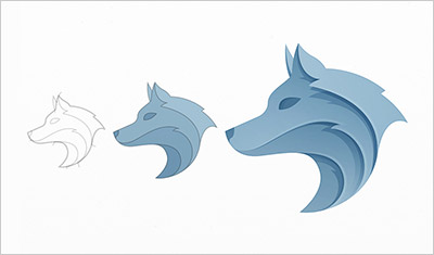
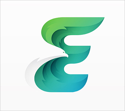
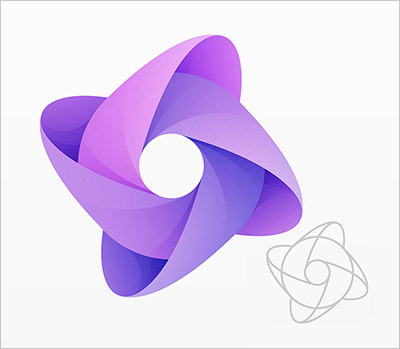
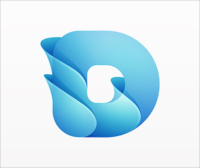
1. Offset & Overlapping Gradients:
The most top-rated style of logo making nowadays is offset and overlapping gradients, it reflects the high-end quality of logos with subtle and mixed gradients. The element of shadowing is incorporated this year in the logos to add depth and grace of the entire look. This should be tried more in 2018 and it is recommended by the guru logo designers. Moreover you may judge the fixture and mixture of light and dark color corners/edges in the logos made by this technique. Some beautiful examples are given below for inspiration.
More Examples of Overlapping Gradient Logo Designs
2. Badge Style in Logo Design
If you like retro, to the point yet meaningful stuff than making badge like logos would be a good option as they have been first choice for sports & food industry. This technique manifests logos that look like badges, logo color combinations can be added to enhance the outcome of the logo. If you are a fan of badges then use this style for your logos in 2018.
Few more examples of badge style logo design | Some perfect examples are here
![]()
![]()
![]()
![]()
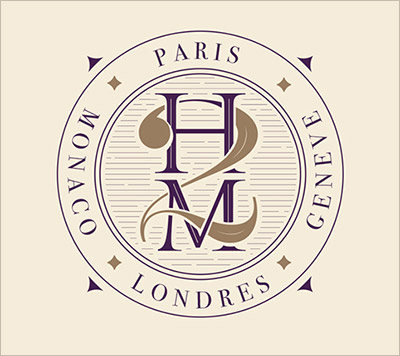
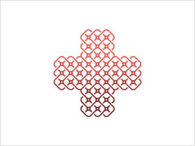
3. Continuous Line Art Logo Design
Line art looks intricate, cohesive and competent than any other logo technique ever since it is different, neat and shows the skill of a maker’s fine hand as you can see in examples it starts from one point and ends on the point where it completes the whole shape of the logo design. This looks interesting and quite stimulating for the viewer.
![]()
![]()
![]()
![]()
![]()
![]()
4. Full Color Character based logo design
Sometimes a client demands to create character image, avatar or mascot for company’s logo to reflect the stance and impression of the enterprise. Any character is drawn ardently and different colors are inculcated to make the cool feel out of the logo design. I personally love to make characters and incorporate them into logos as they can easily be associated with brands and remembered easily.
![]()
![]()
![]()
![]()
5. Hi-Detailed Hand Lettered Logo Design
Well, if you have no other way than hand lettering logos is the superb way to go about, hand lettering looks sophisticated and complex, it gives a graceful impression to the logos and one would for sure get oneself a logo that defines meaning and sense. Usually tattoo studios, bars and soft drink brands prefer such logos that are amalgamated by hand lettering.
More Examples of Hi-Detailed Lettering Logo Designs
Credit: Mateusz Witczak
![]()
![]()
![]()
![]()
6. Logo design with Masked Image
An image is beautifully inserted in a logo defining the model and theme of the company, it reflects the image of the company and what it stands for. Certainly a good way to represent one’s footings and work expertise. It also gives a bigger picture about the company and not just the name alone.
Credit: Sebastian Ścigalski
![]()
![]()
![]()
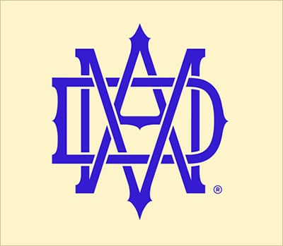
7. Cleaver Wordmark
Usually eyewear shops, pizza parlors, pasta dine in restaurants, hotels and spas pick up on the logos that have their “mark” as image in them. Cleaver Wordmark is a creative way to represent what the place is all about, what does it hold, how does it serve and a slight idea what the company and ownership prepares/fixes.
More Clever Wordmark Logo Designs
![]()
![]()
8. Overlapping Characters & Words
If you are locked out with ideas that what technique you should undergo to get yourself a pretty reasonable logo design then you can be very simplistic with the technique and yet sophisticatedly natural. Use overlapping technique to transform a logo design into something meaningful, provocative and creative. Insert in characters and words, overlap them to make a connection. Some creative logo examples are given below
Credit: Romain Billaud, ODG, This One
![]()
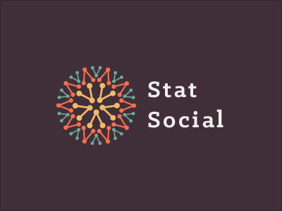
9. Logo design made with same or several elements
If you are not happy or satisfied to use a single element into the logo then you can add as many related elements as you want. The basic idea is to make something communicative and not confusing, if one element is not doing the exact job and is not enough to make a descriptive sense out of it then choose multiple of them. Sometimes you need multiple tints, colors, images and elements to create magical artwork.
![]()
![]()
10. Half Shadow Logo design
Half shadow will give more depth to logo design, beside being flat prefer to create logo design with shadow on the left or right. If you are more into shadowing then use half shadow, one fourth or three fourth technique, basically it adds value and inventiveness of the logos.
![]()
![]()
I have also been presenting logo design trends 2015, logo trends 2016, logo trends 2017 and now 2018 has something unique and exceptional. Check them out and give us your feedback guys. We love to hear from you.
More Logo Design Articles you would love to read:
- 20+ Must Watch Thin line Animal Logo Design Ideas Created By Yuri Kartashev
- 15+ Creative Negative Space Logos | A Unique Style Introduced by Yoga Perdana
- 30+ Stunning 3D Logo Design & Logotype Ideas by Pavel Zertsikel
- 10 Best 2 Color Combination Ideas for Logo Design + Free Swatches
- 20 Cool Yet Creative Logo Design Ideas of 2017 Designed by Bodea Daniel
- 50+ Creative A to Z Alphabet Logo Designs & Type Logos for Inspiration