Banding can come as an easy lesson if you follow the right market guidelines, know your audience thoroughly and have a clear view of the need that your brand covers. However, it might become complicated if you’re a graphic designer, branding expert or even project manager, and you need to build or increase brand visibility and awareness. There are plenty of ways to develop a logo, besides knowledge, logic and intuition.
Beyond market trends and information that you already know, there are examples of excellent brands. Google is one of them. According to a Forbes top, it is the second largest brand in the world, after Apple. The Google logo history contains plenty of design initiatives that contributed to the brand’s nowadays fame. Once you look through them and analyze each, you might notice that they are valid and promising. Let’s see how your design can improve and even boost a brand by learning from what Google did so far!
1. Build and Show
Many know the Google logo or, at least, elements from it. Google has briefly soothed its brand colors, without changing its appearance drastically. Throughout its logo changes, the brand has kept its recognizable colors and the font adjusted just a bit. However, there are now plenty of products which reiterate the brand’s name. When looking at them, the public rather recognizes the brand, instead of reacting negatively to repetition.
Google Translate, Google Maps, Google ads, Google Chrome, Google+, Google Wallet and Google Pay are just a few of the products which have something in common – the brand’s name. When working with any of the above (as you might do), you know who it belongs to, what it can offer and what you can connect it with. Naturally insert the brand’s name when creating the design of a new product for your audience.
2. Correct with Discretion
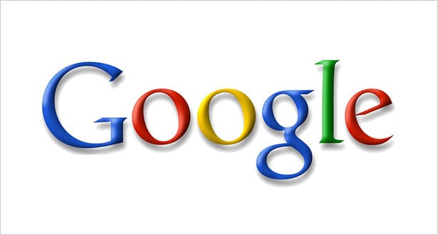
In 1998, the brand’s logo featured a blue capital G, instead of a green one. However, the logo also included an exclamation mark. The change was meant to straighten the shadows of the company’s 3D letters. However, after less than a year, the brands logo silently disappeared as it became too resembling to Yahoo!’s logo. The exclamation mark-less logo was featured until 2010, and it was changed again in 2012.
It was only a year later when Google announced a major logo change, even though branding experts noticed the other adjustments. Don’t announce adjustments to your branding visuals, especially if they don’t have a message to support it. However, don’t oversee necessary changes because the public might perceive them as negative.
3. Differentiate the Brand from the Product
Google is a brand which got famous due to its core product: Google Search Engine. Yet, the company aimed to differentiate its corporate message from the engine and created Alphabet. The corporation got so far that it featured a tagline even before the product did – Don’t be evil. This initiative provided its employees with clearer mission, vision and values. It also determined a corporate culture which was no longer vague.
Google Ventures and Google Capital are housed under Alphabet since 2015. Alphabet features similar elements – such as the font – but it developed a separate message and unique branding elements. If your brand hosts more products, differentiate them and keep them separately from the corporate brand. This is a different environment with its own public and expectations.
4. Keep It Friendly
Many designers already know that simple logos are easier to remember than complex ones. There are few exceptions to this rule of thumb, such as Starbucks or Heineken. However, Google decided to pursue the rule and keep it simple and approachable. Since the brand’s purpose is to be of daily usage, it mixes geometric forms with a simple but joyful writing.
There are few situations which require you a sophisticated logo, even in the B2B world. Make sure that your logo is simple enough to reinforce the brand proposition, instead of complicating it. When elements from your brand are so friendly that they become recognizable independently, you can turn to bold initiatives, such as the Google dots.
5. Innovate and Play
Google had little tools to innovate back in 1997. The company released its Beta version of a search engine which featured a logo developed in a free online graphic program called GIMP. One year later, the graphic designer changed it. Since innovation tools were still limited, the designer put the secondary color from the pattern on the third letter, instead of the second.
In recent years, Google innovated with interactive doodles and even doodle games. Its font resembles Futura and it’s free for download. Is this surprising? You can find the right tools to innovate and impress by taking advantage of technology. You can also play with your basic options and make sure that other branding designers and experts will notice your game.
The Google Rise
There’s no doubt that Google is a top worldwide brand, as Forbes stated. The brand found a need for a product such as the search engine in the market and decided to cover it. It did it so well that now owns the most popular product in its field. Moreover, it reached the stage where it made some huge acquisitions, such as YouTube or Picasa and didn’t even rebrand them. The two brands kept their consistency and public through remaining loyal to their vision.
Today’s branding relies much on the emotional side of the public. The age of impressing through product quality is now long gone. There are niches, unique audience categories and preferences that come and go. There are plenty of logos which are recognized even on the street, due to the customer loyalty message they send. Some of them are Jordan, Fendi, Coco Chanel or Adidas. The public engages in ideas and campaigns that are rather emotional than convincing. So, make the most of your logos and enchant your audience!
Recommended Posts:
- 5 Tips To Capture A Better Photograph
- Best 10 Sites for Premium Vector Graphics in 2018
- Set Up, Manage and Protect Your Apple Devices in Minutes with MDM
- Top 26 Professional Web Tools For Business 2018
- Wix: The Web Is Your Playground


