Hi there guys! We hope that the world of graphic design is treating you well and that you enjoy doing everything that you and your team works on. So, we were noticing a pattern and decided to talk about it with y’all. Have you guys also observed that these days line art logos are being liked and preferred by most of the clients? Because we have been designing and appreciated in line art style than any other in the market. And we would like to discuss some of the reasons for this modern behavior.
But first, let’s all get to understand what is a line art logo? A line art logo is a minimal, thin or bold line art created usually with the pen tool or geometric shapes. It is simple yet sophisticated using abstract as well as definite shapes in line work. Incorporating one line at a time, different variations of line art logos can be produced. And it is totally up to the logo designer to keep the logo simple or make it a complex one.
The neat thing about these logos that no shading is required and involved nor are the logos detailed. All the designs are created by keeping in mind the audience and their brand knowledge. In cases where the line art logos are kept simple, it is basically done to ensure that the brand message is communicated well while still opting the minimalistic design approach as well as less color therapy. They are preferred by clients for their modern minimalistic approach as well as the definite shape that presents the meaning of a brand or firm. They are more likeable and playful in both web and printing environment.
Our second take on the line art logos and them being preferred by clients would be that the logos are uniquely intriguing because of their bold connected lines relation with each other and audience wants to see their favorite brands adopt new communication styles. Also, all these simple lines are not only easy to transform but are very versatile as well. Graphic and logo designers can easily edit the existing line art logos by adding relevant colors of their brands to them. With the growing interest in line art logos, we’re sure that these logos are here to stay.
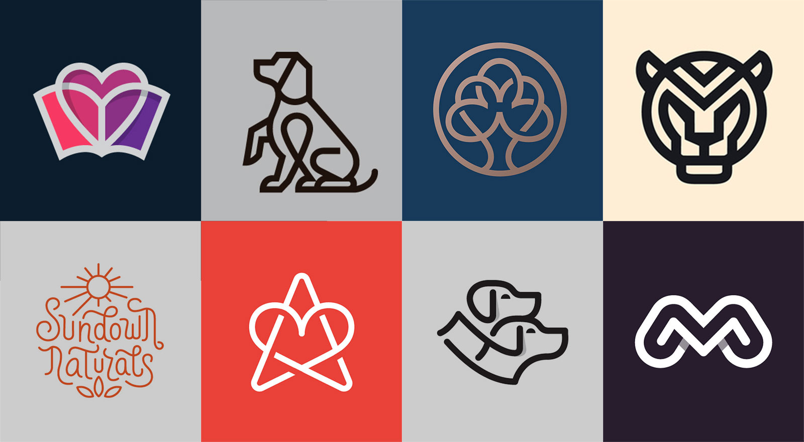
In the attached logo collection, you will notice how the artist has skillfully created the line art logos that goes so well with the brand along with the design elements depicting definite shapes.
Some Really Good Examples of Line Art Logos For Inspiration
![]()
![]()
![]()
![]()
![]()
![]()
![]()
![]()
![]()
![]()
![]()
![]()
![]()
![]()
![]()
![]()
![]()
![]()
![]()
![]()
![]()
![]()
![]()
![]()
![]()
![]()
Created by Nina Megrelidze
Recommended:
- 25 Awesome Logo Animation for Inspiration
- Describing Logo Designs With Animation | A New Logo Trend of 2019
- 25 Verbs Creative Logo Design Project
- Letter A to Z Logo Design, Marks, Symbols, Monograms for Inspiration
- 19 Static & Animated Inspiring Mystic Logo Design Ideas
- 30+ Modern Logo Design Samples & Logo Marks For Inspiration
- From Concept to Reality | 20+ Modern Logo Designs with Sketches
- Fall in Love With These 25+ Cute Animated Logo Designs by Bodea Daniel