Hi guys! We are on a roll these days exploring new topics to create designs for and to write on. Since we were busy doing just that, we realized that we should also talk about one of the basic yet the most important things when it comes to printing – and that’s color. In this blog we will be talking about CMYK (a color model), Spot Color (a special premixed ink) and Process Color (a combination of 4 standard process inks). So, let’s get started:
CMYK:
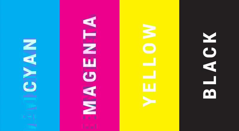
CMYK literally stands for Cyan, Magenta, Yellow and Key (Black). There is a myth about the ‘Key’ though that it ‘B’ for black was changed to ‘Key’ to avoid any confusions the printers might experience between black and blue. A variety of colors can be produced in a print job using this color combination.
Spot Color:
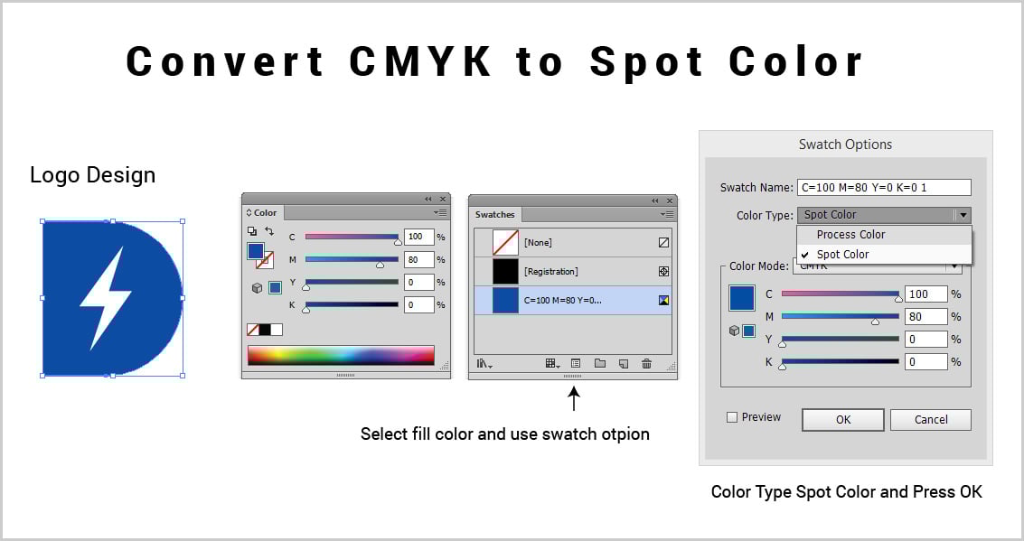
A spot color known as special color is a solid color which is used instead of a processed ink or by mixing it with the additional inks. But mainly, a spot color is used for color accuracy or when specific colors are required to be printed. Spot colors are capable of producing accurate colors other than the combination of other processed inks. You can convert any cmyk color to a spot color or use pantone book to select any special color and use it as spot color. Think about the red color of coca cola. It is pantone 2347 C (“C” stands for coated color). In above example i have converted cmyk to spot color. Logo design color is (C=100 | M=80 | Y=0 | K=0) now after making it spot color it will be used as a single special color for printing for color accuracy.
Process Color:
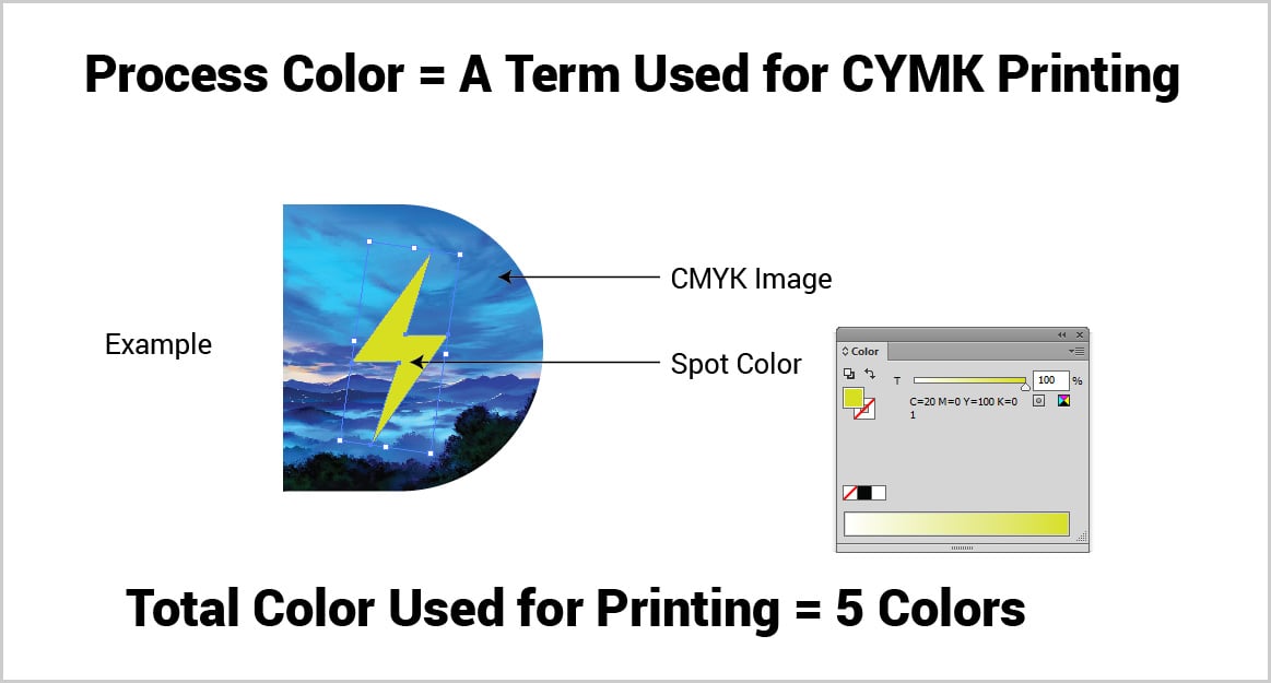
A process color is made and printed using the 4 basic inks which are Cyan, Magenta, Yellow and Black. It is always advised to use process colors when multiple are supposed to be printed especially colored photographs.
Printers use CMYK for process printing as well as additional spot color for accuracy. Nowadays, color sharpness and bright colors are more likeable by firms and they are switching from CMYK to RGB colors for digital printing as well as screen printing. Few printing tips we would like to share with you:
- Don’t use process colors for any document which is going to be viewed online only.
- Don’t finalize colors by seeing them on your screen, if it is feasible for you then do visit your printer’s shop to see how colors will look like after getting printed. Have pantone book with yourself for color reference if you are using any spot color.
- Buy screen calibrator for the accuracy of colors. If you are working in a process printing firm you should have colorimeter for matching colors in graphics business.
- You can use spot and process colors together for the print jobs which require printing one same thing on multiple pages e.g printing logo design in a special spot color and printing colored photograph in process color (cmyk). In technical terms we call it 5 color job.
- Never use process colors for logos as they differ from one printing environment to another and cmyk print buckets have several different qualities available in the market. To maintain the color accuracy always use spot color or most preferable pantone color.
I hope this article will be useful for newcomers as well as professionals working in printing firms. If you have any question regarding printing and suggestion you are more than welcome to share in comment section.
Recommended:
- 5 Types of Printing Techniques for Business Cards with Examples
- What Are The Different Types Of Banners With Image Examples?
- 10 Best Portable Instant Print Camera & Photo Printer | Polaroid, Kodak, FujiFilm & HP
- 10 Beautiful Restaurant Food Menu Designs For Inspiration
- 10 Best All in One Wireless (Wifi) Photo InkJet Printer with Scanner for Designers