When it comes to branding and marketing, much is to be learned from some of the biggest brands that got it right with their popular logos!
What do you remember most about your favorite brands?
Is it their signature taste, sounds, style, nostalgia, or the warm memories you feel?
How you feel about a brand largely depends on its logo. A logo may seem like a small detail, but it may be the most critical piece of the marketing puzzle. It’s hard to think about such iconic brands as Nike, Apple, Starbucks, Coca-Cola, Pepsi, and McDonald’s without their logos coming to mind. That’s because these popular logos did what they were intended to do. But what makes some logos soar and others fall flat?
It takes more than just art skills to create a successful logo. Read on to discover what it takes to make logos with impact!
Planning Makes Perfect
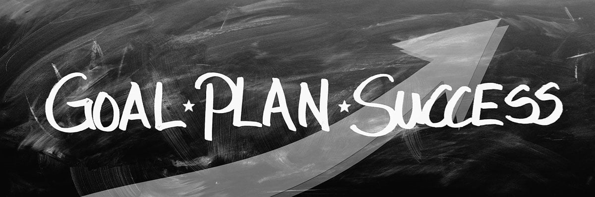
Contrary to popular belief, companies don’t wing their logos. Top corporations hire marketing teams to conduct market research before creating a logo design. Market research covers the following points:
- Target brand demographics
- Annual income
- Age range
- Geographical location
- Problems for target demographics
- Preferences of target consumers
- Consumer psychology
Market research helps companies create a target consumer profile. Marketing teams use these profiles to design relevant marketing materials, including logos.
Popular Logos are Simple
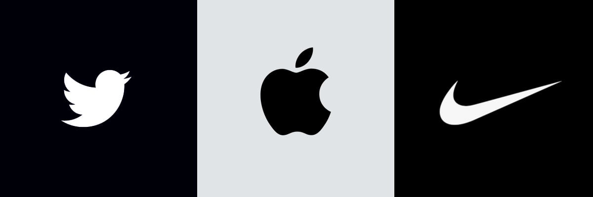
Market research is the first step. The next challenge for corporations is to apply the principles of logo design to produce popular logos.
The first principle is simplicity. However, achieving simplicity in logo design is anything but simple. It’s one of the most challenging aspects of marketing design. Simplicity is essential for creating memorable logos. The best examples include Nike’s signature dash logo, the Mercedes Benz symbol, and Twitter’s iconic bluebird.
What do these simple yet effective logos have in common?
For starters, they feature a limited or mono-color palette. They’re not heavy on the bells and whistles. Instead, they feature simple lines and shapes. An excellent example to look at is the evolution of Adidas’ logo. This iconic logo didn’t start as the simple black logo you know and love.
The first Adidas logo was more complicated. It featured a detailed shoe hanging above the brand name, “Adidas.” Above the brand name was the name of the shoemaker, Adolf Dassler.
Needless to say, the first Adidas logo had a lot going on. Over the years, Adidas refined its design and eventually ended up with its simple signature logo. Adidas, like other brands, learned that simple logos are more recognizable, clearer, and evoke an emotional response from consumers quicker than complicated logos.
The Power of Colors
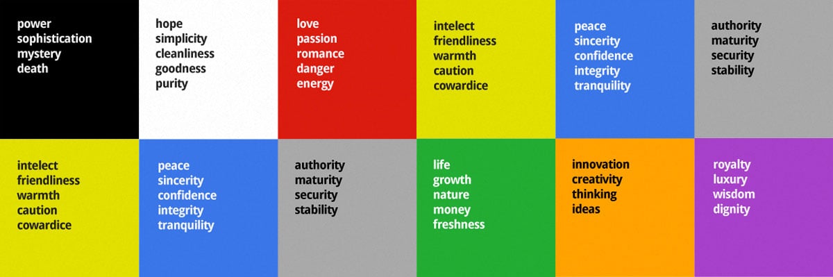
Be careful with your logo’s color palette.
History’s most successful logos have another crucial element in common — they don’t go overboard with colors. They also leverage the psychological impact of colors. Studies show that colors can trigger everything from hunger to rage. Think about how particular businesses or advertisements make you feel. Now, think about the colors used in those ads, restaurants, and logos.
Marketing teams don’t use colors because they look pretty. They’re purposely selected to evoke a specific emotion. One study revealed that combinations of red and yellow made consumers hungry. Is it any coincidence that McDonald’s, Burger King, Wendy’s, and Carl’s Jr. all have red and yellow logos?
Did you notice how PayPal, American Express, and Bank of America use predominantly blue logos? This choice was an intentional marketing decision, as well. The color blue evokes feelings of trust. Trustworthiness is essential for financial brands since they’re trusted with consumers’ money. Trust is also central to healthcare brands. That’s why top healthcare brands like Blue Cross and United Health Group have blue logos.
Think about the type of emotion you want to evoke with your logo and select an attractive color combination to match. You don’t have to stick to just primary and secondary colors. Use a color wheel to discover an extensive selection of shades. For example, a light lavender color may suit your spa brand better than a dark violet shade. Look at how Dropbox uses different shades of the same color in their logo.
Balance and Harmony in Logo Design
![]()
One of the most crucial elements of logo design may be too subtle to notice, but that’s the point. Take a look at the most popular logos of all time. Next to colors and simplicity, you’ll notice they’re balanced and proportionate. Successful logo designers understand the power of harmony.
Consumers’ eyes need a place to rest. You don’t want their eyes darting all over the place or distracted by too many elements. Logo harmony is similar to visual merchandising. Good merchandising doesn’t cover every inch of the store with products. Merchandisers space out the products, so that consumers eyes’ can rest. Negative space is also essential for effective web design, written marketing content, and graphic design.
You’ll notice that iconic logos are symmetrical. Even though Adidas’ logo features three diagonal black lines that ascend in height, if you cut the logo in half, it would still be proportional.
Starbucks’ logo is also perfectly symmetrical, even though you may not think it is at first glance.
The Starbucks logo also has a perfectly balanced color palette, using only three colors: green, black, and white. Color balance is just as crucial as symmetry in logo design. Don’t let the darker shades in your logo overpower the lighter hues.
One of the best ways to achieve color balance is to use complementary colors. Look at how FedEx achieves balance by leveraging purple and orange, which are complementary colors. Another critical element to consider is typography fonts.
You can’t use just any font. You need to choose a style and size that balances with your colors and design. The best examples of this principle are Google, UPS, Starbucks, Adidas, and Amazon.
Iconic Logos are Versatile
Iconic logos are simple, balanced, and understand color harmony. But even these elements alone aren’t enough to create an effective logo design. Famous logos are also versatile. Versatility means that a logo can adapt to any size or marketing medium.
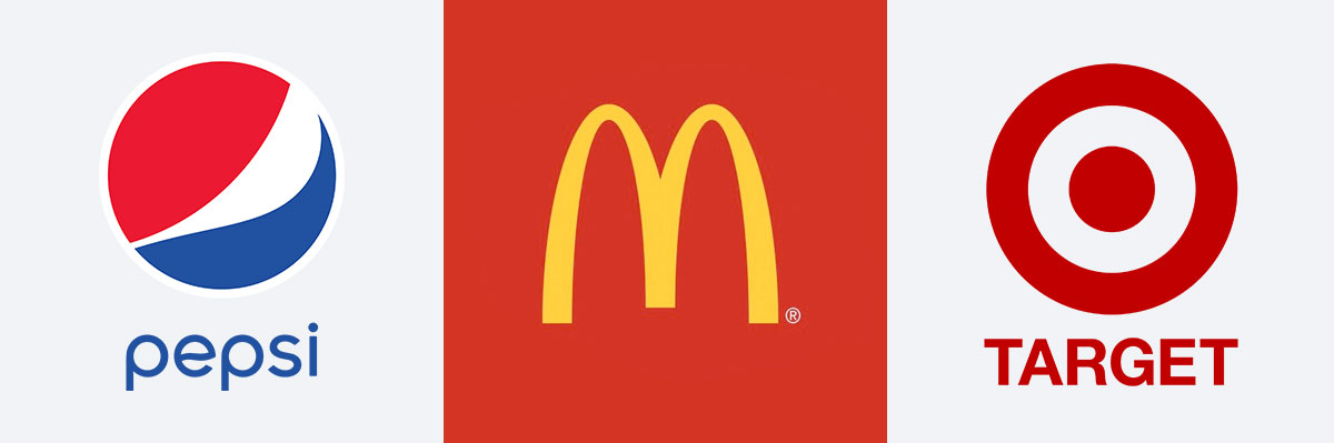
The famous McDonald’s logo works smoothly on cups, wrappers, billboards, company letterhead, social media, and on every other piece of marketing material. You can say the same for Target, Apple, Pepsi, and more memorable logos. Scalability is the most crucial aspect of versatile logos. A logo must be effective at any size, no matter how big or small.
Relevancy Matters
![]()
Would the McDonald’s logo be as effective if it didn’t have those infamous golden arches? What if Target never used a red bullseye and instead opted for a squirrel?
The next principle of logo design is relevancy. Successful logos use symbols that are relevant to their industry and consumers. You wouldn’t use a logo generator to create a cat symbol for your spa business, but you would use your generator to make a lotus flower or a dollop of lotion. One of the best examples of logo relevancy gone wrong was the short-lived IHOP rebrand.
Even though the rebrand was an online joke, it spoke to the importance of relevancy. Switching to a burger logo isn’t the best look for an iconic pancake house.
A/B Testing
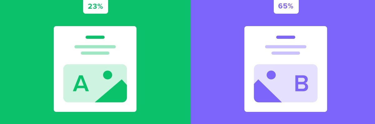
Relevancy in logo design speaks to the importance of a/b testing. Not even name brand companies get it right on the first try. Remember Adidas’ first logo? Sometimes it takes several attempts to get it right. Companies have more tools now to avoid the costs of bad logo design. Marketers use A/B testing to see which logo design is most appealing to consumers.
Marketing teams may issue a “soft launch” to a limited group of people to test logos with their target demographics. They might use focus groups to check a range of designs during the development phase. Even top companies have changed their logos over time. This decision is frequently due to outdated styles and changing consumer demographics.
A growing company like Slack changed its logo at the height of its popularity. Google and Amazon have also refined their logos over time. Marketing isn’t static. It’s continually changing like consumer behavior. That’s why a/b testing should be involved at every step of the marketing process.
Timeless Appeal
A great logo stands the test of time. If you follow all the principles of logo design, you increase your chances of creating a timeless logo that appeals to the next generation of consumers. This fact doesn’t mean you have to keep the same logo forever. As you previously learned, a/b testing may reveal that your logo is outdated. It’s crucial to make necessary tweaks to your logo design to ensure its longevity.
Brand loyalty also plays a role. Timeless logos belong to companies and name-brands with years in the game. These companies satisfy consumer demand, produce a valuable product, and value their customers.
You can’t have a timeless logo without brand loyalty. Business factors like customer service and product quality are just as crucial to logos as the design itself.
Make Your Mark on the World
Your logo is the glue that keeps your brand together. Don’t succumb to the pitfalls of poor web design. Remember the stories of the popular logos that came before your brand! These lessons are just the start of your design journey. Keep reading to discover more tips, so that you can leverage design to its fullest potential.
Recommended Logo Design Articles:
- Volkswagen New Brand Identity | A Perfect Example To Present Brand Design
- 35+ Honest Logos of Famous Brands By Viktor Hertz
- How Much Should I Pay for a Logo Design?
- Why Are Line Art Logos Preferred by Clients?
- Describing Logo Designs With Animation | A New Logo Trend of 2019
- Fall in Love With These 25+ Cute Animated Logo Designs by Bodea Daniel
- 66 Clever Wordmarks | Inspiration for Amateur Logo Designers
- 10+ World Famous Logos in Unique Lettering by Luis Lili
thanks for info