When it comes to pocket folders, the pockets are for more than storing documents. If done correctly, they are part of the design, too. You can use different colors or images on the pockets or stray away from the standard square shape. In fact, doing something unique to the pockets can help your folder stand out.
Remember, just because it’s different doesn’t mean it has to be complex. You can go with subtle changes such as making the pockets a different color from the panels or using vertical instead of horizontal pockets. Still, don’t sacrifice function for flair. Folders come in many shapes and sizes, so it’s important to select a die cut design that meets your needs. Don’t go with a vertical pocket if you need a horizontal pocket to ensure no materials are lost and, furthermore, ensure your contents have room to breathe. You won’t want your creation remembered for the wrong reasons.
All standard design messaging still applies, so keep in mind the psychology behind various elements such as fonts, colors, and shapes when including your pockets in your design. For example, blue evokes feelings of stability and calmness, while green can represent growth. A circle can represent unity and community, but if you’re going for power and stability, use a triangle. Remembering the psychology of shapes can be extra important if you are considering a custom die-cut shape for your pockets. Fonts also play a role, as script fonts add an elegant, feminine element to a design, and sans serif fonts are seen as cleaner and more modern.
You might be thinking, “That’s great, but coming up with an overall folder design is challenging enough, and now you want me to do something different to the pockets?” The short answer: Yes. But, don’t worry, we’re here to help. We’ve put together a dozen examples of stellar pocket folder designs to spark your creative fire.
1. Be Consistent with Your Brand
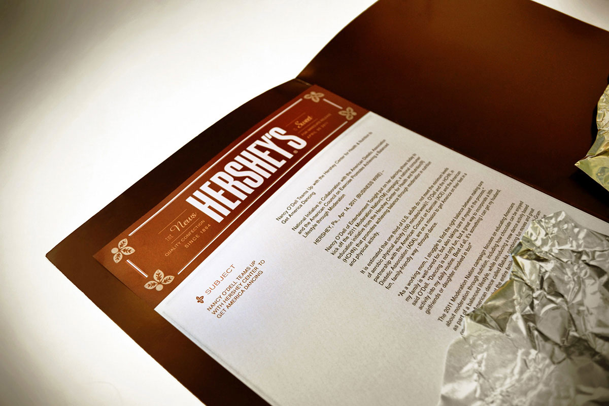
Hershey’s matches its folder to its iconic chocolate bar and its packaging. Between the color of the panels behind the pockets and the unique pocket design, opening the folder looks as if two pieces of chocolate are wrapped in foil, which evokes the feelings of excitement people get right before they remove the chocolate from the wrapper.
2. Consider a Theme
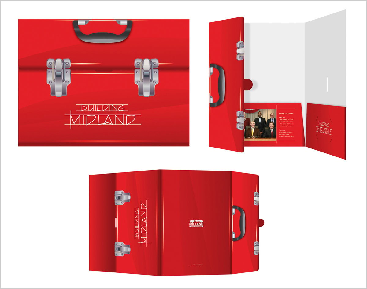
The toolbox design of this folder plays off the theme on the cover of “Building Midland.” It also lets people know they’ll find the tools they need for the job are inside the pockets, whether it’s a report, flyer, or brochure.
3. Repeat Yourself
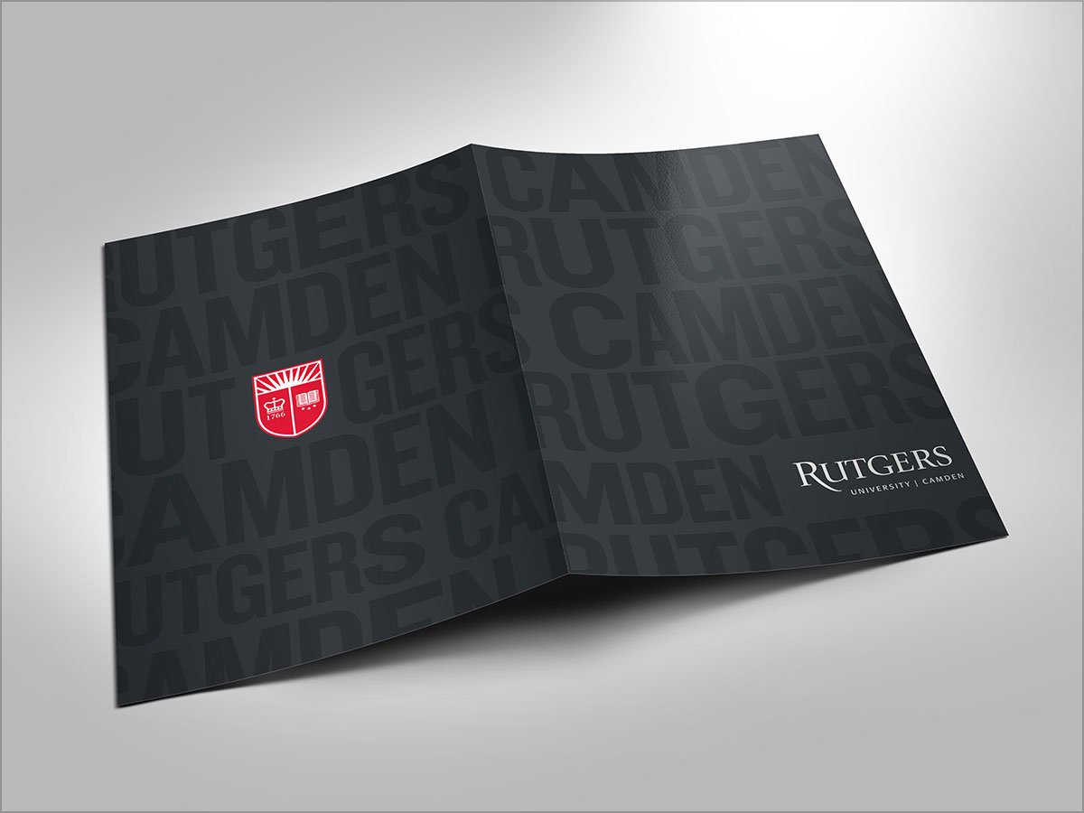
Rutgers Camden appears repeatedly on both covers in large capital letters in a black on black color scheme to subtly reinforce its brand. Its name stands out in white at the bottom of the cover. The school’s red shield catches the eye on the back, highlighting the school’s history and prestige.
4. Use a Coating
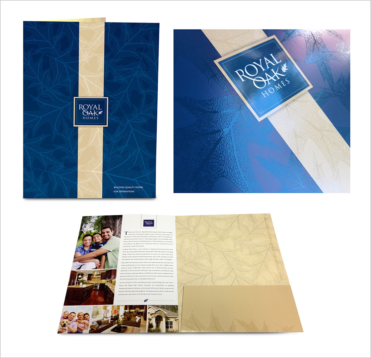
Coatings protect your folder and add durability, but they also can attract attention to specific elements of your design. That’s the case with this folder from Royal Oak Homes, as a glossy coating highlights the oak leaves on the cover and provides a difference recipients can see and feel.
5. Highlight Extra Info on the Pocket
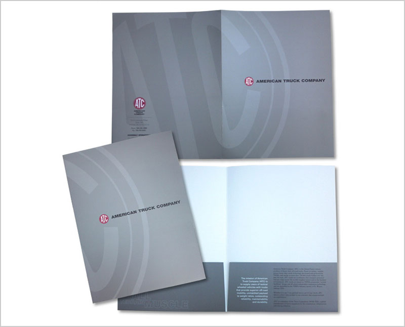
Pockets are a great place to put additional information such as company history, location, hours, or website URL because they typically are the first place people look when they open the folder. American Truck Company uses its pockets for a tagline and company history. This is also cost-effective because pockets are typically included in the cost of side 1 printing.
6. You Don’t Always Need Two Pockets
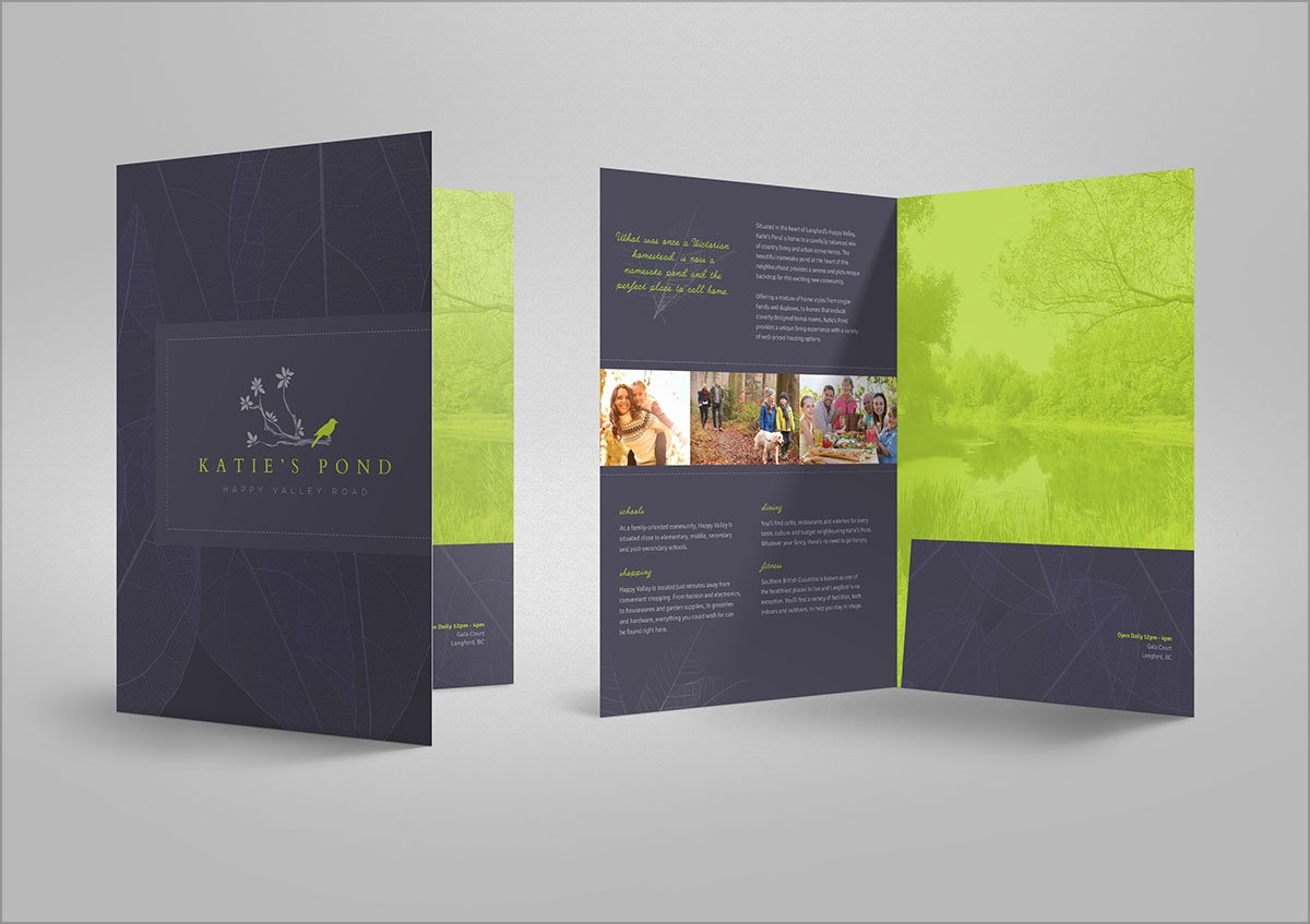
Sometimes, one pocket is enough, which is true for Katie’s Pond. Inside, the left panel is reserved for the story of the subdivision and images to entice people to move there, but the area behind the pocket isn’t a waste of space. A serene image of the area’s namesake pond is featured with a lime green filter, tying it the other lime green elements from the cover.
7. Include Information Behind the Pockets
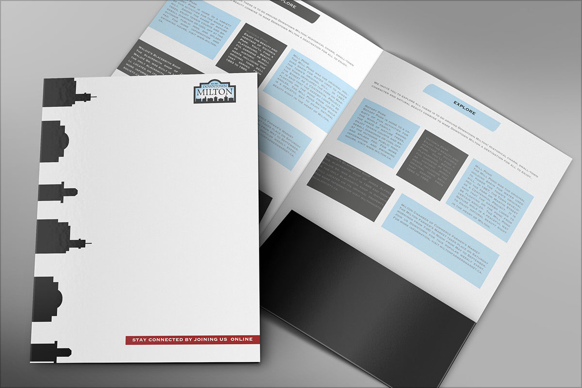
There’s a lot of real estate inside beyond the pockets. Don’t be afraid to explore that concept, as is the case with this folder. Downtown Milton features silhouettes of buildings on its cover but highlights the town’s key locations inside with a little background information on each location.
8. Use Strong Colors
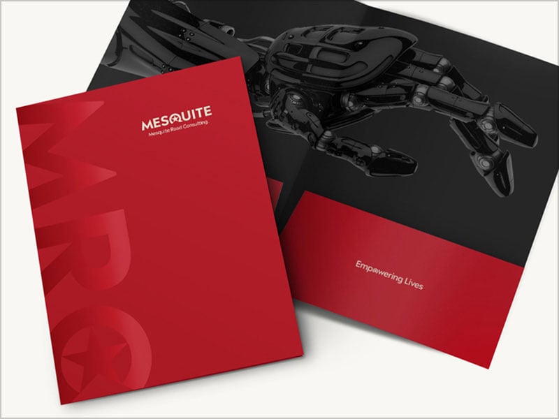
A bold color such as red makes a powerful impression. Mesquite Road Consulting uses red to evoke feelings of passion. The large capital monogram spanning the front cover illustrates this company is a force in its field. This notion goes a step further inside with the tagline “Empowering Lives” on the pocket.
9. Make an Impression with High-Quality Images
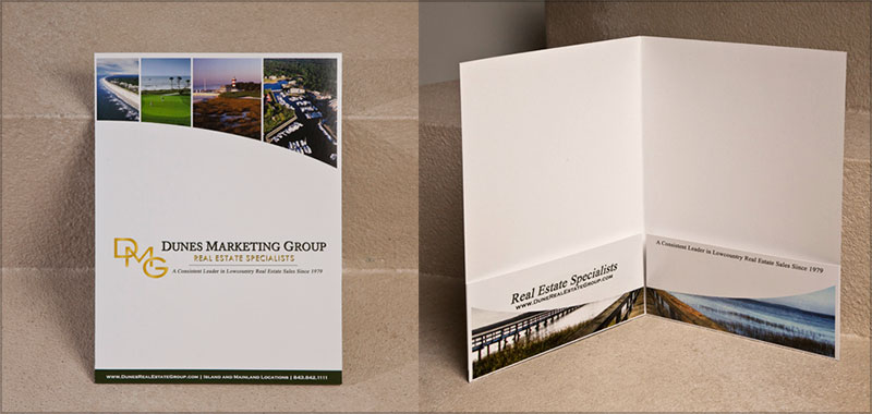
A picture is still worth 1,000 words. Dunes Marketing Group uses several images to entice people to their properties. The high-quality images, which span both covers, illustrates the luxurious waterfront lifestyle recipients could have if they choose one of those areas.
10. Keep it Simple
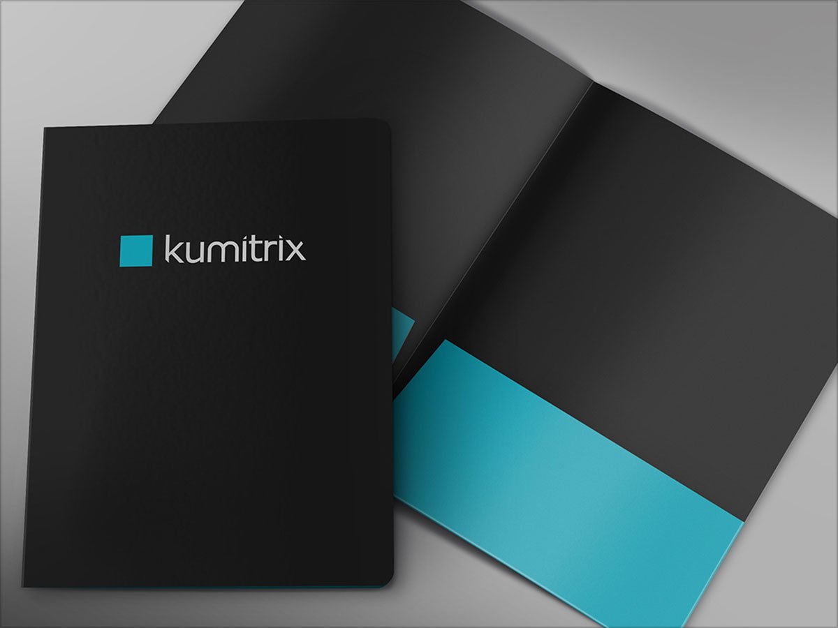
For some great designs, less is more. This clean, crisp design for Kumitrix features only the company name and logo—which also is simple and modern—on the cover. Color branding continues inside as the pockets match the logo on the front.
11. Cut it Out
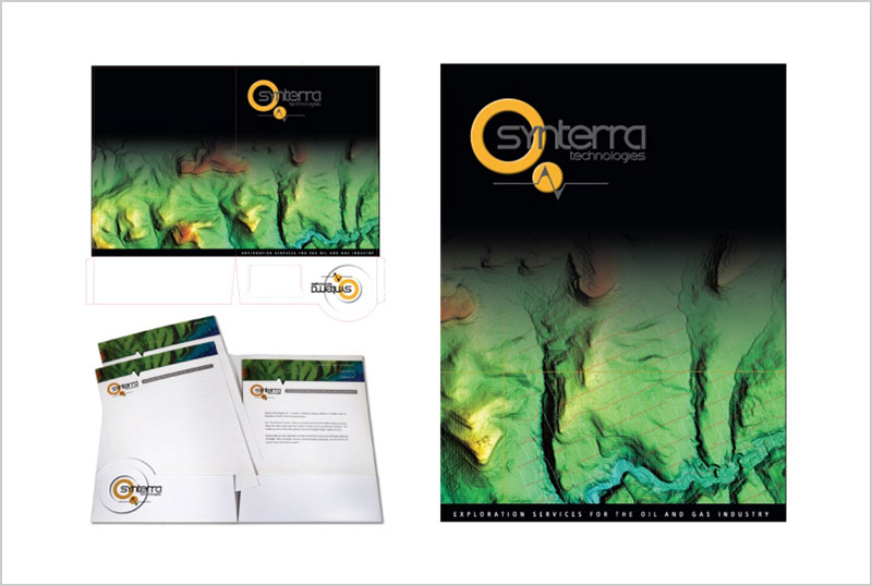
A unique die-cut can help an element stand out and make your piece more memorable. The round die-cut on the pocket of this design from Synterra Technologies mimics the company’s logo that’s featured on the cover, too. This builds continuity and connects the design on the cover to the inside.
12. Don’t Be a Square
Straying away from the traditional square pocket can add a unique element to your design. The rounded pockets of this design create motion and draw the eye to the folder’s contents. Adding the company logo between the business card slits is a nice touch because it reinforces the brand and surprises the recipient when they remove the card.
More Interesting Articles to read:
- 5 Types of Printing Techniques for Business Cards with Examples
- How Can I Make My Brain More Creative?
- What Is A Good Design Brief? A Must Read For Everyone
- Are Graphic Designers Paid Well?
- Cool Advertising Posters | A Visual Treat for The Eyes