Hello there everyone! We hope that you all are taking great care of yourselves and of your loved ones and are also creating magical designs by using our amazing mock-up PSD files and design templates. And we would also like to thank you guys for always sharing your positive feedback and super interesting suggestions with us.
We know that our easy to follow tips & tricks, creative thoughts and ideas help you work on your personal and commercial design projects but for our today’s blog, we wanted to do something different and we are all set to share and discuss some of the worst logos that were ever designed and then redesigned because you cannot do anything if your business logo sucks. So, let us get started!
Allow us to ask a few questions first: on a scale of 1 to 10, how confident are you about your business logo? How does it make you feel when you look at it as a stand-alone design and how old is it? We are asking these questions because we would love to know about your logo design journey in order to guide you better. The examples of the worst logos ever that we have here are not just bad examples of how companies at times, take their main point of recognition lightly but also a learning point for you guys to follow certain guidelines before you go ahead with a branding strategy.
For a logo to be nothing but the best, brand team and team members of the creative agency sit together, share ideas, discuss possibilities & opportunities, and talk about things that might go wrong – in one way or the other. Know that even if you make one of the most successful campaigns of your entire career, you must think through every good + positive and bad + negative aspect of launching the project etc. Why, you ask? All marketing and advertising campaigns that are made live, designs that are made, and all the post launch content plans that are worked on will be liked and disliked by large number of people.
It’s simple, not everything that you love will be loved even by your audience so you gotta be prepared for all sorts of results and feedback. Same goes for logo designs as well – you design a bunch of logos, only one of them gets approved and then you start using it for the branding and everything else. The feedback will be subjective, but you will know if it was a great logo after connecting with your existing and potential customers.
![]()
So, Emanuele Abrate, an Italian freelance graphic designer worked on a bunch of logos and redesigned them in a way that they look stunning. We’ll start with the logo of Instituto de Estudos Orientais. If you look at the previously designed logo, you will see that it is a logo that has a double meaning and in entirety, it does not even make any sense. Abrate, while keeping the essence of the logo, has utilized the negative space and enhanced the pagoda. His design approach brought the modern look to the logo making it more effective for the organization too.
![]()
In the Before image of the Computer Doctors, you will see that a mouse is there, but a health-related design element is missing – and we feel that, that is when the actual meaning was lost. As per Abrate, there was nothing to be saved from the previously designed logo, so a new logo design was created. Now if you look closely at the new logo, you will notice that the origin of the idea is a computer screen whereas there’s a cross sign too and that depicts healthcare.
![]()
Arlington Pediatric Center’s old logo does not make sense. It is out of proportion and it feels like it was designed just for the sake of it. By creating simple and circular shapes turn into a pictogram, the designer has made sure to come up with something that’s more appealing and shows what’s the logo all about.
![]()
What do you guys see in Mama’s Baking‘s old logo? We feel that even though it is a very subjective question to ask, the logo is pointless, is not clear at all and we clearly don’t see the element of a mother’s love or anything related to the name for that matter. By adding an oven mitt that’s also heart shaped and using chubby typography, the goal of creating a simple yet powerful logo has been achieved.
![]()
Any logo with a double meaning will bring negative publicity to your business / brand and we know that gone are the days when CEOs would get happy even if people were talking bad about their services etc. Clinica Dental San Marcelino’s logo is one of the best examples of the worst logos that have been designed under the sun. Just look at the logo and decide what to do with that because it’s not even creative to say the least.
There are many more examples that we are adding to our blog and we know that you’ll have a good time viewing them and while you are at it, we would love to encourage you guys to make your own pointers of things that you should avoid when it comes to logo designing.
Kudawar Pharmacy Before & After Logo Design
![]()
Fire Prevention Products Before & After Logo Design
![]()
Safe Place Before & After Logo Design
![]()
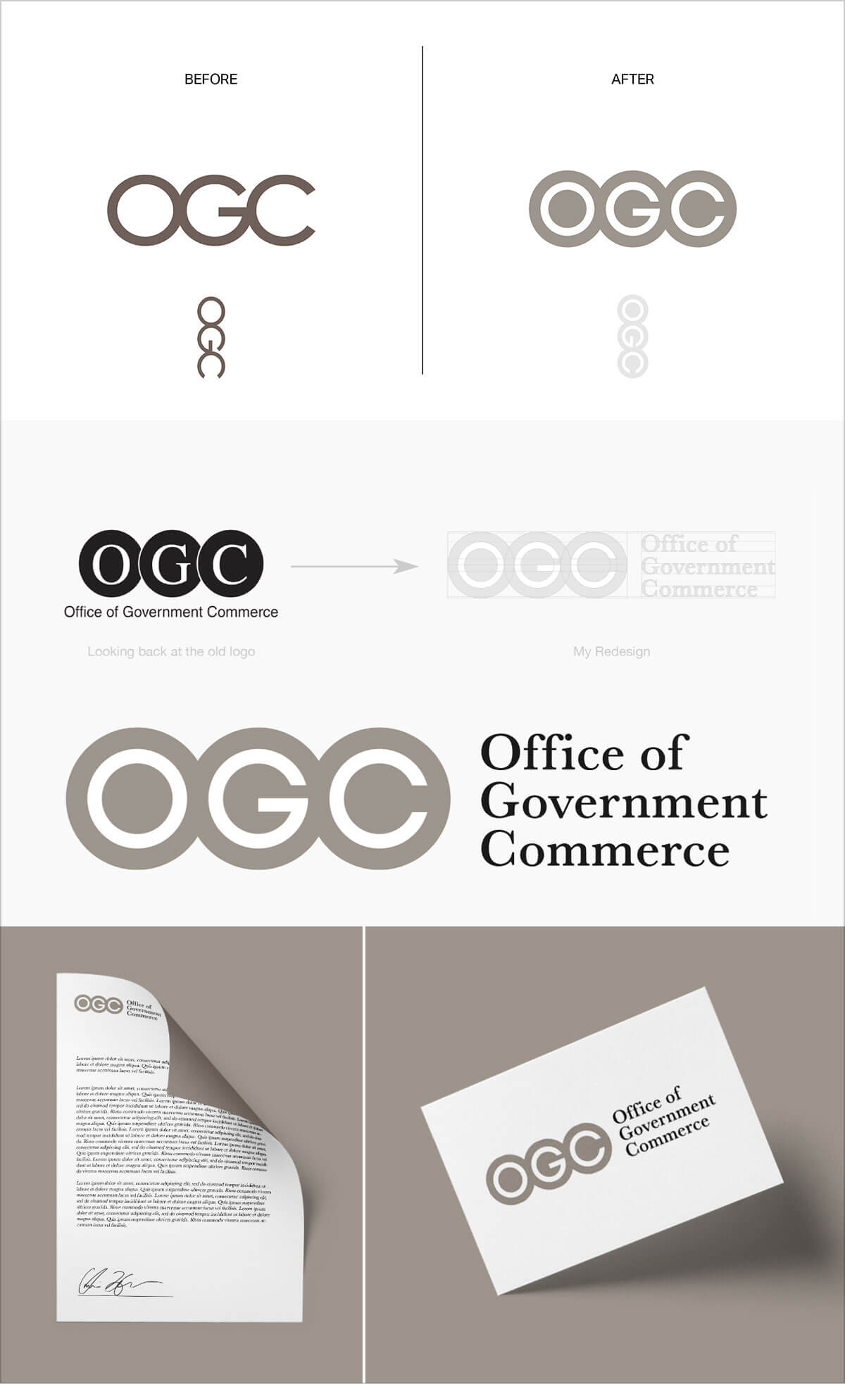
OGC (Office of Government Commerce) Before & After Logo Design
And that’s all for today! We’ll see you all next time with another exciting and super informative blog of ours.
Credit: Emanuele Abrate
Recommended:
- New Stunning Negative Space Logos by George Bokhua
- 55+ Awesome Logo Ideas 2020 For Freelance Logo Designers
- Feast for the Eyes | 20+ New Negative Space Animal Logo Marks by Daniel Lasso
- Modern Logo Designs & Marks 2020 for Inspiration
- A Must-See Creative Spin on Famous Logo Designs
- 25+ Logo Inspiration 2020 for Young Logo Designers
- 20 Illustrated Logos for Inspiration | A New Logo Design Trend of 2020
- 28+ Modern Logo Design Ideas 2020 By Alexey Akhmetov