Hello there friends! Before we begin talking about our today’s blog, we would like to thank you all for your overwhelming response on our previous blogs and for also showing your interest in our tips that we shared on branding & rebranding a business. We would like to continue sharing a few more tips on how effectively you can brand and rebrand your business or product so let’s dive right into it.
We are sure that by now, you guys know how to work on the branding of a business / product and what factors can make or break the brand. This isn’t a test and we do are not expecting perfect answers or examples from you but we know that we it is finally time to create a branding design, we happen to face challenges that usually start from within for example: our own second thoughts, generation of some new ideas, a team member’s input that may change the entire thought process or the clients who could not convince their senior management to go forward with a certain campaign idea.
Due to these internal and external factors, what happens is that the branding campaigns and designs start to suffer and although, we are unable to see what that does to the business instantly, we can clearly notice that there is something off about a number of things like the branding itself, then comes the promotional campaigns as well as the perception of your existing and potential customers etc.
With all that’s been thought of, the creative thinking, the designs, the efforts of the branding team and everything else for that matter – the business / brand / product starts losing its worth. We did not want to be harsh, but it is what it is. Like we always mention this very thing in our blogs that your packaging is that one thing that attracts a potential customer towards your business and if you are not able to convince someone through your branding, then it means that you will have to keep trying until you reach at the point of getting recognized easily.
Okay so, that was for branding the products etc. for the first time. Now, let’s have a look at what happens when a creative agency is asked to rebrand a product / business. Everything needs to be paid attention, especially the part when you decided to rebrand something. Don’t plan a rebranding if you are doing it without a genuine reason. You must be wondering about a reason to rebrand or change how your brand appears on screens, paper etc. so, allow us to share a few of them with your right here:
- Bad reputation
- Acquisition of brands
- International growth
- Outdated branding & strategies
- New management
We personally do not get the last reason that we have mentioned in our list but honestly, that does happen. A new CEO walks in and they want to change everything – not just within the organization but also for the clients / customers too and allow us to be a little blunt here, this ain’t a good reason to change things like that. Such decisions must be made strategically and if the strategies do not make sense then there is no need to rebrand anything. But that’s just us and you are free to disagree with us on that.
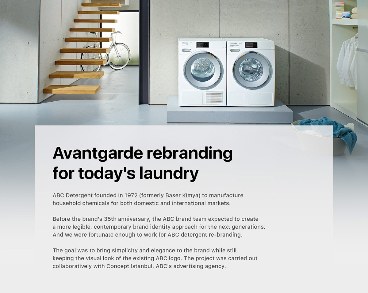
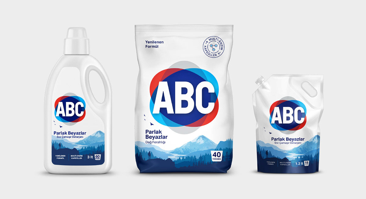
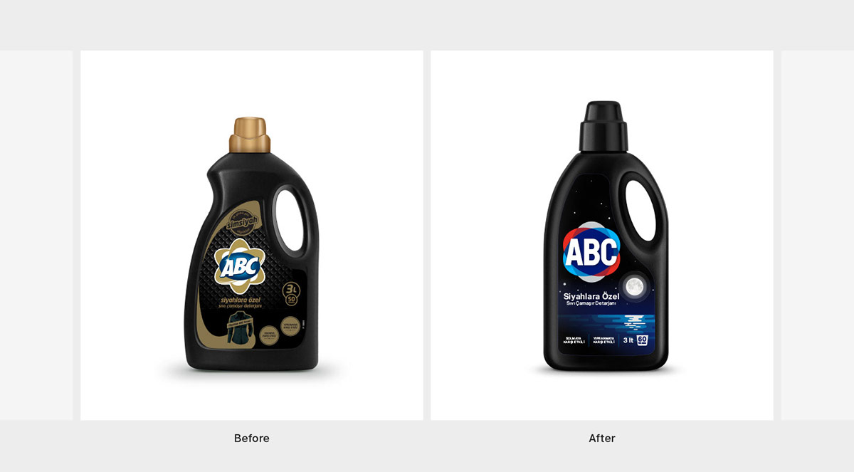
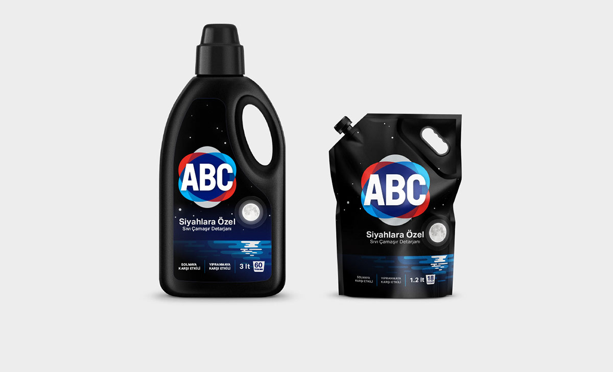
Let’s talk about the product in question here – ABC Detergent and how its rebranding was thought about and worked on! ABC Detergent was formerly known as Baser Kimya and it was founded in 1972. Household chemicals for local & international markets were sold under the name of this company. But of course, with the passage of time, rebranding a business / product becomes a need rather than a by the way sort of a thing.
You would want to get in touch with your existing and potential customers with a different approach and that’s how it was decided for ABC Detergent to depict a contemporary brand identity, it was supposed to be legible too and you will see how neatly it was done by Mehmet Gozetlik and team after collaborating with ABC’s advertising agency Concept Istanbul.
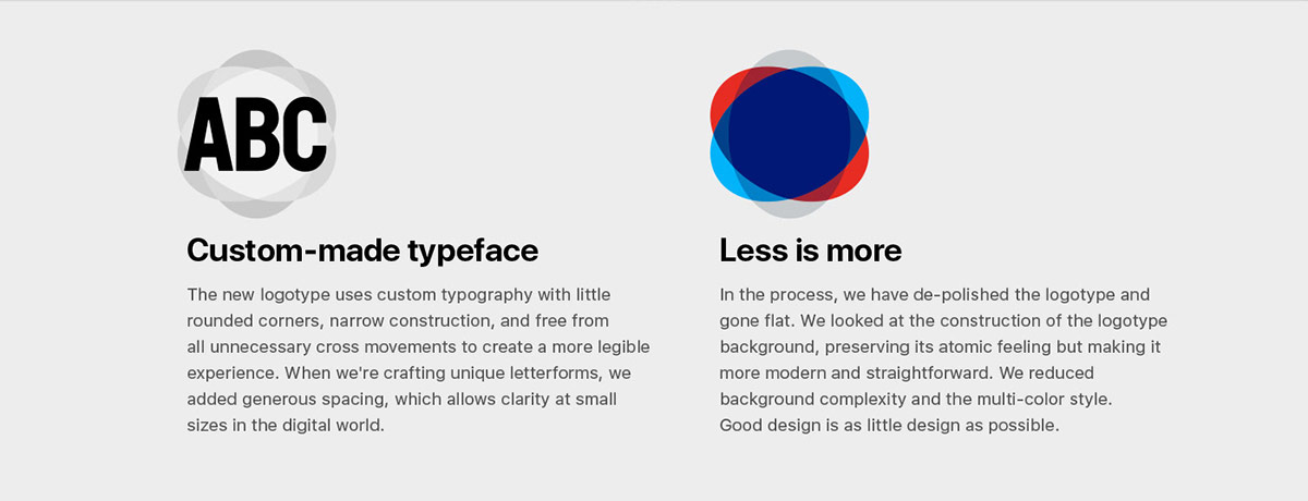
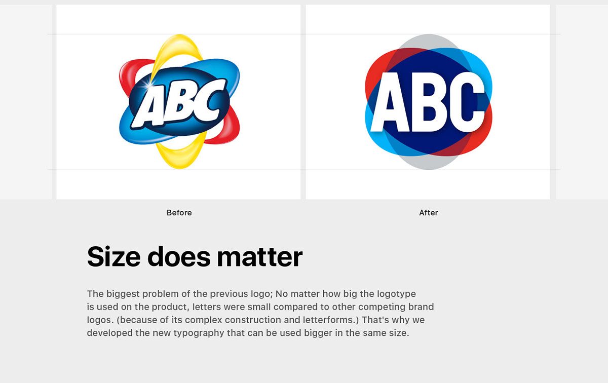
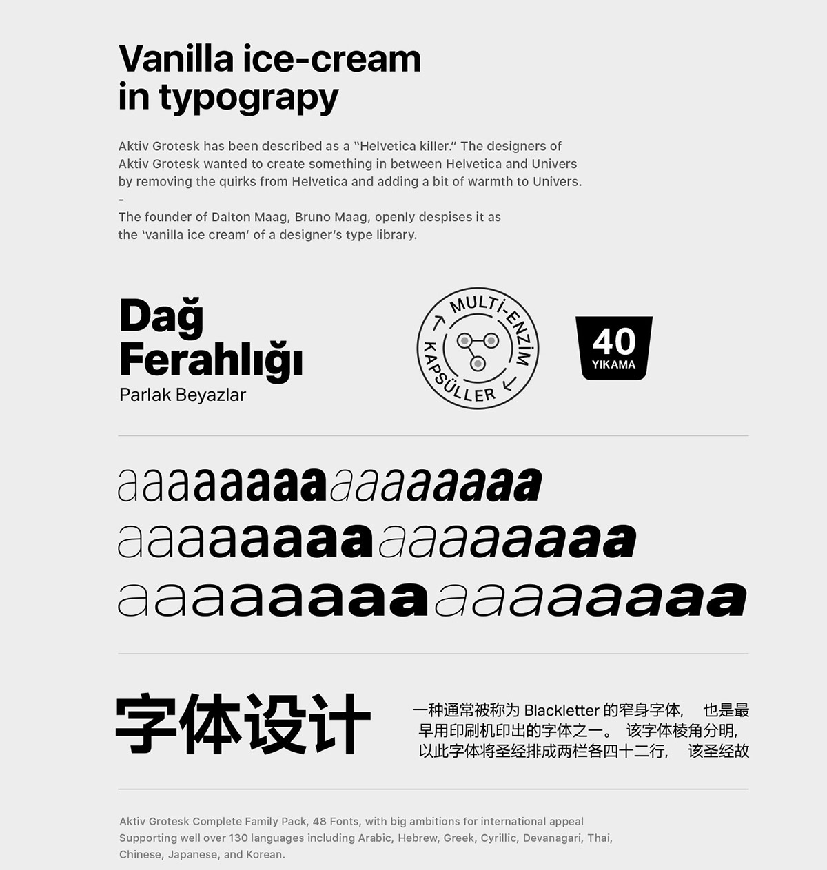
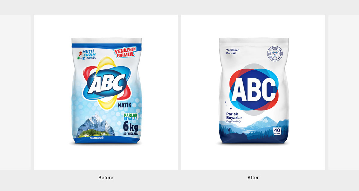
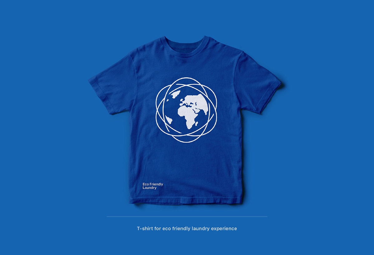
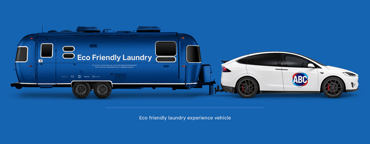
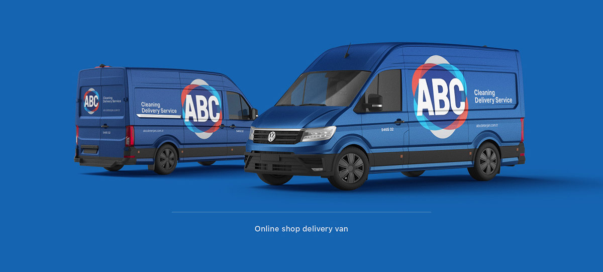
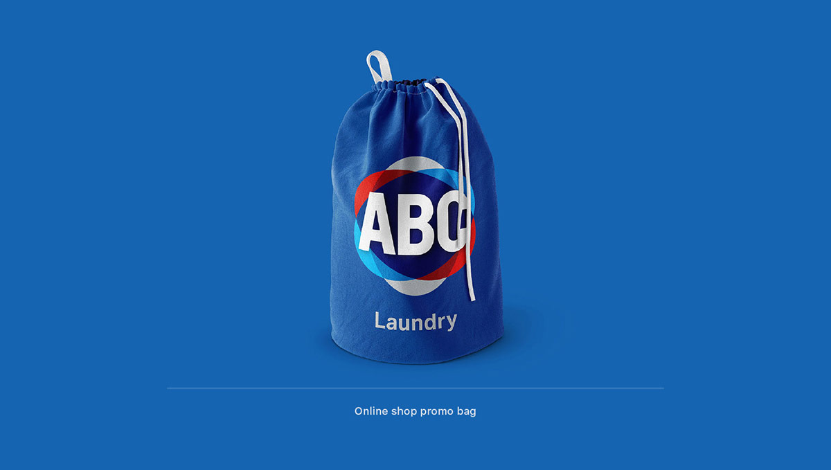
Mehmat says that the goal was to keep the visual look of the ABC’s existing logo but to bring out elegance and simplicity to that brand. A custom-made typeface was created as the first step of rebranding the brand while also following the less is more technique. The atomic look & feel is still there but it has been made flat to be more straightforward and modern.
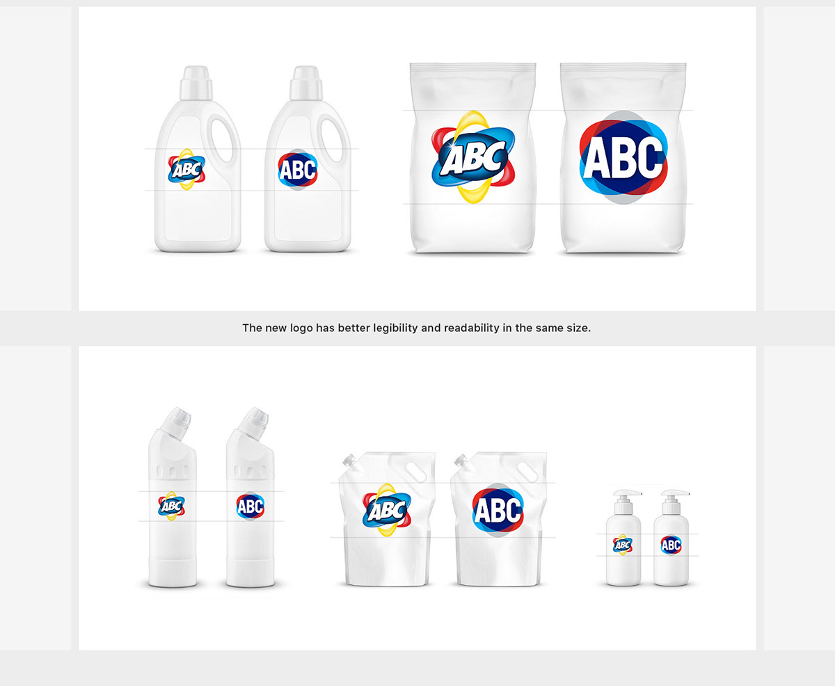
As far as the size of the logo is concerned, the rebranding team has made sure that it’s given proper attention to, by incorporating a typography that can be made bigger if need be while keeping the same size of the logo itself. This development makes the logo more readable and legible.
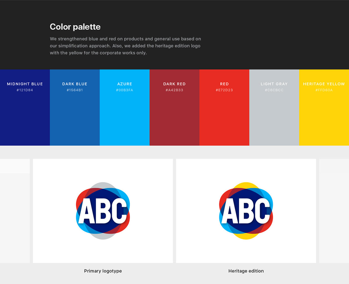
Interesting color palette has been created to use for the brand that includes; midnight blue, dark blue, azure, dark red, red, light gray and yellow which will be used for corporate related designs. During the process of rebranding new design principles were also made that will involve a flat and legible logotype, consistent typography, contemporary illustrations as well as refined colors for the brand.
To get more insights, we’d like you all to check out the entire process of how beautifully ABC Detergent was rebranded and feel free to get inspirations from it.
Credit: Mehmet Gozetlik
Beautiful ABC Detergent Rebranding Project for Inspiration
Recommended:
- Rebranding Examples of Famous Companies in the Last 100 Years
- Samsung Rebranding Concept by Aziz Firat
- Exquisite Taqiza Branding Design Inspiration Created by Abraham Lule
- Volkswagen New Brand Identity | A Perfect Example To Present Brand Design
- Brand Identity Test: Can You Guess These Famous Logo Designs?
- 20 Beautiful Business Card Design & Brand Identity Projects For Inspiration
- 10 Beautiful Corporate Identity Design & Branding Inspiration
- A Beautiful Paris 2024 Olympic Games Branding Design


