Hello there friends! We hope that you all are enjoying our blogs and are also utilizing them for your personal and professional design projects. And before we start talking about what we have worked on for you guys today, we would like to thank you all for your positive feedback and interesting suggestions. Know that we try to create everything that you request for and your support and encouraging words keep us going so keep ‘em coming!
As you guys know that creative agencies that are associated with brands and businesses for their promotional campaigns etc. are always on their toes to make things work in the best ways possible, to set trends that are worthy of following, and to always stay ahead in the game. Keeping in mind how almost every agency in the world wants their brands to make their move that is unique and interesting, we had to cover this very interesting and inspirational communication design campaign that goes by the name Artek – Conscious Consumption.
We can bet that you guys are going to love our today’s blog, but more than that you will also be able to consume a different kind of informational stuff too so, let’s us get started!
In our today’s blog, we are featuring an inspirational communication design by Kokoro & Moi. Allow us to introduce you guys with them and then we will have a look at what Conscious Consumption is. Kokoro & Moi is a creative agency located in Helsinki, Finland that claims to transform brands with bold ideas and progressive concepts. Their main focus is on building brand identities and experiences for the audiences at large.
Recommended: Exquisite Branding Design for Lawyer Vesha
We are sure that all the creative marketing agencies that exist around the globe keep the focus on building brands that will stay for longer periods of time, service providers that will make sure that the communities are benefitting from them in one or the other and that is when the organizations happen to survive too. If your focus is not on the people but to make money, then there are chances that you might not survive for more than two or three years as your audience will get tired of you and they will either want you to change / revise your strategies or they will want you to pack your bags and leave.
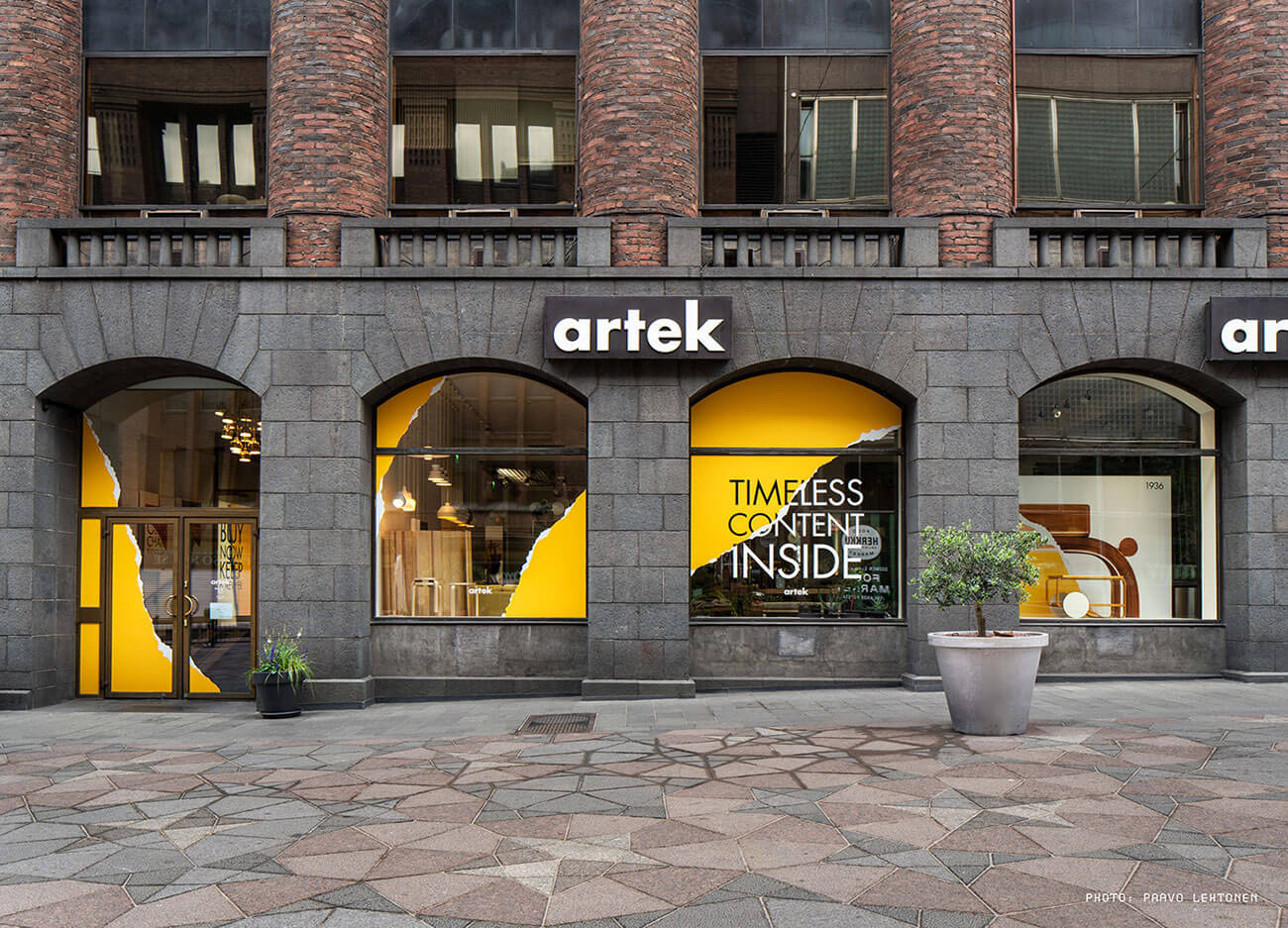
Kokoro & Moi happens to be one of those creative agencies that are striving to shape the brand strategies in such a way that they would last – like literally. This Artek – Conscious Consumption is one of the visual challenges that this agency accepted. Let us have a look at their objective and the goal(s) they tried to achieve through this. So, Artek is a Finnish furniture company that creates, manufactures and sells products & also sources materials to their customers responsibly. Their designs are so unique and quality long lasting mainly because their products are created using natural & renewable materials.
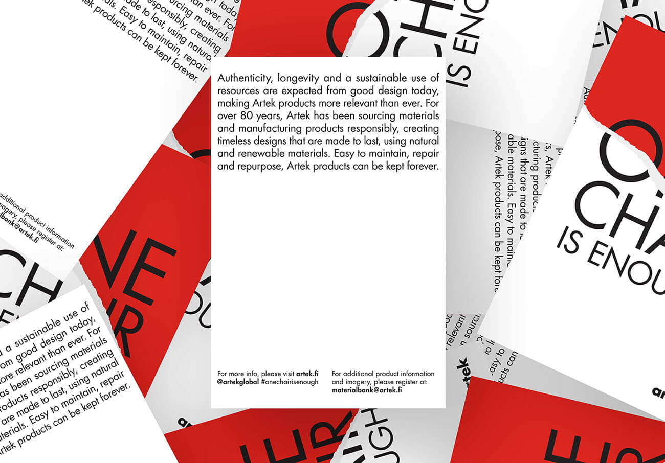
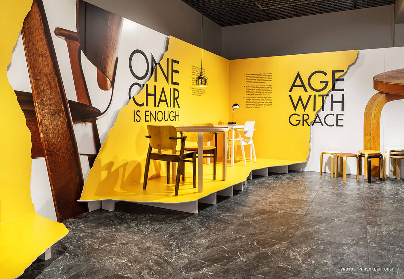
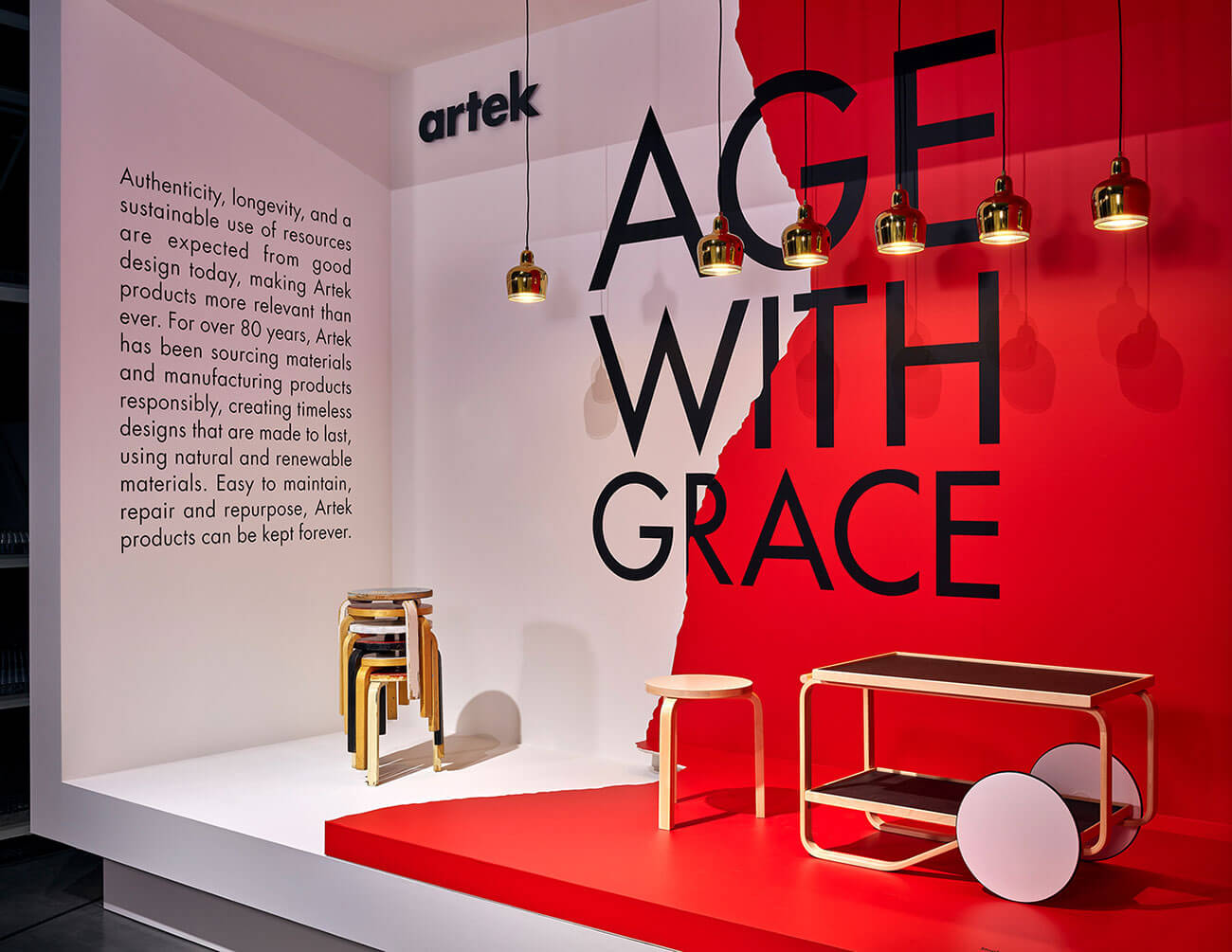
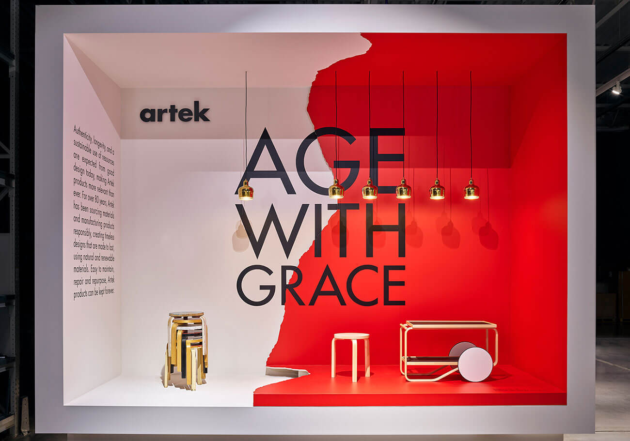
Interestingly, Artek products are of such great quality that they can be kept forever – as the company is literally in business for more than 80 years now. Authenticity, longevity and their sustainable usage of materials and resources provide more to the quality of the products. Kokoro & Moi decided to portray this sustainability of the products manufactured by Artek through this inspirational communication design by creating this visual identity for this very campaign that literally brings out the themes of conscious consumption. This campaign also portrays the story of the company Artek and how it has shaped the business over the years through their practices.
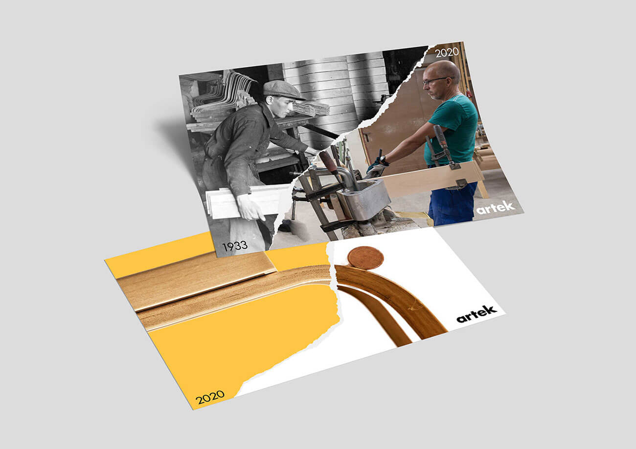
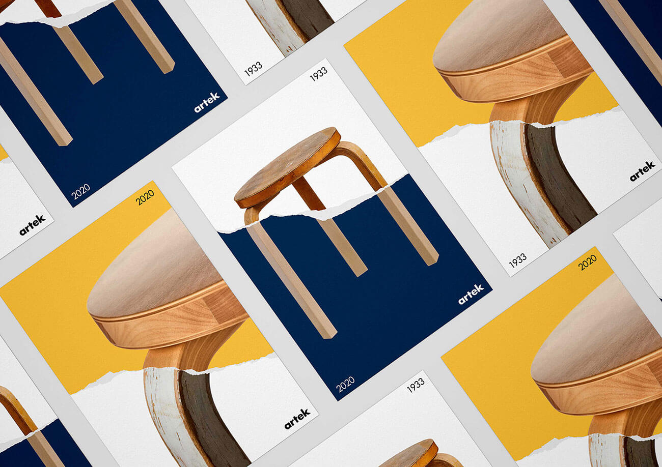
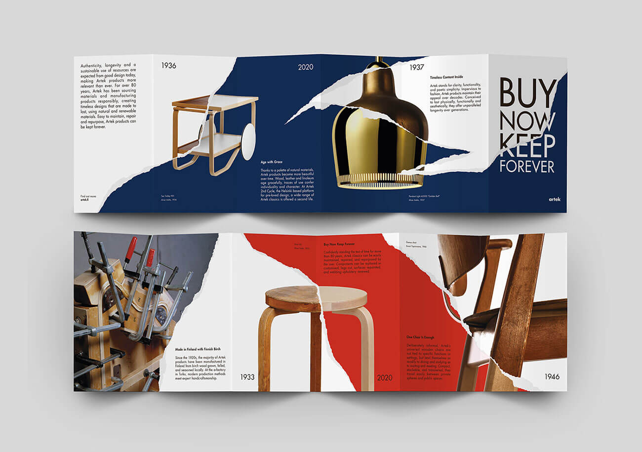
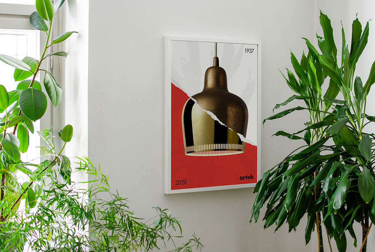
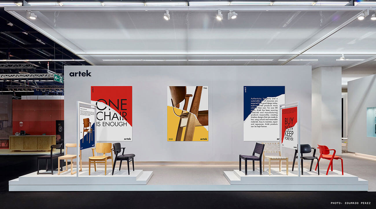
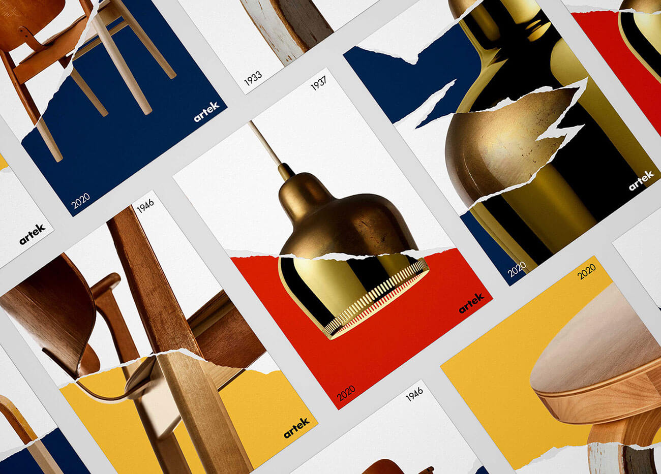
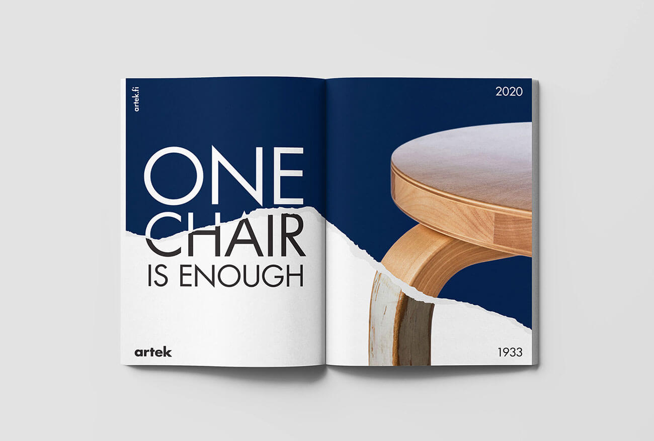
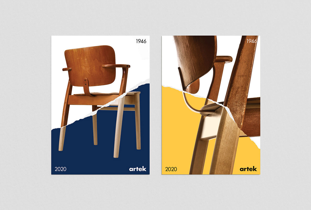
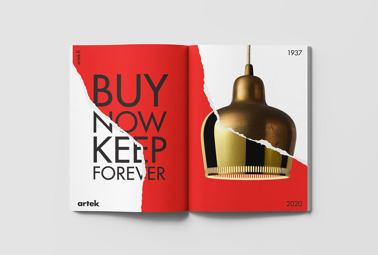
We love how Kokoro & Moi approached this inspirational communication design by picking the visual identity from the idea of timeless designs of the products that are created and manufactured by Artek. So, the visuals are representing pages that are torn into two parts in which the upper layer of the page is showcasing the newer version of the product whereas the lower layer of the page shows the older version of the product – these layers are combined in such a way that although it looks like these are two separate pages / images of the same product.
These two layers represent two different eras of the same product by conveying the message that these products are timeless, and their quality is so good, so good that they were as great to use years ago as they are now. The color palette is marvelous as it consists of three Bauhaus inspired tones of red, blue and yellow whereas, the typography Futura was used to write the slogans and texts that were provided to the agency by the client.
We suggest you to go through all the visuals that have been created by Kokoro & Moi for Artek to see how beautifully they have captured the idea if new and old products that tell the story of the products and designs that are created to last forever.
Credit: Kokoro & Moi
Artek – Conscious Consumption | An Inspirational Communication Design
Highly Recommended Articles:
- Paper Cut Illustrations | A New Trend of Communication Design by Eiko Ojala
- Word as Image | A Project by Ji Lee (Facebook Communication Designer)
- 19 Awe-Inspiring Creative Paper Cut Editorial Illustrations by Eiko Ojala
- Hanoi Landmarks | A Creative Ad Campaign on McDonald’s Fries
- Inspiring Creative Outdoor Billboard Ad Campaign To Save Water
- Beautiful ABC Detergent Rebranding Project for Inspiration
- Cool Advertising Posters | A Visual Treat for The Eyes
- Which One to Choose? Colorful or Minimalistic Packaging Design