Hey there everybody! You guys are so awesome that we have to take this moment to thank you all for your overwhelming response on our previous blogs and for also sharing them with the ones you love and work with. Also, keep all the positivity come our way as it motivates us to continue making awesome things every day. Now, let’s get straight to the point – our today’s blog is going to be all about lettering so, let’s get started!
First things first; we must talk about what lettering is and how you can incorporate it into your projects art works, and everything else to make it look aesthetically pleasing. So, lettering is an art of drawing and creating letters rather than writing them down like we usually do. This form of art allows the artist to use letters as illustrations which means that whatever letter or phrase is there, you can make it look like an illustration. All the letters that are drawn are given proper attention to as they collectively serve a purpose in the piece of writing etc.
Oh, and there are at least 7 different types of lettering and then there are some more that have not been assigned proper names or categories but let’s call them sub-lettering styles. Okay so, that ones that have been allotted names are:
- Serif
- Graffiti
- Vintage
- Sans Serif
- Cursive / Script
- Creative Lettering
- Gothic (Blackletter Calligraphy)
Allow us to share the different styles of lettering with you now one by one. The first one that we are going to cover is ‘Serif’ style of lettering. Serif style of lettering takes the form from the Sans Serif style of lettering but there are two major differences in these styles that set them apart. One is that in Serif lettering, the strokes are small yet decorative at the end of the letterforms and the other difference is that the thicknesses in the strokes differ between the letters.
Then comes the ‘Graffiti’ style; it is a free style art form that lets the artist play with letters as much as they can because there are no hard and fast rules for this style of lettering (and that’s what makes it cooler than any other writing / lettering style that exists). You can choose thick, thin, sharp or round – depending on what you require as the end result. Vintage style lettering, however, is pretty traditional and was considered as contemporary during the 19th and 20th centuries. Now, artists are asked to draw vintage style lettering art to represent something cool and hipster through vintage style lettering which makes it 10x cooler than the regular art and design techniques that are used.
Sans Serif is basically the starting point from where a lettering artist begins with their drawings of the letters etc. It is important to note here that for Sans Serif letterings, the artists must pay full attention to the thickness of their strokes as consistence is the key to it. The height and spacing between the letters must be balanced as well so, that there is harmony in whatever you have created for your art works.
On the other hand, Cursive style lettering allows you to draw or write letters in a flow – quite literally. Although, lettering and calligraphy are not same but for Cursive / Script style of lettering, some of the rules of calligraphy are also followed like the up, thin and down, thick rule but the most important rules of them all are to be consistent – with the strokes, making sure that the spacing is right and that there is balance in the piece of writing.
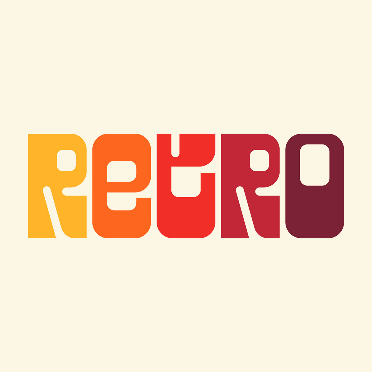
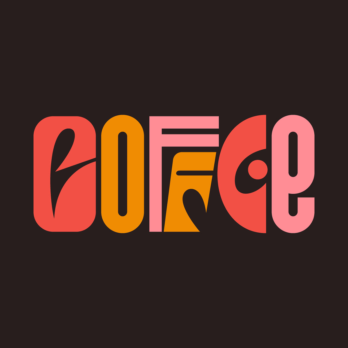
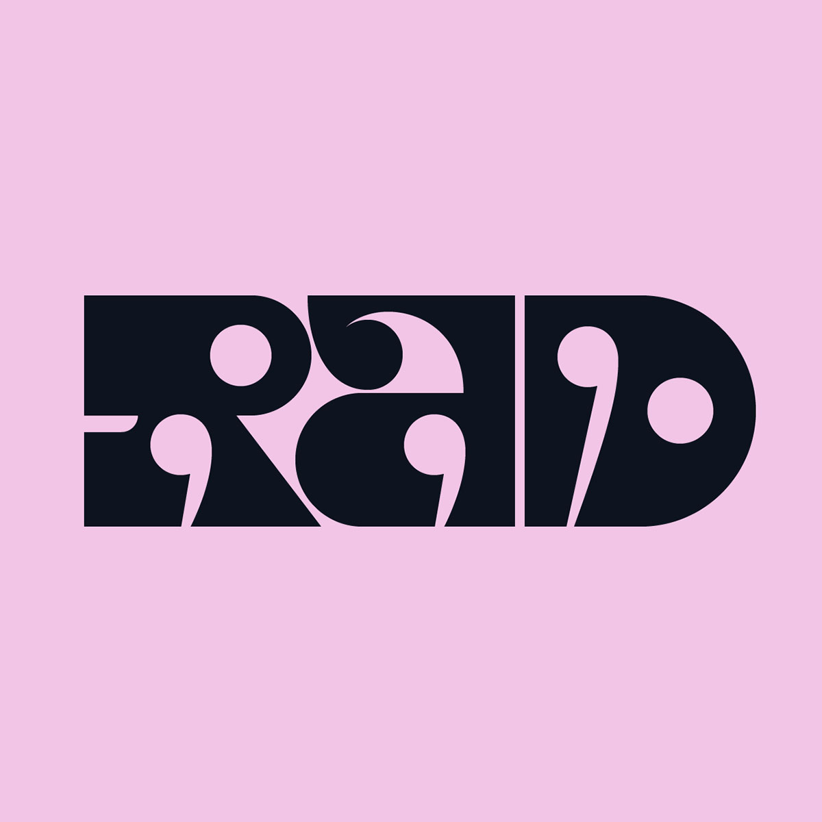
Creative lettering incorporates textures, perspective, play on words as well as illustrations and all of them make this type of lettering so cool that you will often find it hard to stop drawing or looking at the art pieces. In addition to writing letters in shapes etc., the artists add elements like shapes, illustrations, perspective and motives to bring life in the letters. And lastly, Gothic style lettering is what depicts the medieval times and is usually preferred by artists who want to create something for old and traditional concepts, ideas etc.
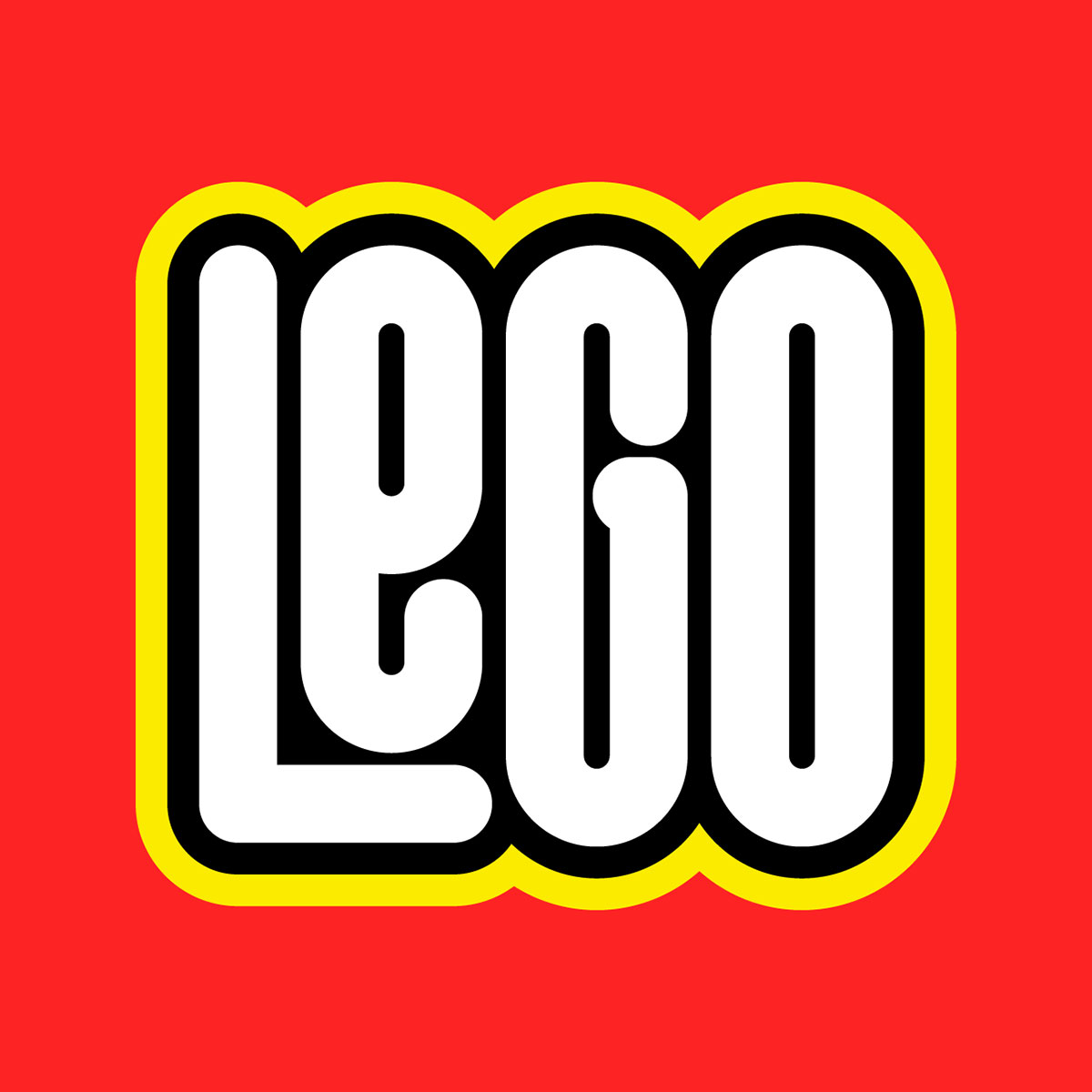
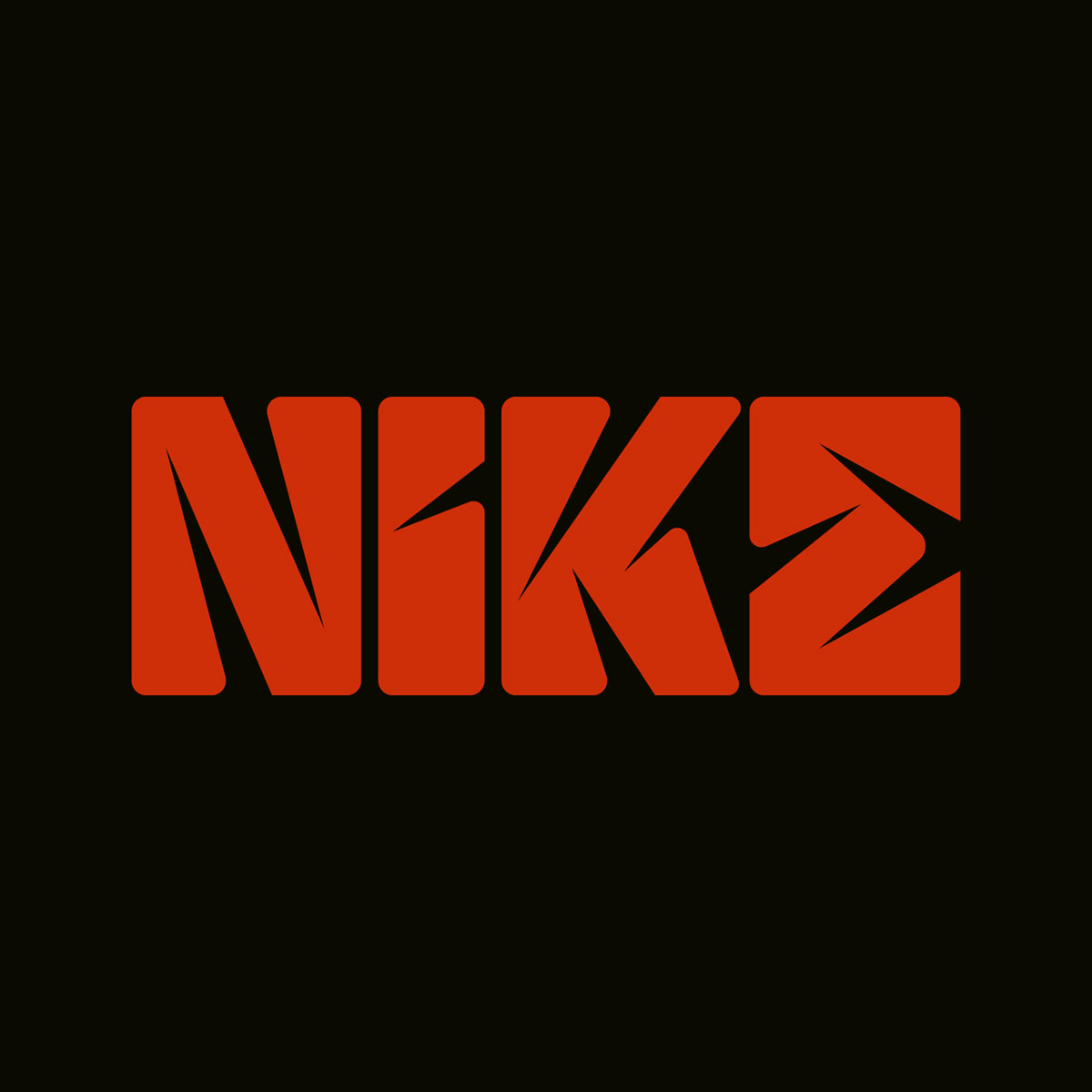
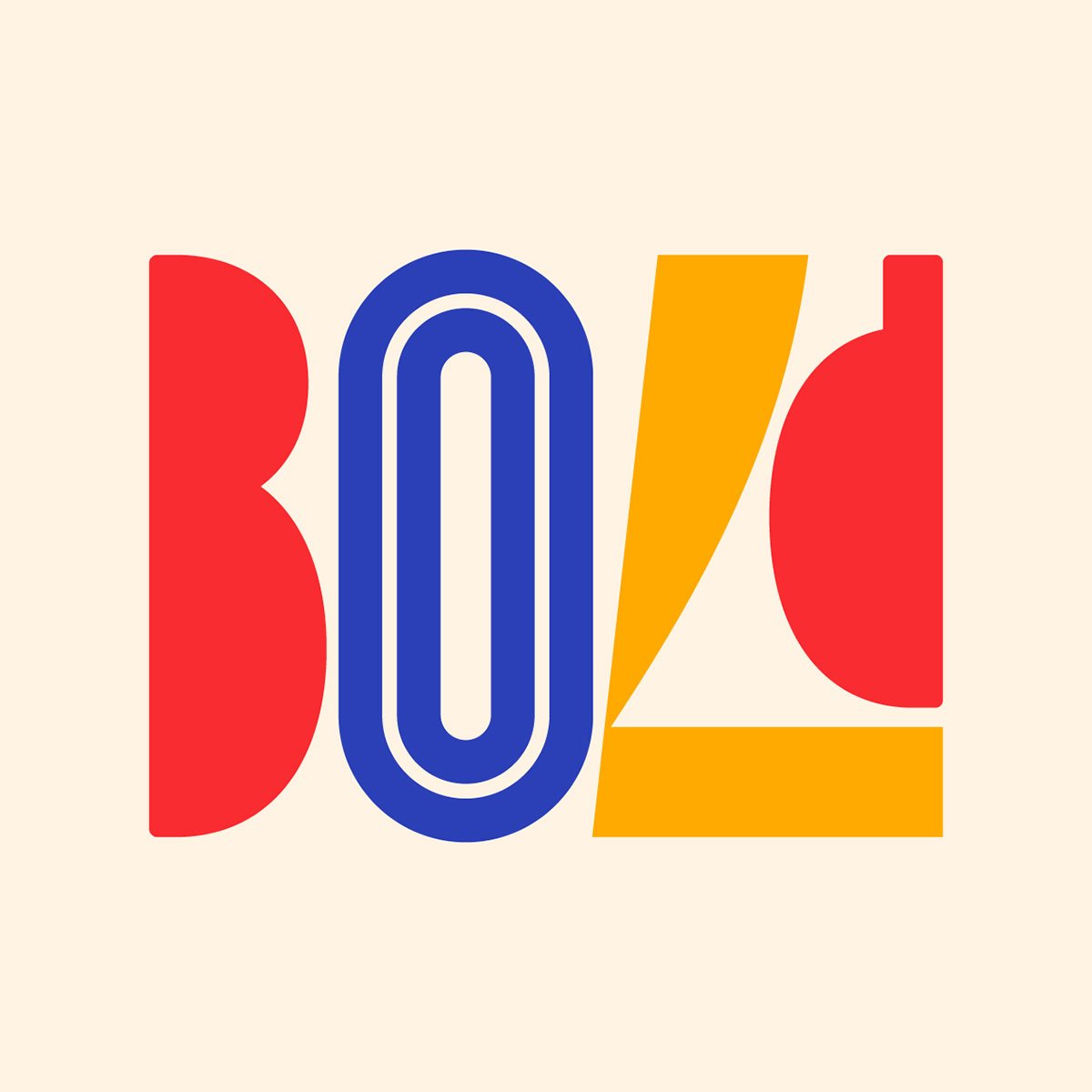
Okay now that we have talked about the types of lettering in detail, we would like you all to go through this stunning lettering series of famous brands that was being done as an experiment but it turned out to be so good that we had to feature the artist and the art too. Rafael Serra, a Portuguese type designer and lettering artist has created this beautiful lettering art of Adidas, Domino’s Pizza, Honda, Instagram, Netflix and so many more. All these art pieces are unique and strong and we love the fact that this artist came up with a really nice idea to draw something as cool as lettering this project. We can bet that you will love each and everything that you will see by the end of this blog and if you do, do share it with your friends and colleagues as well.
Credit: Rafael Serra
Experimental Bold Logo Series of Famous Brands Turned Amazing
Some More Experiments:
Recommended:
- 50+ Cartoonish Logo Design Ideas for Professionals
- Some Cool Vintage Logo Designs for Inspiration
- Inspiring Vintage Badge Logos from 2000 – 2020
- 25+ Modern Animal Logo Design Ideas 2021
- Sketch To Logo Process | 20 Cool Logo Designs For Inspiration
- Line Art Animal Logos 2020 by Mohamed ELdeeb
- World’s Famous Brands Logo Fonts With Free & Premium Download Links
- 9 Worst Logos Ever Redesigned By Emanuele Abrate
- Creative Word Marks For Inspiration by Daniel Bodea


