Hey there everybody! We are back with yet another lettering and behance typography special blog for you guys and we are sure that you will love it as much as we do but before we start talking about we are about to share; we would like to thank you for your overwhelming response on our previous blogs and for also sharing them within your personal and professional circles. It feels so good to know that we have such good readers here on our blog. Also, keep sharing your feedback & suggestions with us in the future too!
We are assuming that most of you would know what is meant by lettering and typography but for those of you who don’t know about these two terms in detail, we would love to share with you guys that lettering happens to be the art of drawing letters so that it can resonate with the message that is supposed to be delivered through the written text whereas; typography is basically the style of arranging letters to make them readable and appealing.
Both lettering and typography look great wherever they are placed, both have their own significance and bring the best to the viewers but of course; you have to know when to use lettering and when to use typography to make more sense of your content. For example; lettering looks amazing for posters and invitation cards whereas, typography looks neat for logos and we practically love the approach when it comes to branding designs.
Okay so, since we have shared briefly what lettering and typography are, it is time to move forward with the best and effective techniques that are there to satisfy your creativity and objectives of designs as well. In order to see what is working for your business and what’s not, you first have to do something, you need to put forward an idea or a concept so that you can evaluate if what you did can work for you or if it should be tweaked a little to make it work for you.
Recommended: 30 Creative Examples of Food Lettering & Typography by Danielle Evans
We can bet that you must have worked with people who get discouraged way before going live or experimenting with something new and then they ask you about the solution because somehow, they have stopped making money. If you are their agency and have the freedom to share what you feel, you must always raise your concerns so that your clients can rethink and can also give you a go-ahead to at least see how a certain campaign would work. Maybe not even a campaign, you can literally experiment with a static creative post to see how it is working. That is the liberty digital and social media have that they allow you to accept challenges and work on them too.
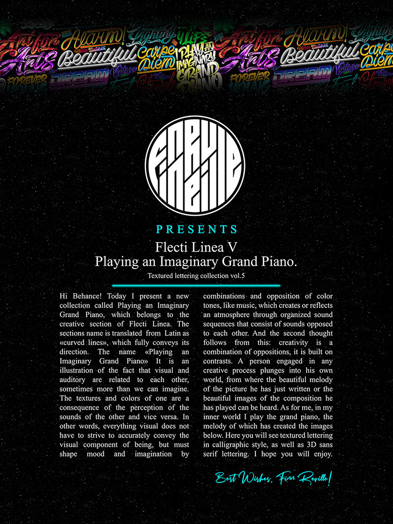
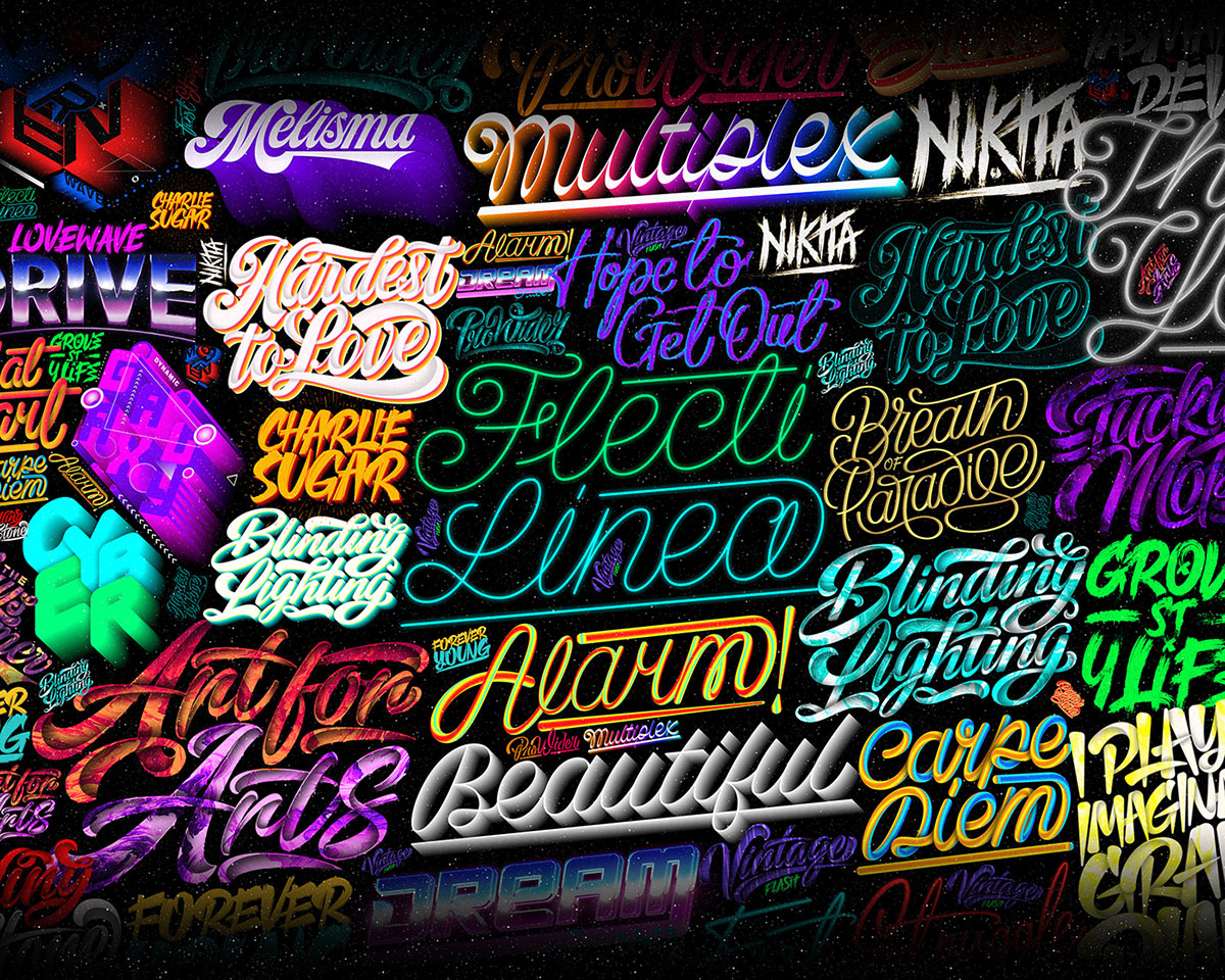
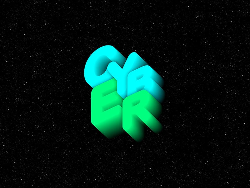
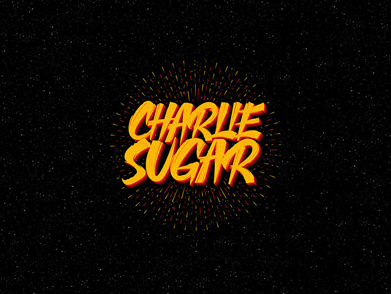
We are not sure how frequently you guys check out latest updates in the tech and design industry, but we want you to know that great things happen on a daily basis and this blog of ours is a solid representation of that. Want to know how? Keep reading to know about Finn Reville and his works. Finn is a Russian letterer and typography artist who beautifully creates lettering and typography for his clients. He also shares his work with the world to inspire them because that is how it should be; you know something, you share it with others so that they can learn from you and then create something even better. And no, that does not count as copying someone else’s work or techniques, that is literally taking inspiration from someone who is creative and generous enough to share their secrets and tips with you.
Recommended: 9 Rules of Success | Inspirational Typography by Gosha Bondarev
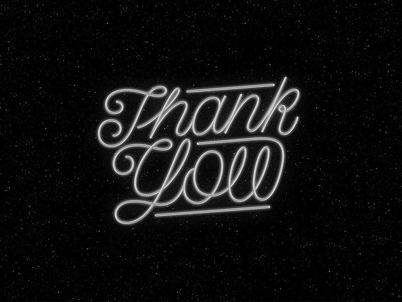
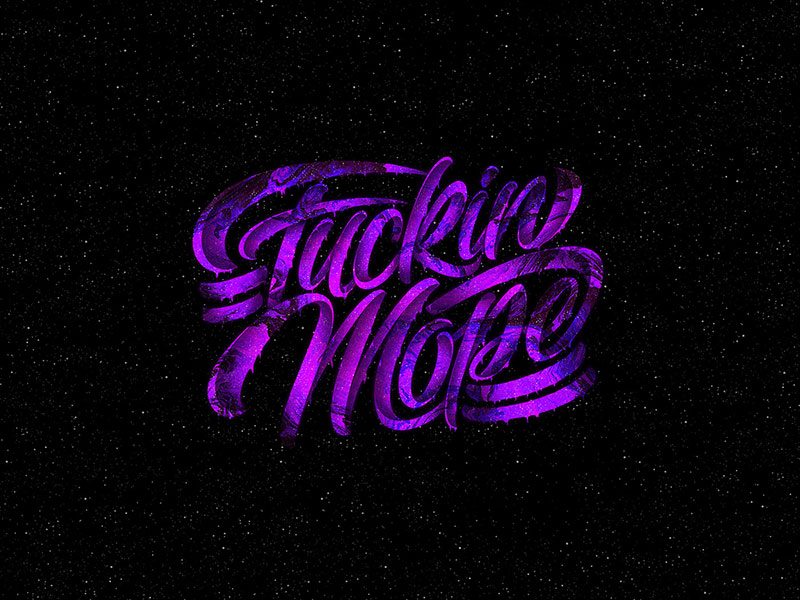
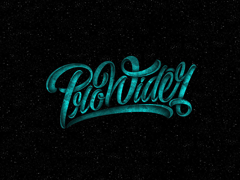
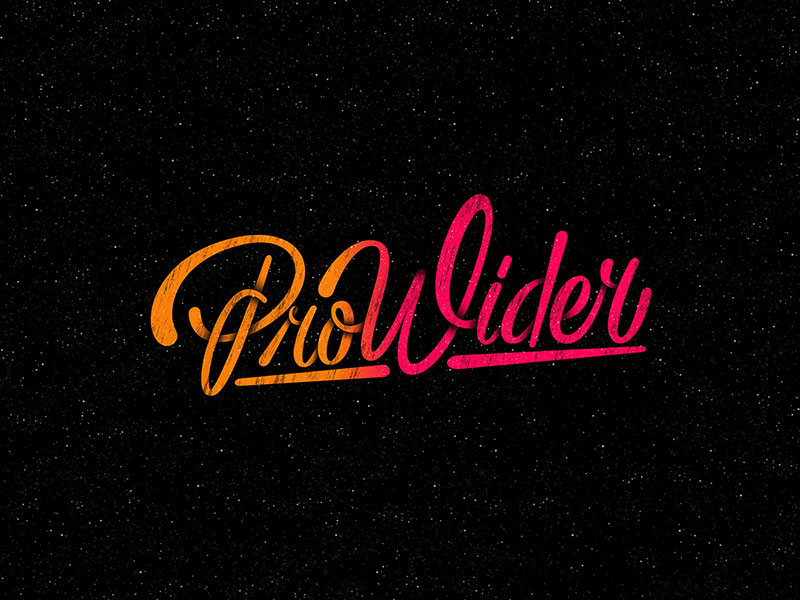
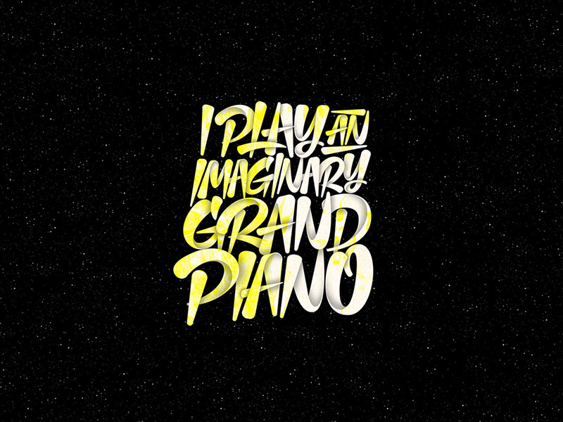
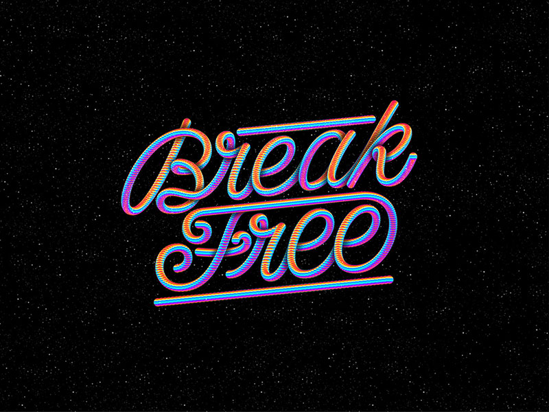
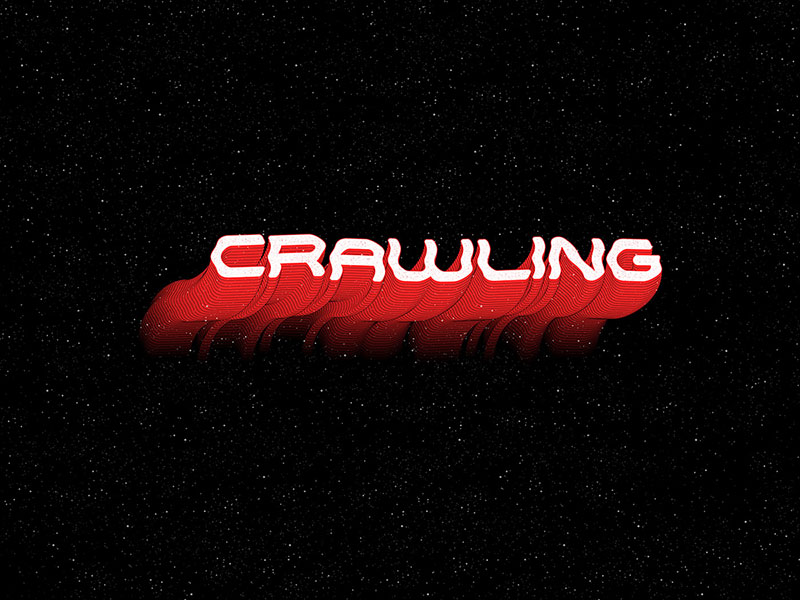
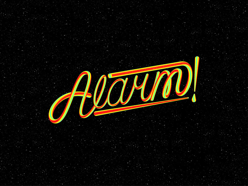
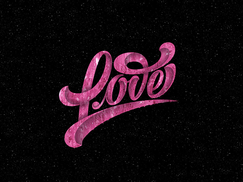
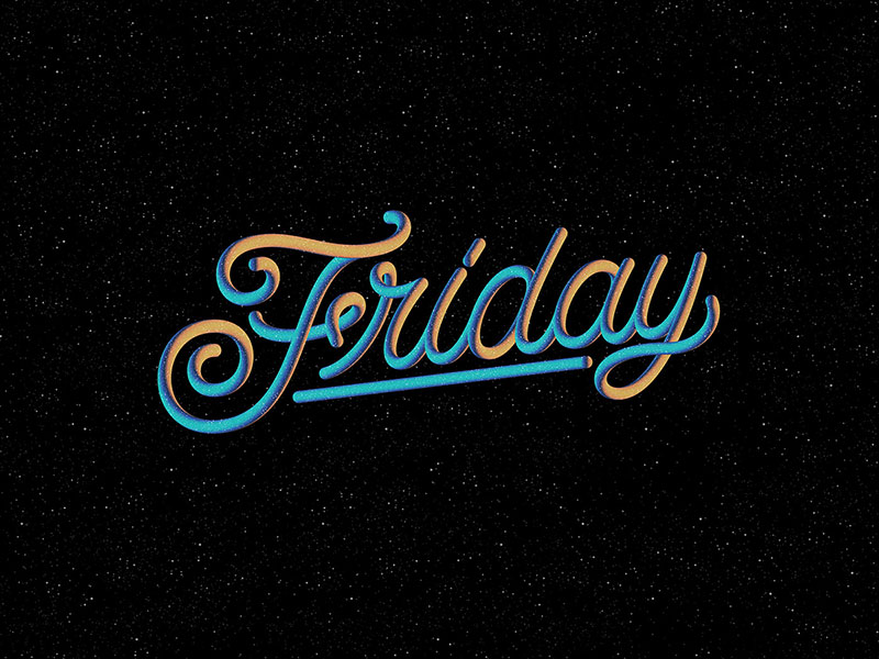
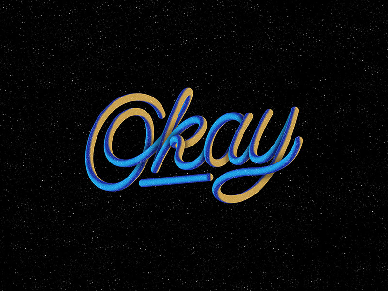
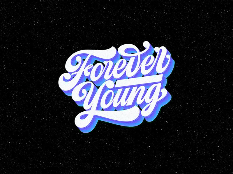
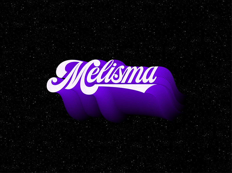
So, the project that we are about to share was created by Finn that revolves around the idea of ‘Playing an Imaginary Grand Piano’. The mini yet detailed artworks depict the fact that visuals and sound go hand in hand or maybe more than that too. What we mean to say is that Finn has successfully created art that complements the sound while also being visually compelling and that’s the beauty of it. So, while there is harmony between the words that are there and the sound (music, nature and more) there is also a contrast of everything else as well. Always remember that creativity is a product of contrast – it is a combination of opposites and when you can figure out how to depict it through art, you should know that you have unlocked the main secret of creating art or anything else for that matter.
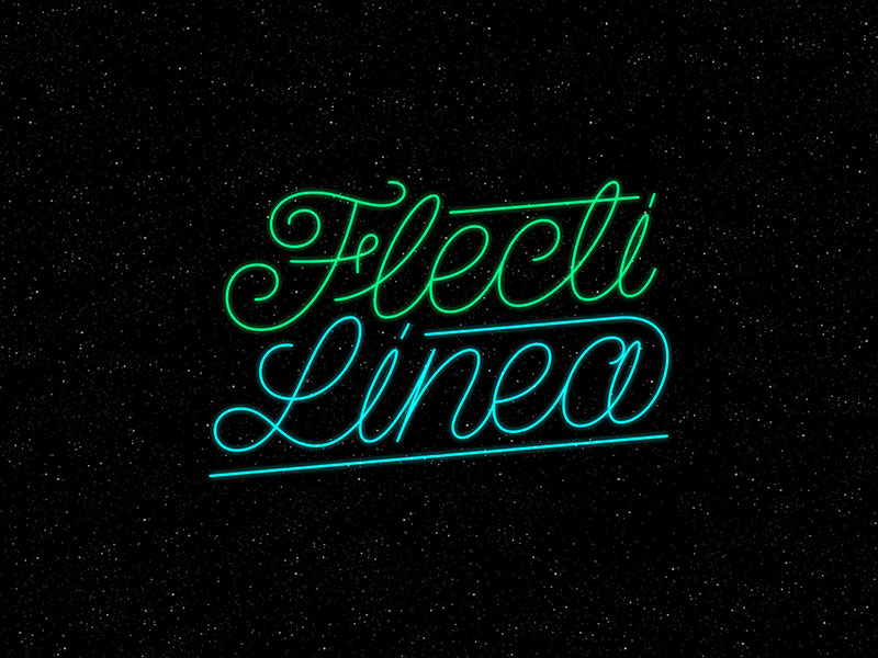
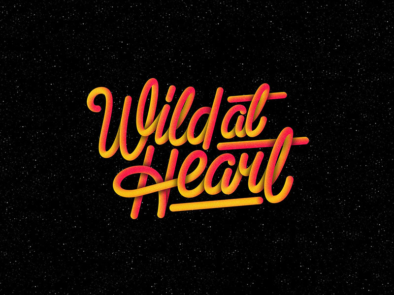
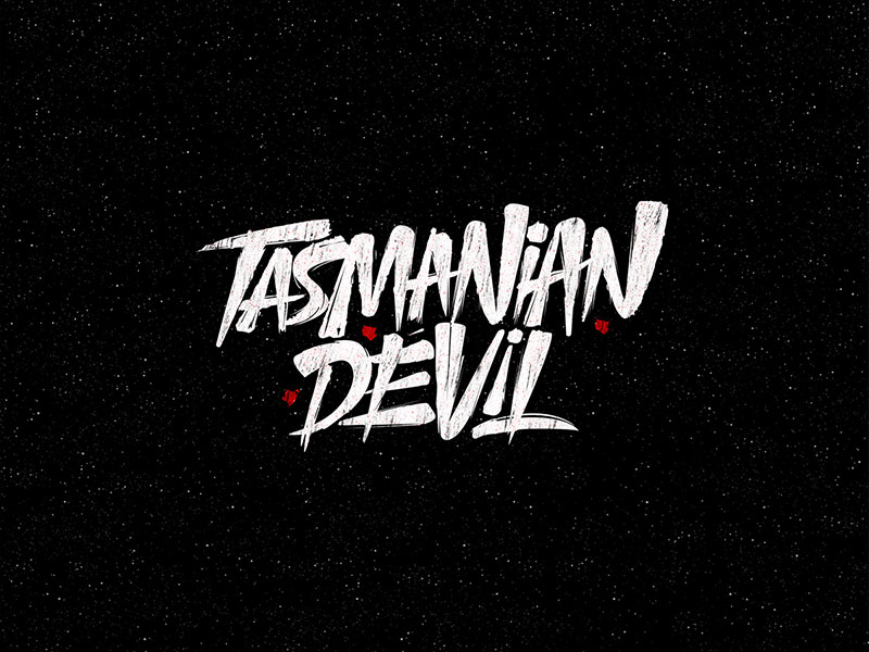
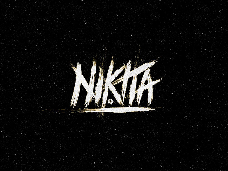
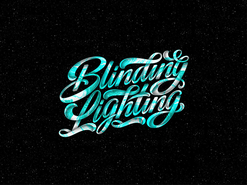
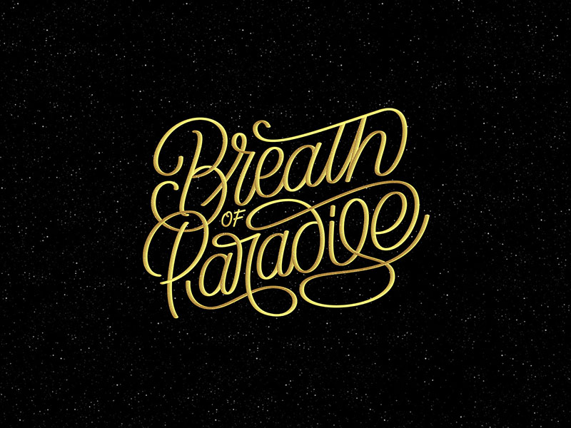
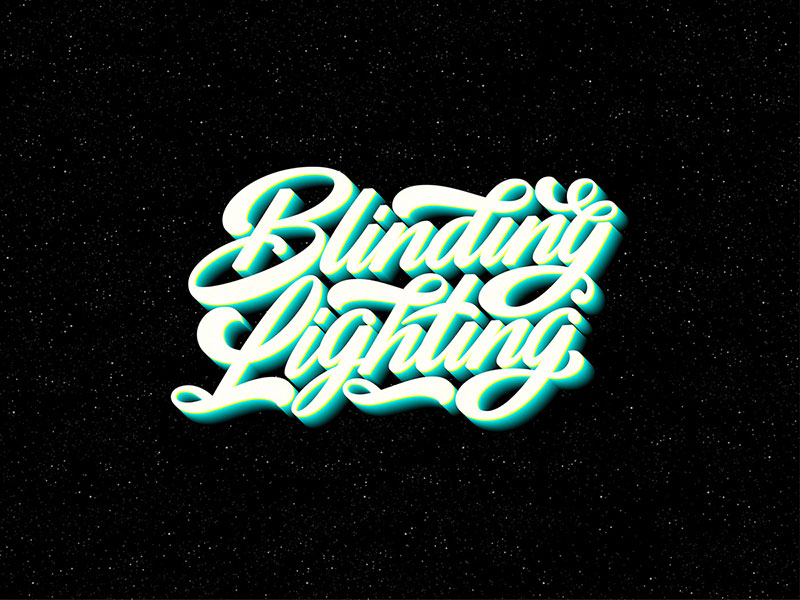
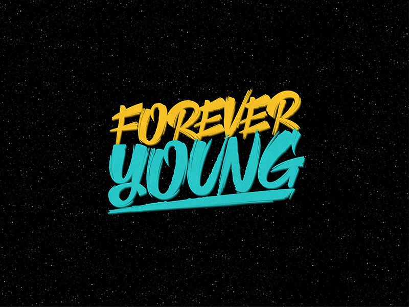
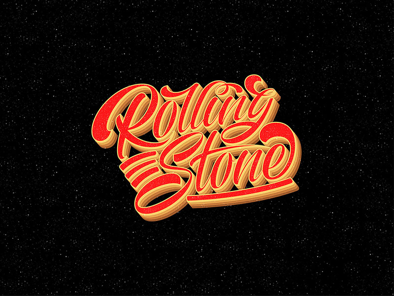
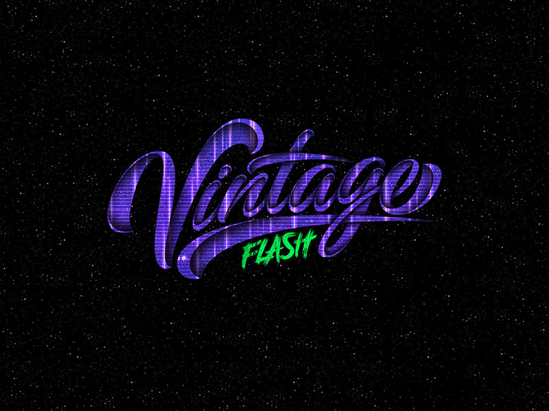
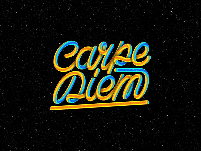
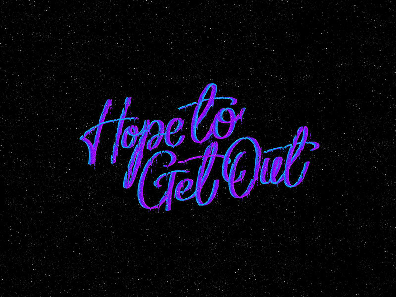
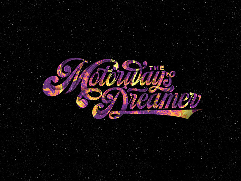
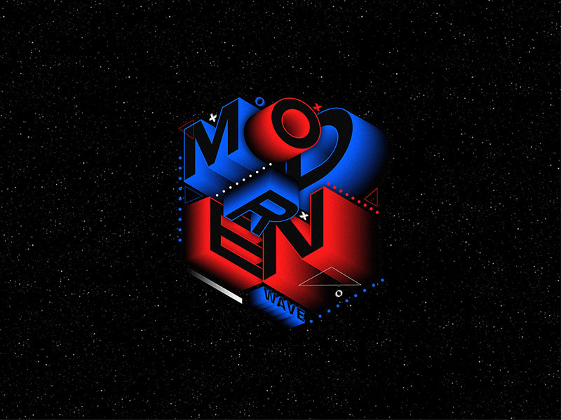
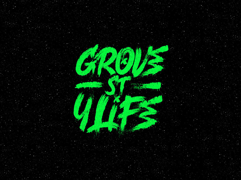
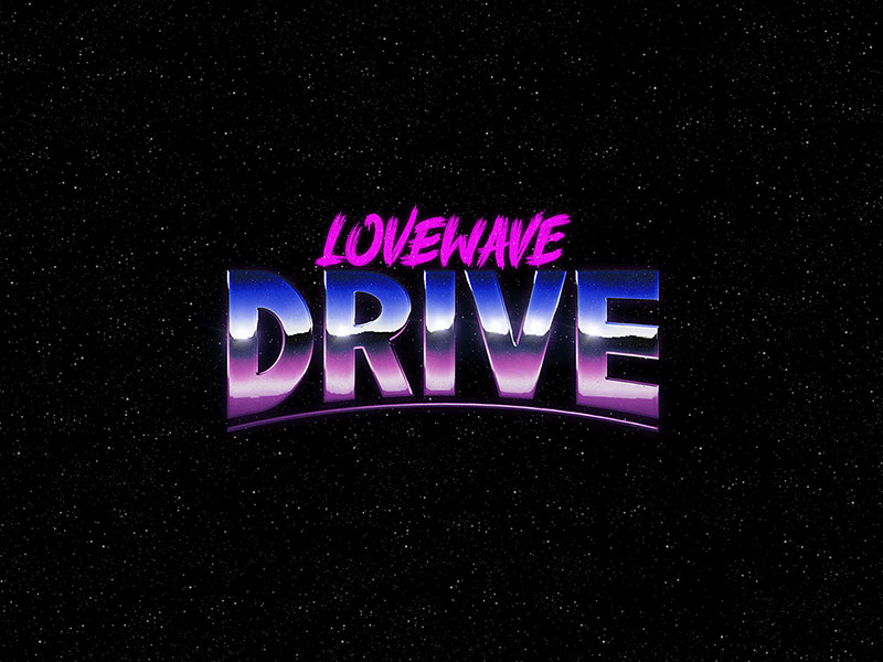
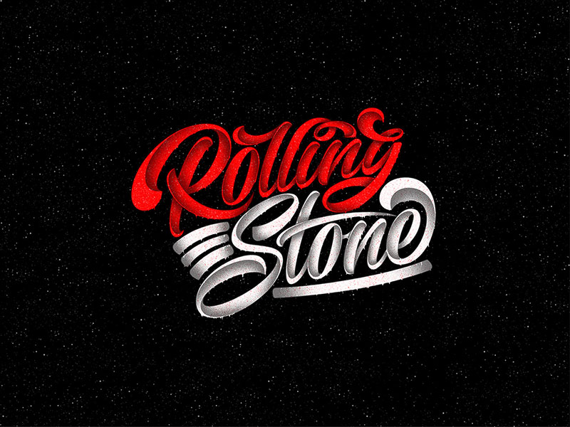
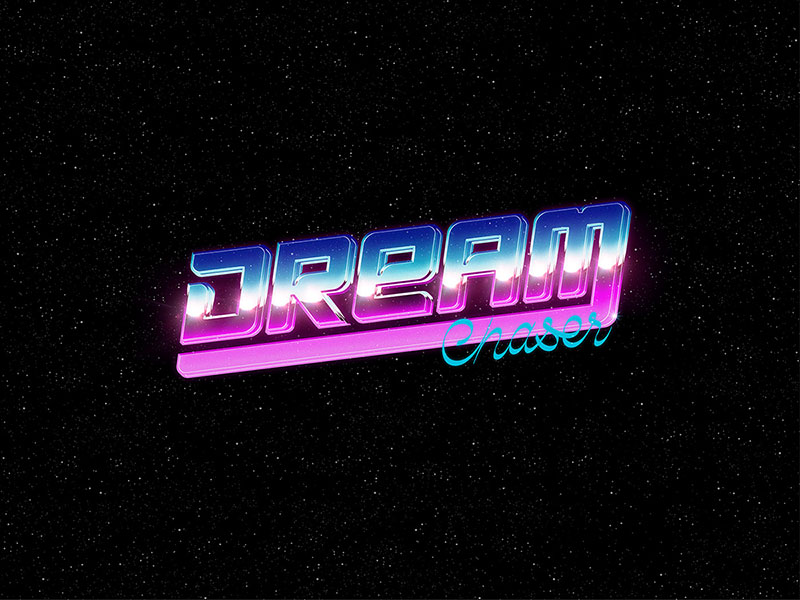
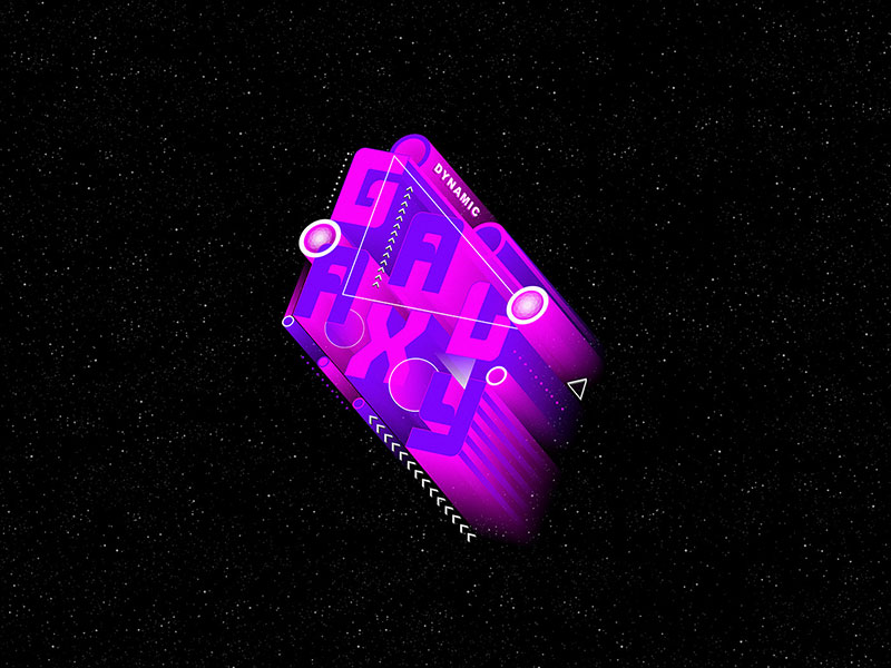
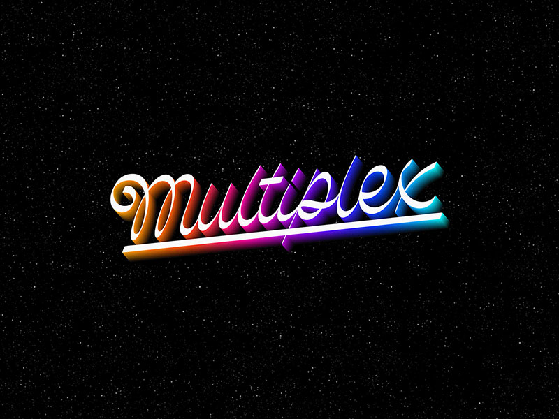
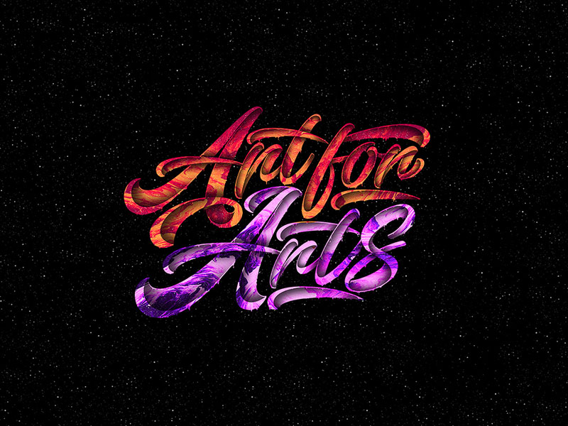
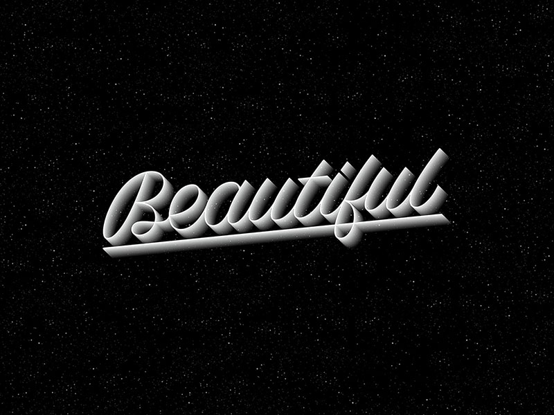
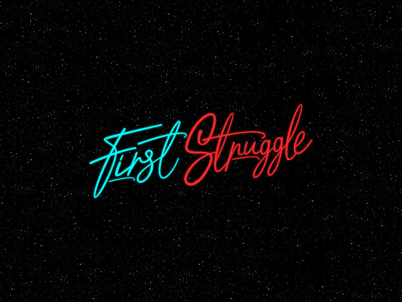
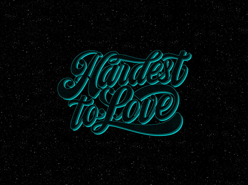
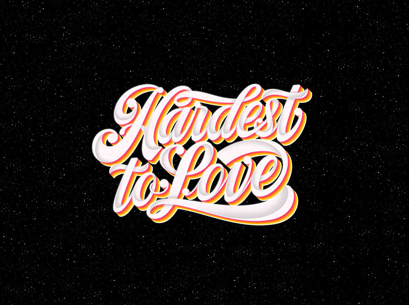
When you will go through today’s Best of Behance | Lettering and Typography Inspiration by Finn Reville, you will see that the designed words are the most basic words that you come across daily but the way those have been drawn and illustrated and then placed is what you will appreciate the most.
That’s all for today! We hope that you will have a nice time reading this blog and we will look forward to read your feedback in the comments section.
Credit: Finn Reville
Best of Behance | Lettering and Typography Inspiration
Recommended:
- 120 Cool Hand Lettering Typography Posters by Risa Rodil
- 25+ Breathtaking 3D Typography For Inspiration
- 45+ Awesome Lettering & Typography Designs for Inspiration
- An Eye Candy Lettering / Typography Design by Jonathan Ortiz
- 50+ Creative Inspirational Hand Lettering / Typography by Stefen Kunz
- 40+ Beautiful Lettering Calligraphy Styles For Inspiration By Novia Jonathan
- A Feast For The Eyes | Remarkable Typography Design by Mark Caneso
- 50+ Inspirational Words With Brush Typography Design by Luis Lili
- Creative Typography & Lettering by Ana Mondragon
- 50 Beautiful Wisdom & Inspirational Typography Quotes by C-J Amaya