Every brand needs to have a logo. They are essential to make a company memorable and introduce it to the public. Not to forget that a logo needs to be a visual representation of its values. Having a striking and well-designed logo makes a brand stand out immediately. Thus, a lot of work needs to go into the whole design process.
With that said, famous brands are not immune to horrible logo design mistakes. Redesigning a brand’s identity can be tricky. Ideas that seem excellent in the workroom might not be as impressive when the public sees them. So, what should you do to create an unforgettable logo? And what can you learn from the design failures of the biggest brands out there? Let’s find out!
Finding Ideas for a Great Logo Design
A good logo is eyecatching and thrilling. It is one of the essential elements of a brand. So, it is not something you should ignore or rush. It takes time, creativity, and a lot of trial runs to get the logo right. Thus, you need to be knowledgeable about the ins and outs of brand design. And have the skills to make a logo pop out.
A good design team can create a sensational logo if you give them enough time. Social media can be super inspiring, so browse around and get to know the brands, big or small. Remember to use a VPN software while scrolling through social media or using online design tools like Figma. After all, you don’t want your brand new idea to leak or for cybercriminals to get their hands on your client’s information. Connect to the VPN app whenever you are online to ensure your security is at the highest level.
Coming up with an original idea is the key to a good logo design. In contrast, copying someone else’s work is very wrong. It can be unintentional since you can’t be familiar with all the logo designs in the world. But, avoid creating a logo that is like your competitors.
The latest trends can be a source of logo ideas, but make sure you remain original. Your goal should be to create a logo that will look fresh even after a decade or more. Unfortunately, design fads last for a short time. Therefore, your trendy logo might look outdated soon.
Using the right color combination can be inspiring as they can tell the public more about your brand. Bright shades are generally not recommended. Instead, go for colors that are pleasing to the eyes. You have probably noticed that some of the major brands often use blue in their logos. Facebook blue is recognizable everywhere, but the reason behind this color choice is Mark Zuckerberg’s color blindness. That blue shade is soothing and comfortable, so we shouldn’t underplay the power of colors.
Famous Logo Design Mistakes
1. Reebok
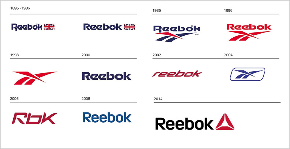
Reebok had one of the most disappointing logo changes in the last decade. Their classic logo from the 1990s was iconic, so Reebok fans were shocked when the brand unveiled their “delta” logo in 2011. The rebranding happened right after Adidas bought the company. Reebok then shifted to a whole new audience that includes CrossFit enthusiasts.
The old logo, as well as the brand, were almost forgotten. That is until the reemergence of the 1990s trends. Luckily, the design team in Reebok saw this as an opportunity to put the brand on the map. They decided to bring back the legendary logo but change it a little bit. Honestly, these tweaks are almost invisible. But Reebok fans are ecstatic that the company is not doing CrossFit gear only.
2. Starbucks
Starbucks logo is famous around the world. The enigmatic siren is a synonym for good coffee and tea. But Starbucks had no idea how much outrage their retro logo would cause when they launched a line of vintage coffee cups.
The original logo design features a naked siren. So, when the vintage coffee cups appeared in 2008, the company got thousands of complaints from Christian groups who weren’t very happy about the logo. Starbucks pulled the campaign right away, and they haven’t used that logo since.
3. Instagram
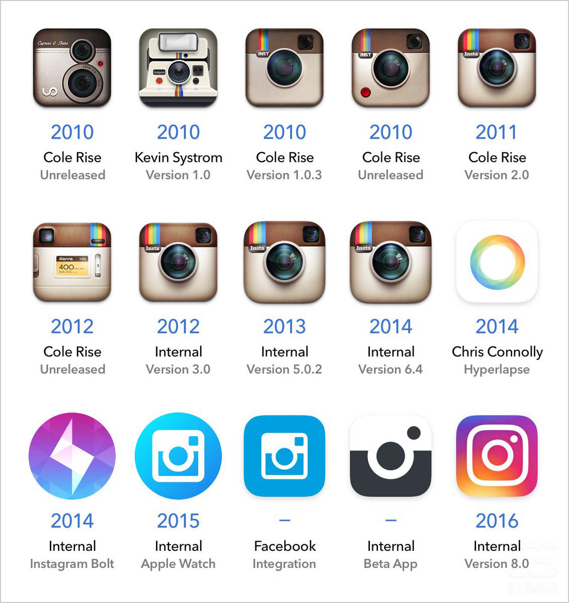
Instagram’s instant camera logo was a masterpiece. It made the social media app stand out right away. Many photo editing apps have tried to copy Instagram’s logo idea, but they weren’t as successful. Users were shocked when the company unveiled the new logo in 2016. Seeing the ombre square with an outline of a camera on their home screens seemed unnatural.
It was an enormous step for Instagram, but the logo didn’t have the support right away. While most users have warmed up to the design by now, Instagram did acknowledge that not everyone is a fan. So, they included the option to change the icon to their old instant camera logo.
4. NASA
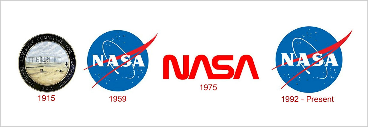
When you think of NASA, the first thing that comes to your mind is probably their “meatball” logo. It is an accurate representation of everything that NASA stands for. There is another lesser-known NASA logo, nicknamed “worm.” NASA used it from 1975 to 1992.
The “worm” logo was supposed to be more modern, as NASA tried to rebrand itself for the future. However, the critics pointed out all the design flaws in the new logo, including simplicity and absolutely no individuality. Luckily, NASA decided to return to the beloved “meatball” logo.
5. Gap
Gap is a retail brand that rose to prominence in the 1990s. Their famous logo was pretty much everywhere. The company thrived thanks to its loyal customers who recognized the quality Gap provided. So, everyone was a bit confused when they changed their logo in 2010.
The new logo was too simple and almost generic. The public complained for a good reason because it just wasn’t Gap. The retail brand did hear the criticism and brought back the old logo only six days after introducing the new one.
6. Verizon
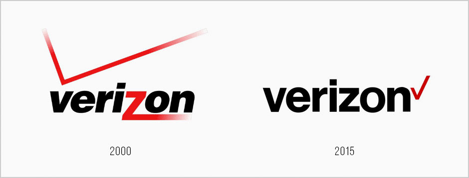
Even though Verizon’s classic logo wasn’t gripping or innovative, it somehow worked for this telecommunications firm. It had a large Z that was pretty memorable. After being bought out by AOL in 2015, Verizon decided it was time for a change.
The new logo is just too simple, without the large Z that was very eyecatching. Instead, we have a Helvetica font with a red tick at the end. The clean design might have ushered a new era into the company, but the new logo is uninspiring.
7. Pepsi
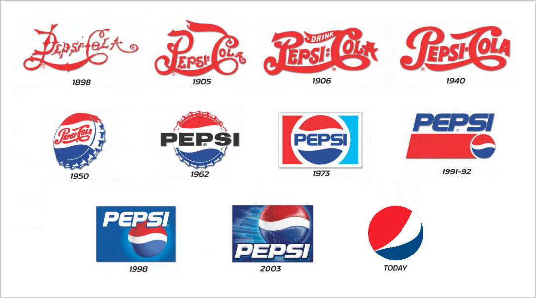
Pepsi is one of those brands that love to change their logos every couple of years or decades. After all, the company has been around for more than a century. So when a brand new logo was introduced in 2008, an artist named Lawrence Yang went viral because he added some details.
Yang’s drawing was a mockery since it showed the terrifying effects of drinking soda. Pepsi didn’t comment on the artwork and stuck to their design. They even updated the logo in 2014 by removing the outline around it.
8. Asics
Asics is a famous sportswear brand from Japan. Unfortunately, the brand hasn’t done a lot with its logo since the 1970s. There were a couple of minor changes, but the font always stayed the same. It does look very retro now in the 2020s.
But, the biggest problem with the Asics logo is the spiral before the letters. It is a bit confusing, so some people might think that the brand is called Oasics. This graphic element doesn’t do anything for the overall brand identity, so it is almost useless.
9. Warner Bros
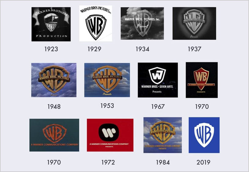
Warner Bros has always followed the same formula when it comes to logos – they need to have a shield with the company’s initials. Unfortunately, the latest redesign fell flat.
The company is relying on nostalgia by using elements from their old logos. But the final version looks too simple and completely forgettable. Warner Bros should try to add something new to the logo because it is not exciting anymore.
10. Marriott Hotels
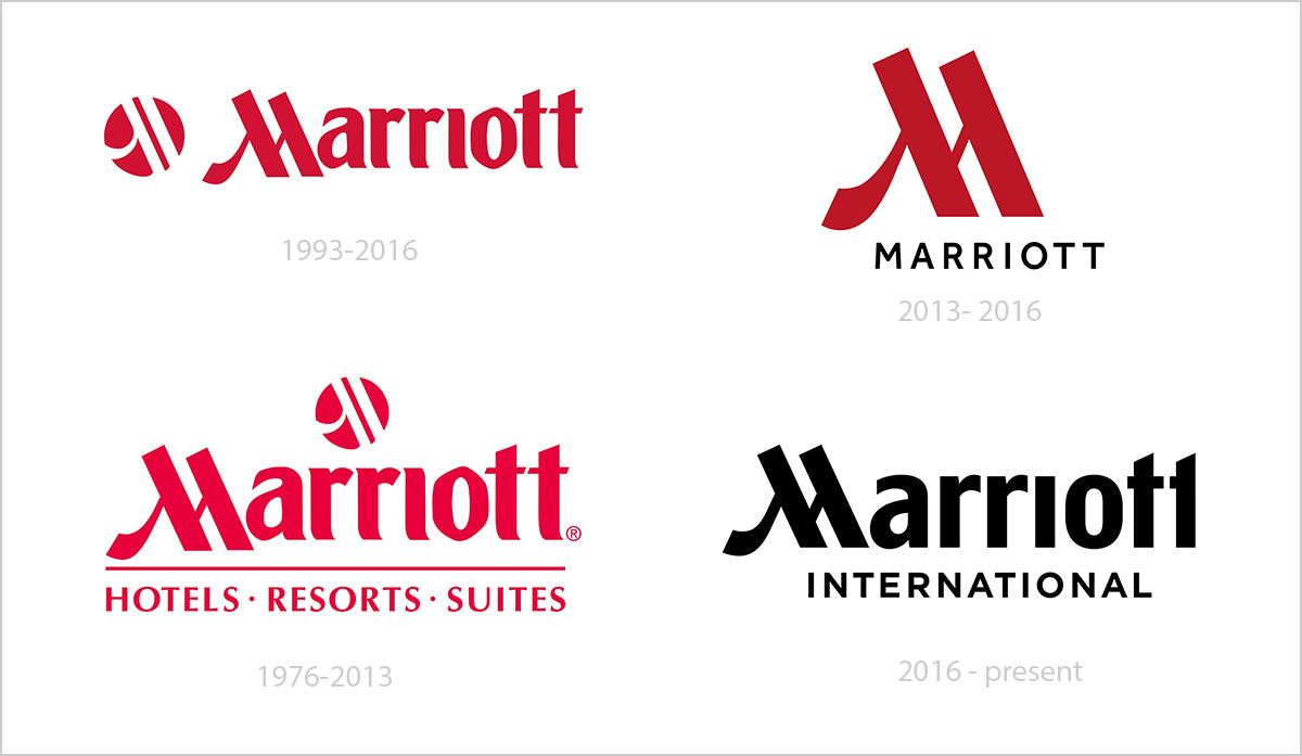
The old Marriott Hotels logo was supposed to be elegant, with an air of luxury. After all, this hotel chain is all about stylishness. But you couldn’t see that in the branding. Instead, the blocky font was too overwhelming and outdated.
Their team of designers changed things around when they introduced the brand new Marriott Hotels logo back in 2014. It is simple, distinguishable, and has a clear purpose. The logo itself completely changed the way the public sees this hotel chain. And that is what good branding can do.
Recommended:
- How Much Should I Charge For A Logo Design 2021?
- Do You Know How to Pronounce These 10 Brands Correctly?
- Why Are Simple Logos Effective? 20 Aesthetically Balanced Logo Examples
- Tons Of Unique & Attractive Logotypes & Logomarks For Inspiration
- Sketch To Logo Process | 20 Cool Logo Designs For Inspiration


