Hi there everyone! We are so very excited to share today’s blog with you because we can bet that you all are going to love reading it as much as we did when we were working on it. But before doing that, we would like to take a quick moment and thank you guys for the love and support that you send our way and for also making sure that the people you love and care for are reading our blogs and making the most of them too. And we hope to see more of that happening in the future as well.
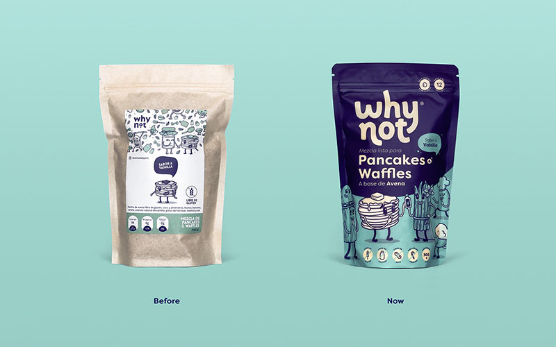
If you guys are one of those people who love having pancakes and waffles almost every other day for breakfast or beyond that too, we are sure that you also have your favorite brands and you only get your mixes from them which makes complete sense. And in addition to the convenience level or the taste your preferred brands offer, we are sure that in the back of your mind, you also like them for how they present themselves because that plays a major role in making or breaking a brand, right? Keeping that in mind, we wanted to share something with you guys that is super unique in the context of packaging and while we will share everything that you need to know about the current packaging, we will also share with you guys how the old packaging was like so that you can compare the two and make the most of your learnings in the future.
Okay so, as we all know that many people are of the view point that indulgence foods are not (very) healthy as they are the food items which are rich in taste, and are usually available in big quantities so that you can keep munching on them but they are full of fats and calories so if you are a diet conscious person or someone who likes to eat all things nice and super healthy, then there are chances that you would not be a fan of indulgence foods.
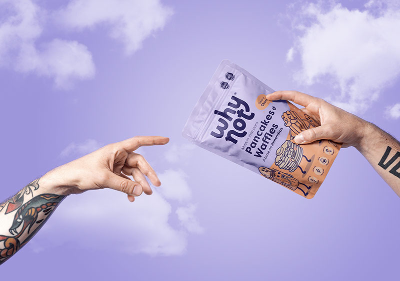
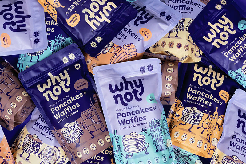
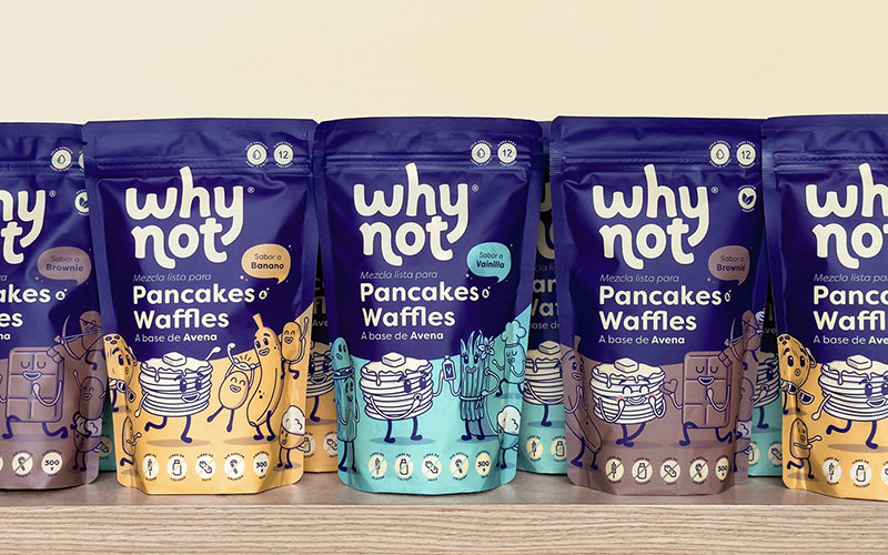
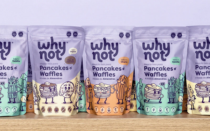
But it is not always necessary that all indulgence food items happen to be junk food. They can be healthy and fulfilling and if they are pancakes and waffles then you might have to rethink your food choices too because what you are about to witness is something so cool and exciting that you won’t be able to take your eyes off of the packaging redesign. So, the creative and design teams of Why Not came up with the idea of making the packaging design more than just a packaging design and they ended up with such amazing visuals that you will find super interesting.
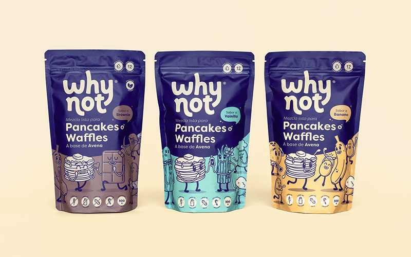
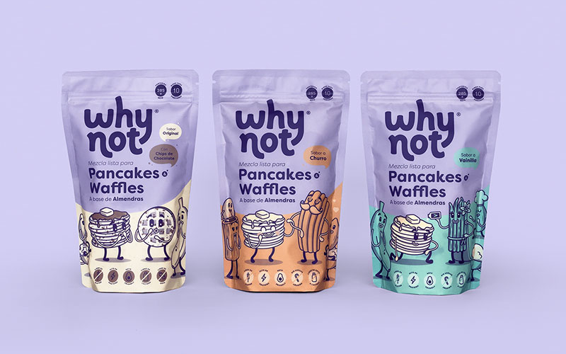
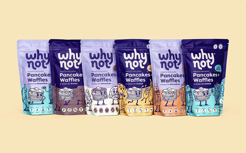
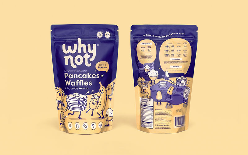
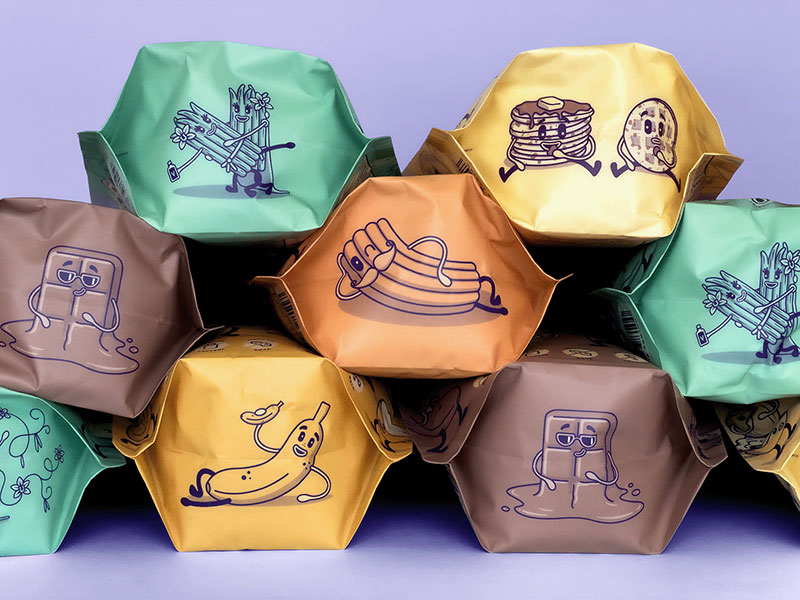
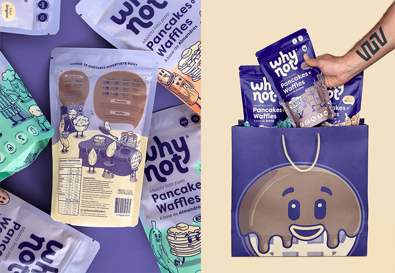
Many food packaging designs happen to look almost the same no matter which country they originate from but Juan Montes, a Colombian graphic designer and illustrator who redesigned Why Not’s packaging, chose an unconventional color palette and illustrated characters to stand apart from the crowd and we think this would be an understatement to say that we have become a fan of his creativity.
As we all know that whenever we come across a packaging design, we are looking at the front design only and do not really feel bothered to check what’s at the back because that side is usually just what is inside the box / packet, etc., manufacturing and expiry dates, and other relevant information that one has to keep in mind before they start using the product. But that is just it, right? But Juan Montes made sure that the back of the packaging looks lit along with making a nice design at the bottom of the packaging as well, making it a complete package that is bound to make you smile. And with the characters to represent the flavors of the mixes, we think Juan has very creatively used the space and has made the most of it. So, if you are planning to work on a packaging redesign for a food item, maybe you can get the inspiration and create something even more fun and powerful.
That is all for today, you guys! We hope that you not only had a great time reading our blog today but that you are very excited to share it with your friends, family and favorite colleagues as well so that they can also check out how the brand Why Not got the coolest packaging design. Feel free to share your feedback with us in the comments section and while you are at it, we would really like to encourage you guys to also send in your special requests as well so that we can work on them and be back here soon with your requested content and more.
Credit: Source
Why Not Pancakes & Waffles Packaging Redesign
Recommended:
- Hint | Spices & Vinegar Minimal Packaging Design For Inspiration
- Xocokaia Chocolate | Visual ID + Packaging Design
- SOLALA | Soap Packaging Design For Inspiration
- Beautiful Packaging Design of Saffron Infused Candles | ByBelo
- Chewable Yogurt Packaging Design For Inspiration
- A Fun-Filled Earth’s Best Baby Wipes Packaging Design
- A Feast For The Eyes | Moonshop Traditional Pastry Packaging Design


