Hi there everyone! We hope that you guys are having a great time reading our blogs and that you are very excited to check out what we are about to share with you guys today. But before we share everything that you guys need to know about this minimalistic chocolate packaging that can inspire you in so many ways, we would like to take a moment to thank you all for the love and constant support that you always shower us with and for also taking out the time to share your honest feedback with us as well. We hope to see more of that happening in the future too.
First things first; we would like to introduce you all to the studio from which this beautiful packaging design was brought to life. We are sure that you guys would love to read up more on the studio and the team that worked on the packaging design so that you can check out their other projects as well in order to get inspired in your own ways. Okay so, Mapoteca Studio is a creative design studio based in São Paulo, Brazil. The creative and super-skilled designers have worked on multiple projects for their clients and we are glad to share that everything that they have made is not only effective for the businesses but is so meaningful that you won’t be able to resist spending hours checking out the projects in detail too.
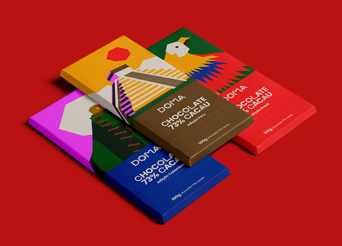
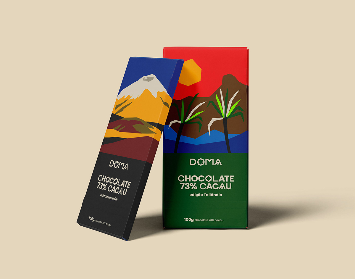
As you all know that in the world of product packaging, a well-designed package can make a significant impact on a consumer’s perception and purchasing decision. One area where packaging design plays a crucial role is in the food industry where creative packaging can elevate the product’s appeal and communicate its essence in its true sense and an excellent example of exceptional packaging design is the Doma Chocolates Special Edition which showcases a perfect blend of minimalism and inspiration. Allow us to share all of that with you guys in this part of our blog!
Minimalism is a design philosophy that focuses on simplicity, clean lines, and the emphasis is only on the essential elements. It is a style that has gained popularity in recent years and its influence can be seen across various industries, including packaging design. The Doma Chocolates Special Edition packaging demonstrates the power of minimalism as it embraces simplicity and uses it to its advantage.
Recommended: Where Will Graphic Design Be In 10 Years?
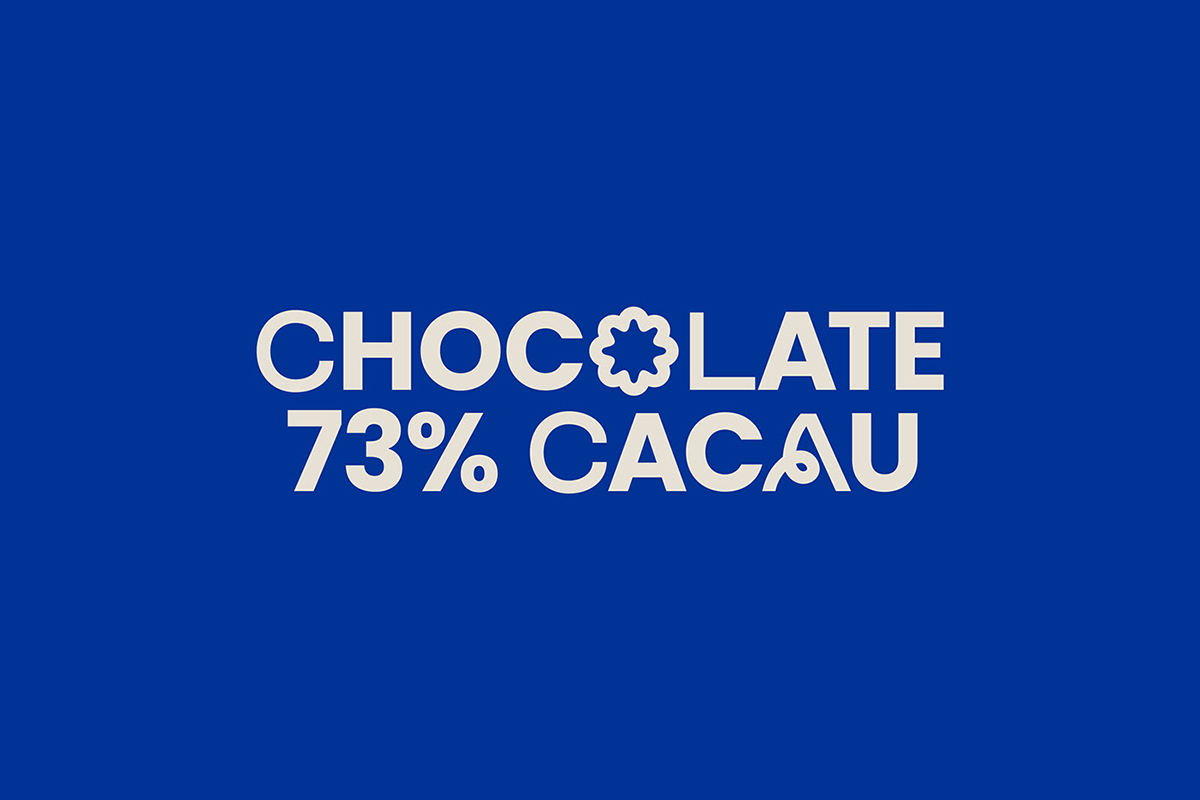
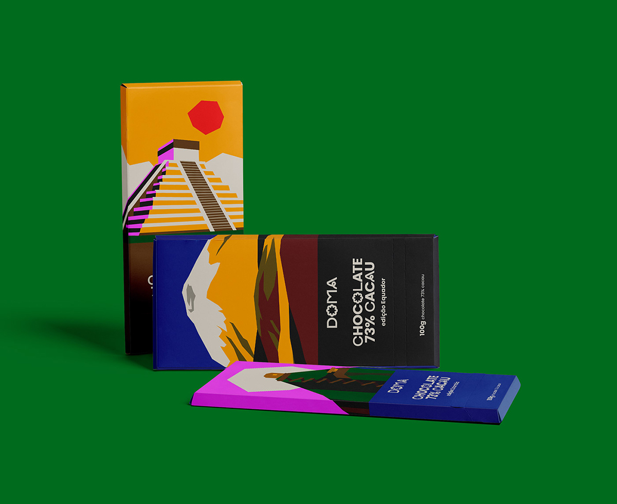
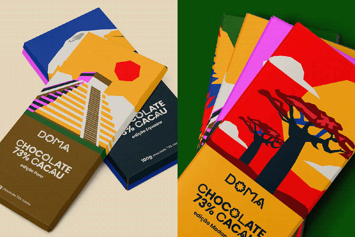
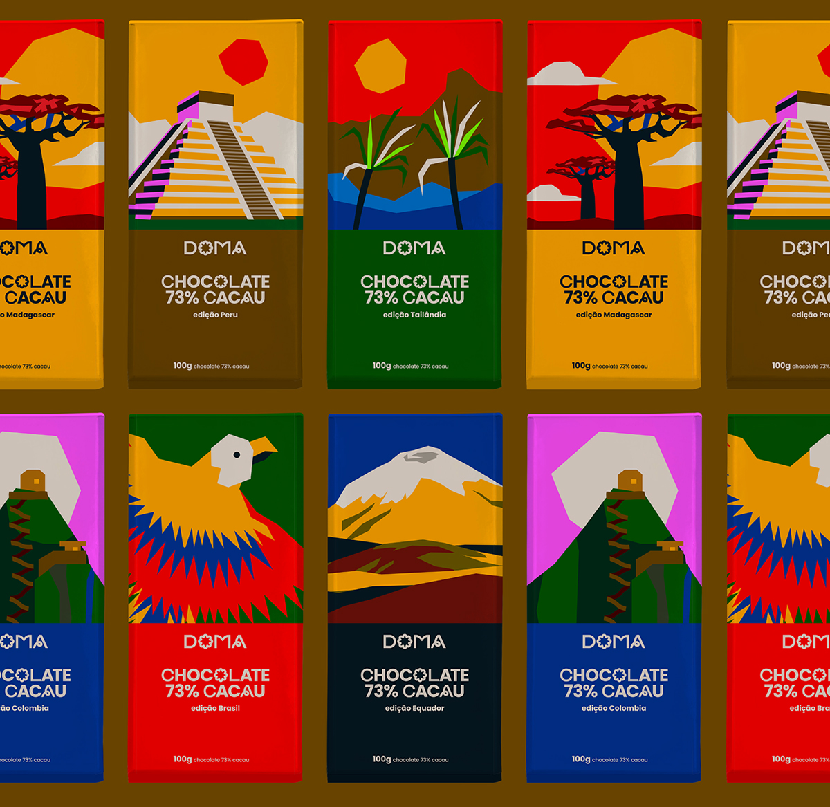
At first glance, the Doma Chocolates’ packaging design appears clean and uncluttered. The designers have employed a colorful palette; primarily consisting of striking colors. The use of color creates an elegant and sophisticated look that instantly grabs attention. The minimalist approach allows the focus to shift to the key elements of the design such as typography, textures, and later on the chocolate itself. In addition, we would also like to talk about one of the interesting features of the Doma Chocolates which is the expert use of typography. The designers have carefully selected a combination of modern and classic fonts that complement each other and enhance the overall design of the packaging. The brand name is prominently displayed in bold – creating a strong visual impact.
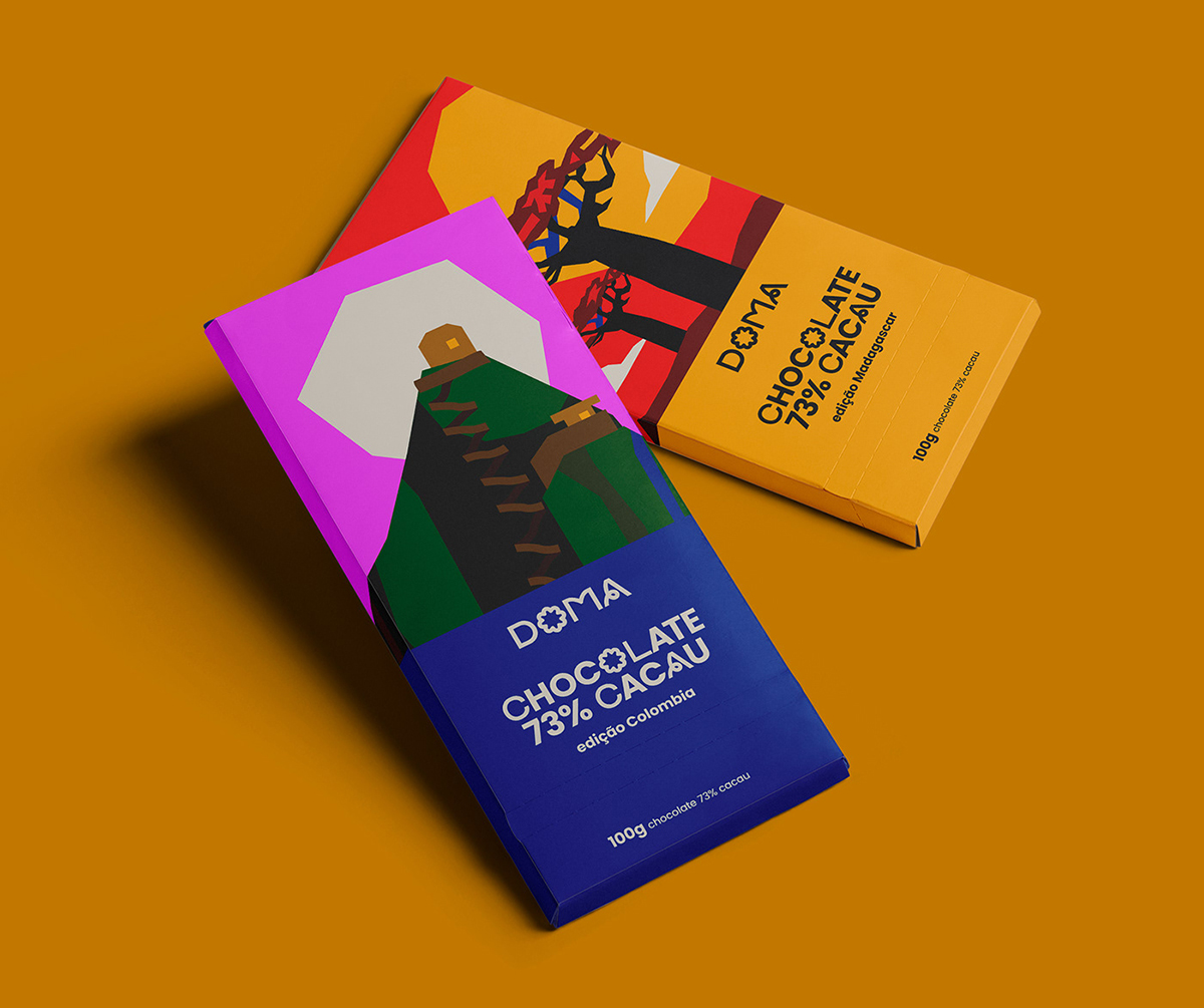
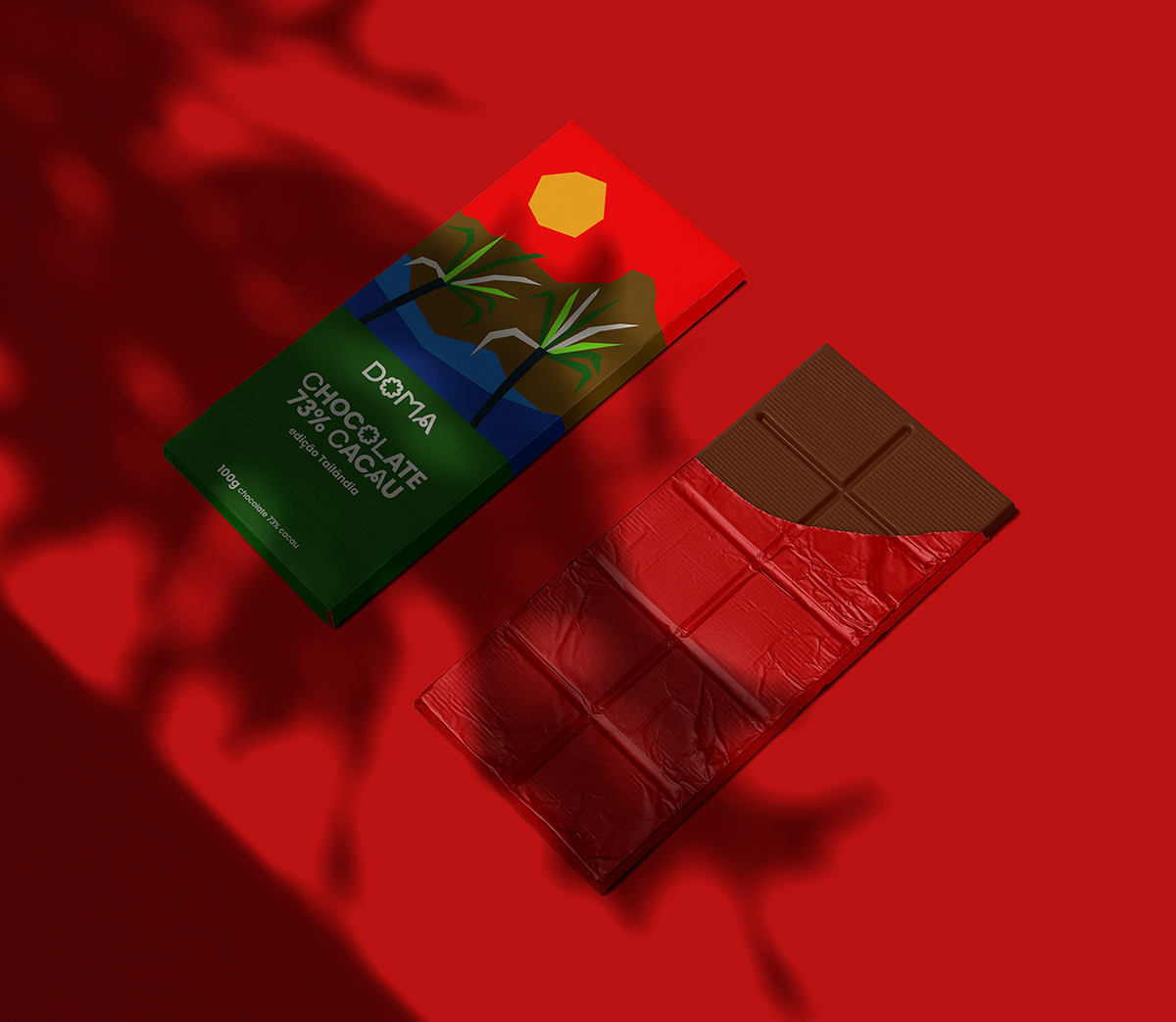
Moreover, the packaging employs a clear visual hierarchy which guides the viewer’s attention to the most important information. The product name and flavor are given prominence while supporting details such as ingredients and nutritional information are presented in a concise manner. This approach ensures that the essential information is easily accessible without overwhelming the viewer with excessive text. Also, the minimalist color palette and typography of the Doma Chocolates Special Edition packaging incorporates texture and material to create a tactile and sensory experience as well. The designers have chosen a premium matte paper stock for the outer packaging which not only exudes elegance but also provides a pleasant tactile sensation when held; making it an experience everyone would love to have.
The packaging also includes subtle embossed patterns adding another layer of depth and visual interest. The intricate detailing on the outer packaging reinforces the creativity and attention to detail associated with the Doma Chocolates brand. By incorporating texture and material; the packaging design becomes more than just a visual experience and becomes a sensory experience that engages multiple senses and also heightens the overall perception of the product. Here, we would also like to mention that effective packaging design goes beyond aesthetics. It should also showcase the essence of the brand it represents. In the case of Doma Chocolates, the packaging design successfully captures the brand’s values and positioning.
That is all for today, you guys! We hope that you guys enjoyed reading the blog and that you will also share it with your graphic designer friends, favorite colleagues and students, etc. as well so that they can also check out the inspirational minimalistic chocolate packaging design and incorporate the learnings into their own projects too. We will see you guys next time something more fun and exciting to read and work on.
Credit: Source
Inspirational Minimalistic Chocolate Packaging Design


Recommended:
- Valuable Tips To Satisfy Graphic Design Clients?
- Exquisite Design of Hungarian Postage Stamps 2022
- 90s’ Label Designs For Inspiration
- DesignGost Rebranding | A Turkish Mentoring Website