Colors have their own psychology, every color defines a certain mood and feeling. We all believe in them somehow, some refreshing colors like neon and pastels actually make us feel so good, black color for some people is a complete let down, they feel low in it while others feel attractive and alluring in wearing this color, in short, there is a story behind every hue that implies everywhere especially in the field of graphic designing and art.
Artists are the ultimate users of colors, they know ‘what color makes up what color gesture’, what comes out from a blend of two colors, which shade adds up to the charisma or what shade/colors brings a new life to the object. We cannot undermine the importance of colors in the creation of the this world too– where we see green color ruling in the forests, in trees and plants, yellows, pinks and blues are found in flowers, even rainbow has all beautiful seven colors, butterfly too has charming colors to inspire. So when a designer is to undertake a task he seeks inspiration out of colors especially from the external source that is present in the whereabouts.
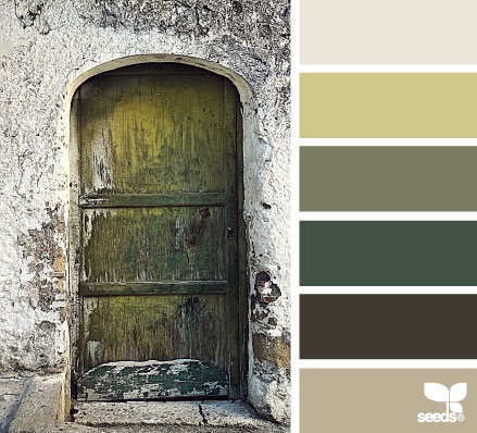
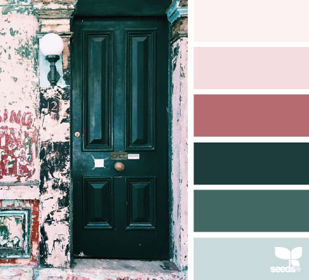
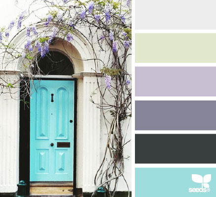
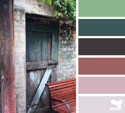
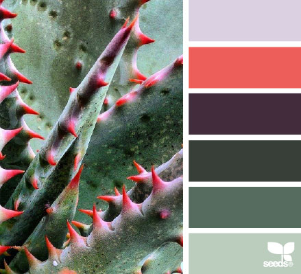
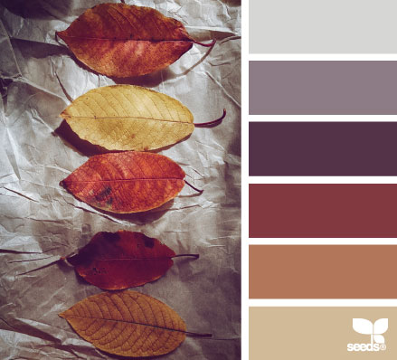
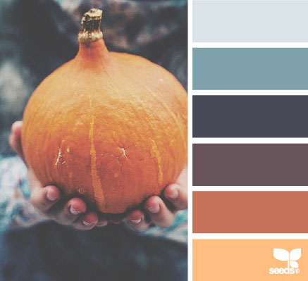
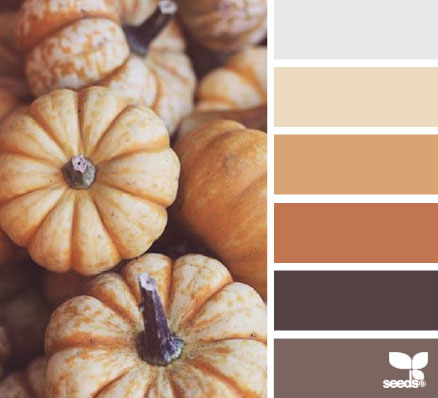
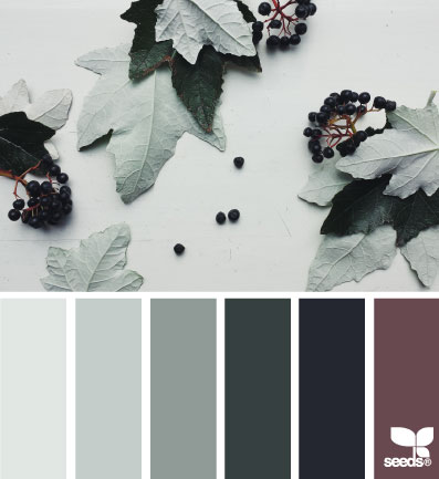
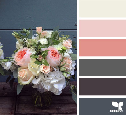
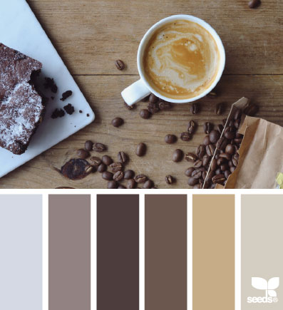
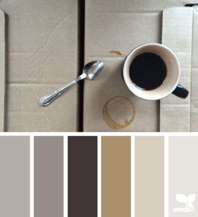
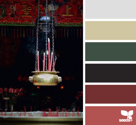
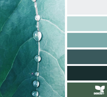
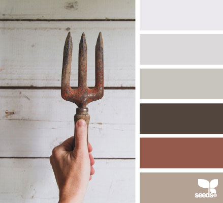
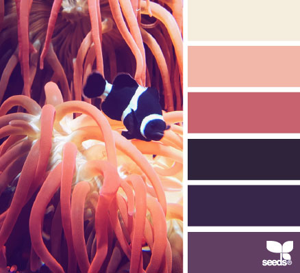
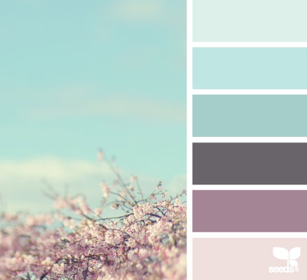
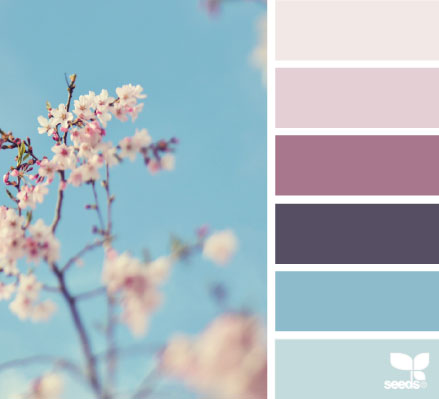
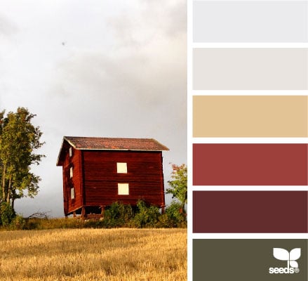
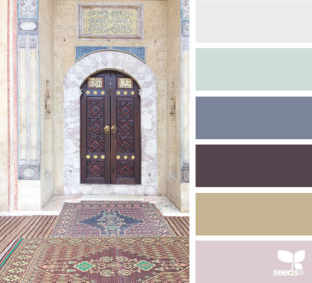
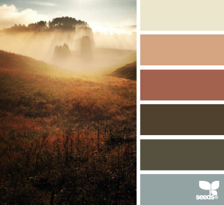
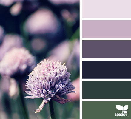
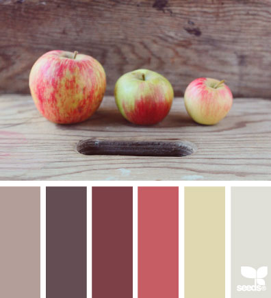
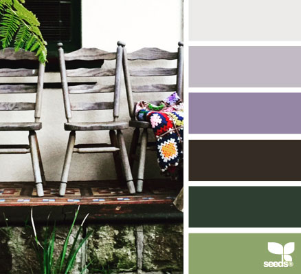
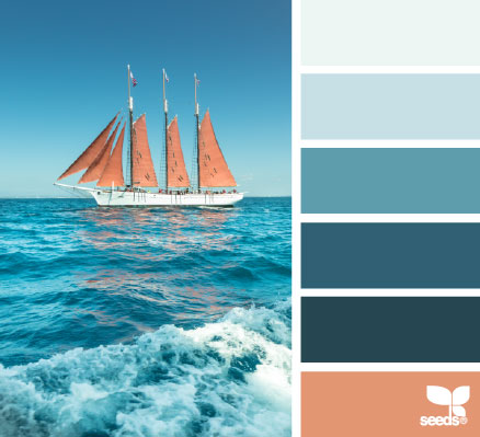
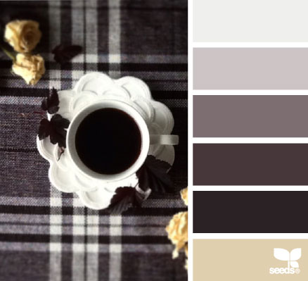
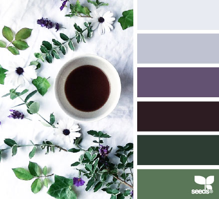
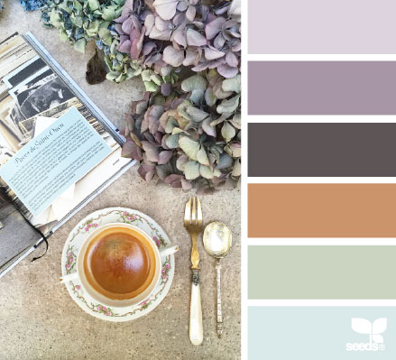
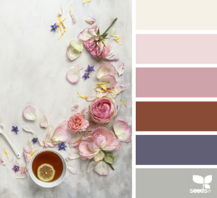
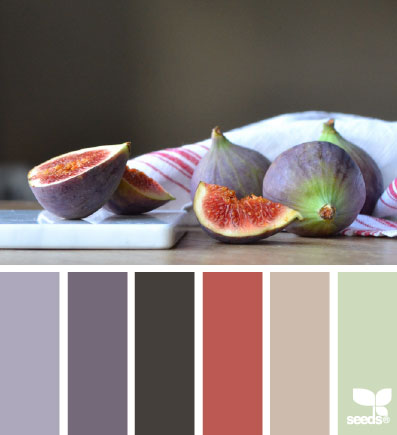
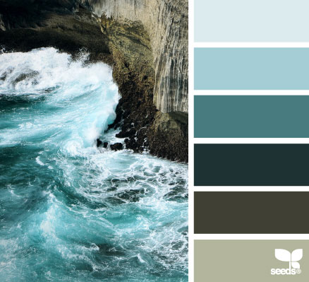
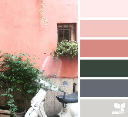
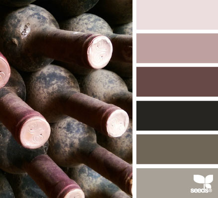
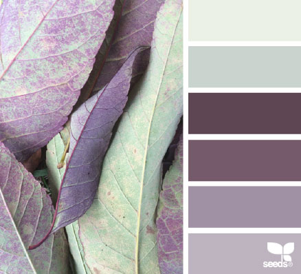
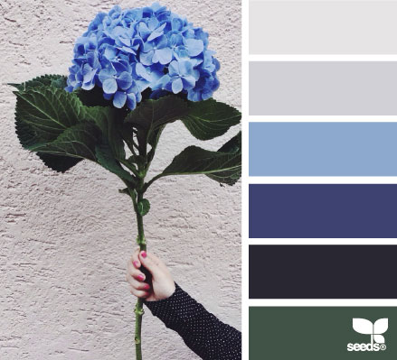
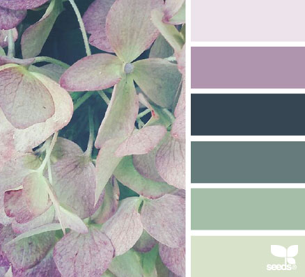
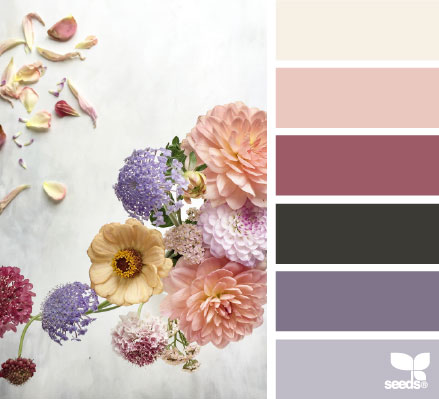
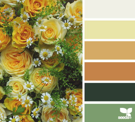
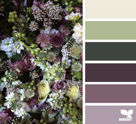
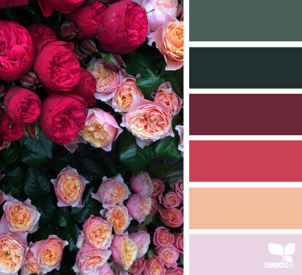
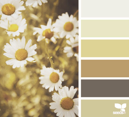
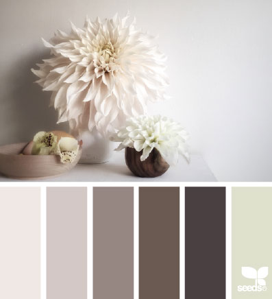
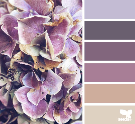
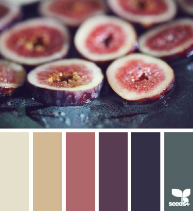
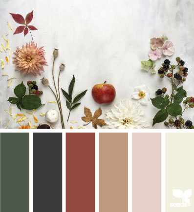
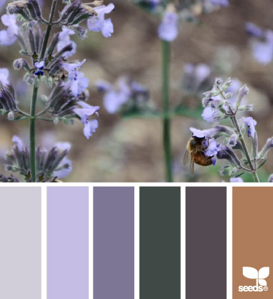
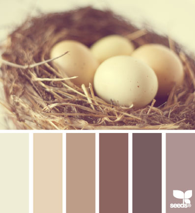
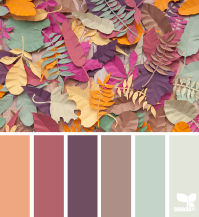
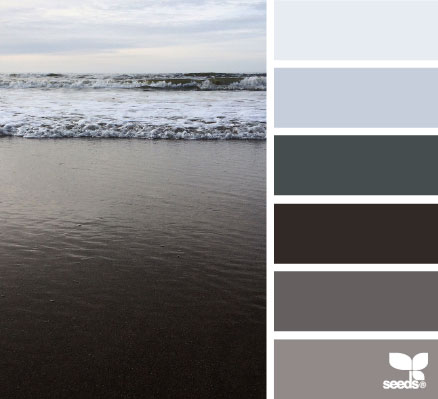
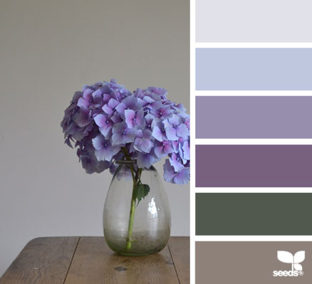
However it depends on the mood of the task and thing that what color may be applied there. Today I am unfolding before you 50 best color combinations for graphic design projects by Designseeds. You will love to get the glimpse that how the designer has used an amalgamation of dark and light shades to suit the design pieces.
A lot of blues, greys, pastels, neon, hazy, numb and sharp colors are mixed and matched to create a sense out of every poster. Certainly a soothing touch to the aesthetics. I am bedazzled and have learnt a lot from this post, designseeds has magically depicted them to define color combinations.
Subscribe us for more interesting stuff and we will keep bringing the posts of your choice in the coming days too, stick to us and get yourselves up to date about art and designs.


