Hi there everyone! We are back with yet another super amazing blog of ours and we can bet that you all are going to have an awesome time reading it too especially if you are looking for ideas and inspiration to get started with one of your clients that happens to be a bank of the sort. And we can’t wait to share everything that you guys need to know in order to start working on your own creative ideas but before we do that, we would like to take a moment to thank you all for the love and support that you send our way and for always making sure that your near and dear ones are also reading our blogs and making the most of them too.
Okay so, in the dynamic world of banking, visual identity plays a vital role in communicating a financial institution’s values, reliability and customer-centric approach. AccessBank is a Micro Finance Bank of Azerbaijan which began its operations in Baku on October 29, 2002, and was re-branded in September 2008 as AccessBank. This blog today explores the inspiring design elements and aesthetics created by a university grad who emphasized how the rebranding can encapsulate the essence of trust, accessibility and innovation (if ever utilized by the brand).
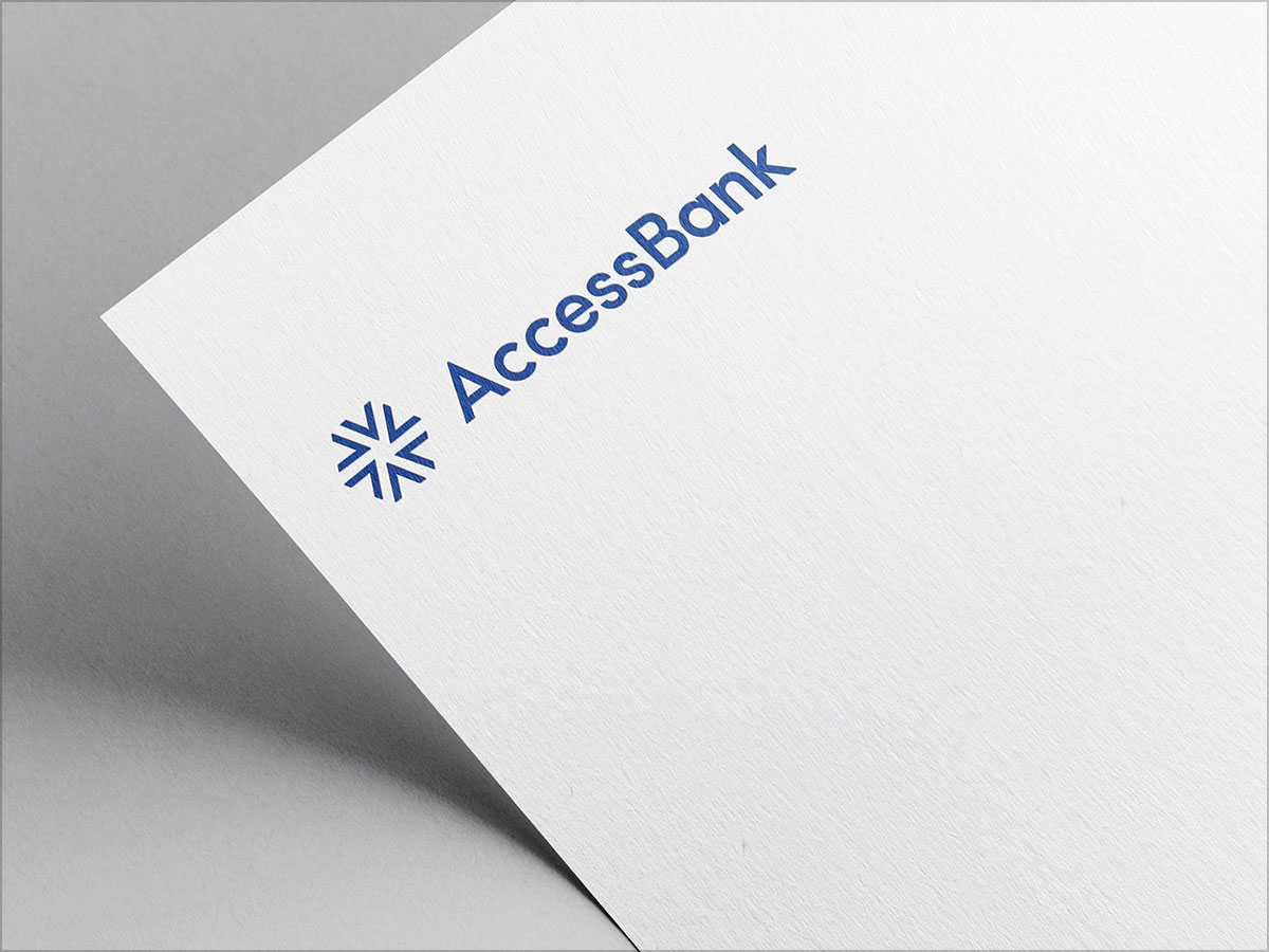
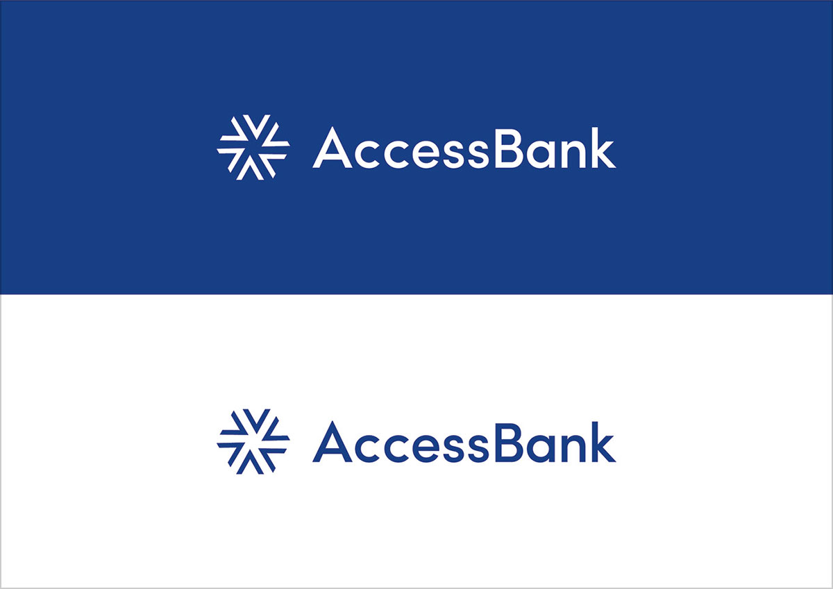
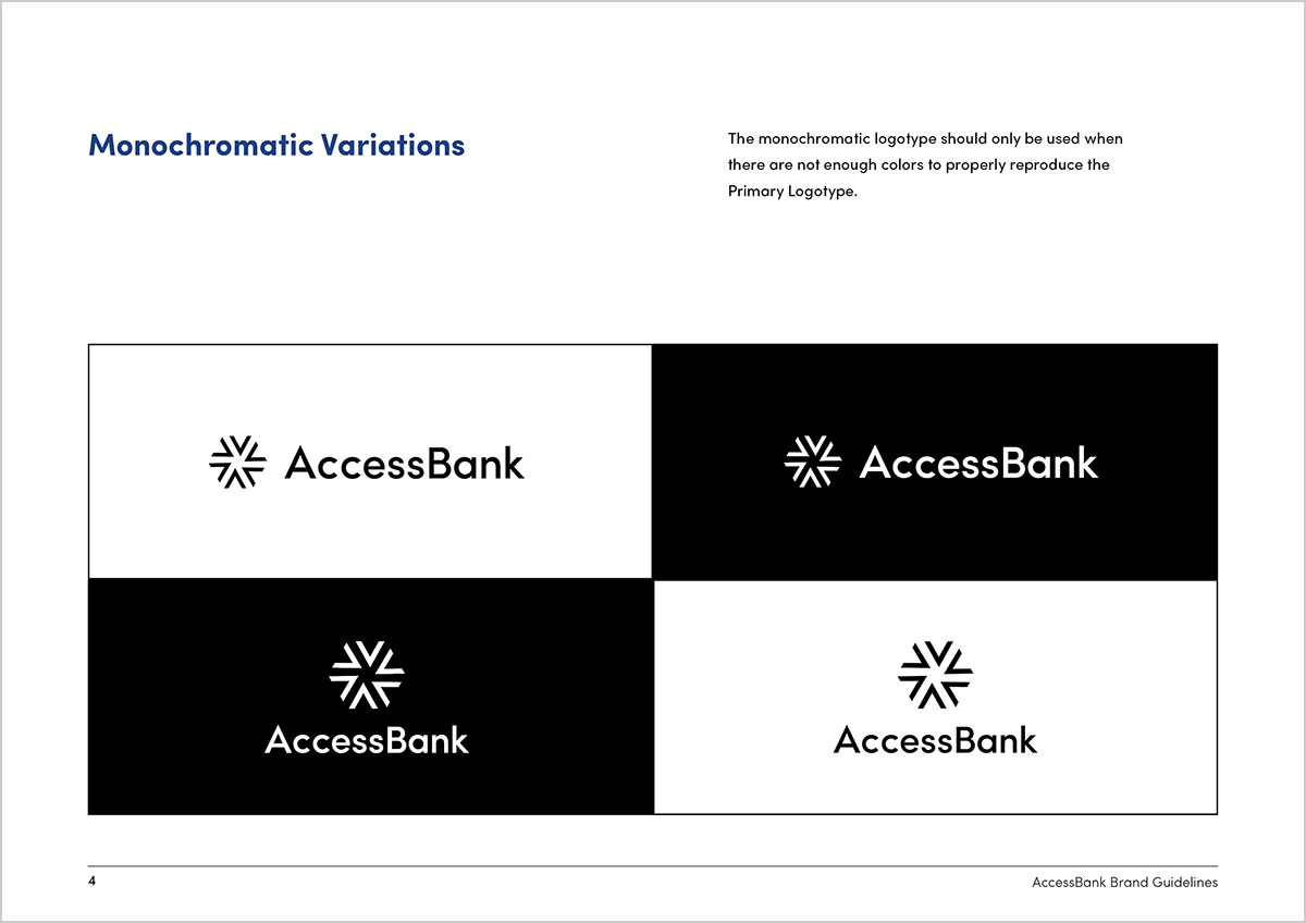
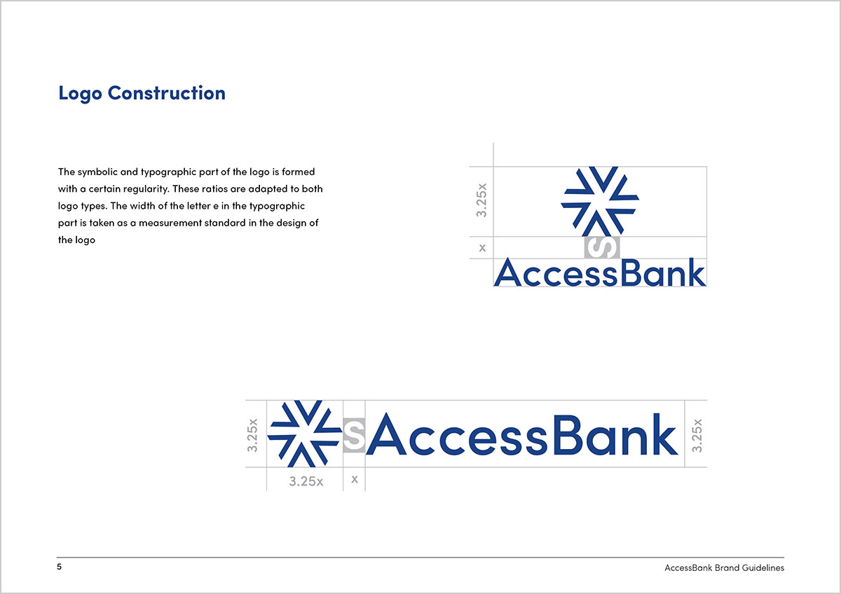
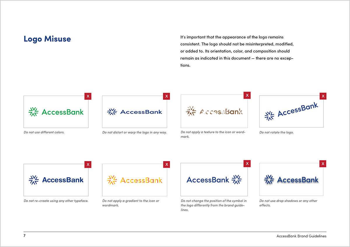
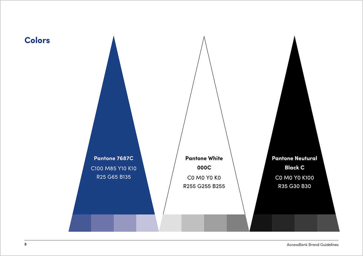
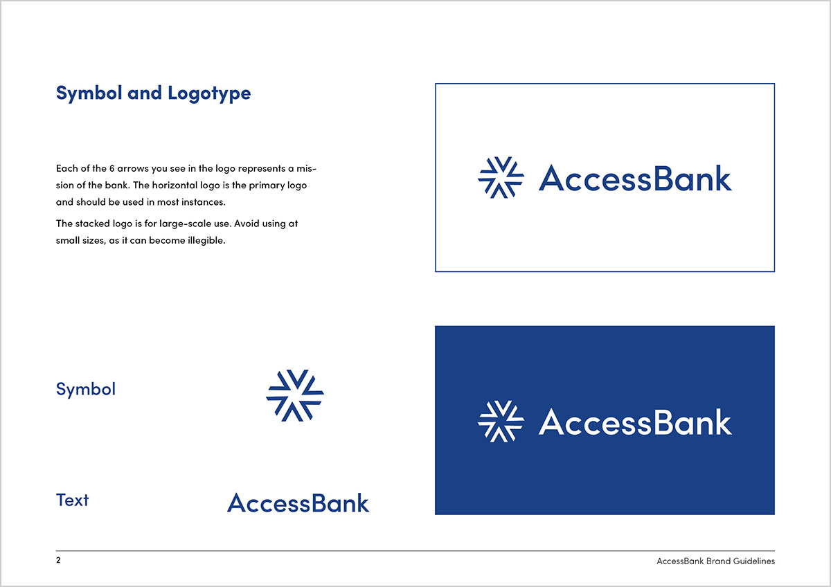
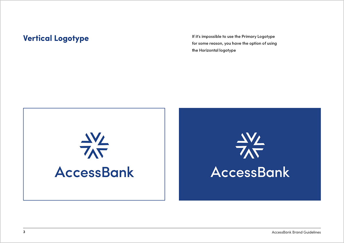
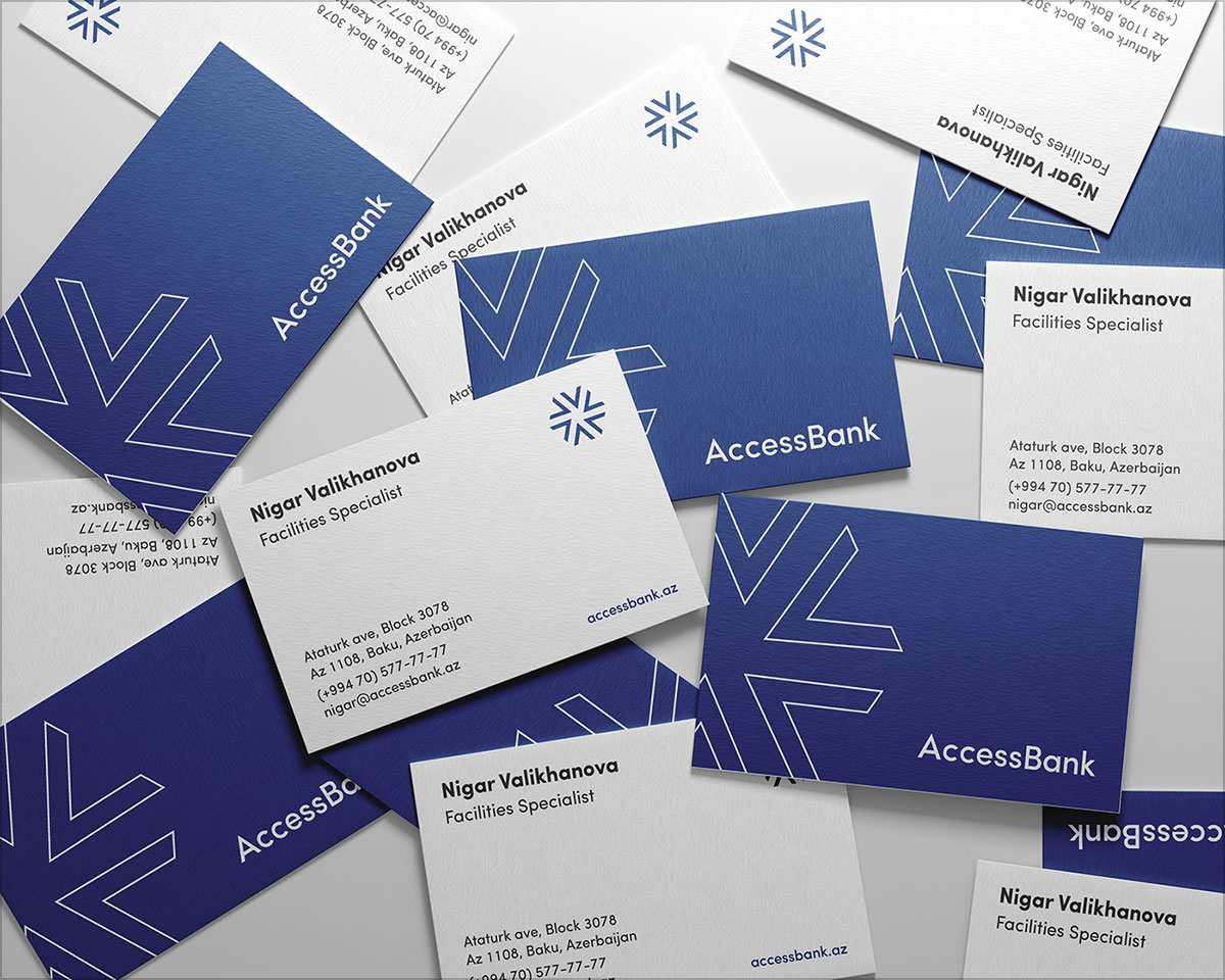
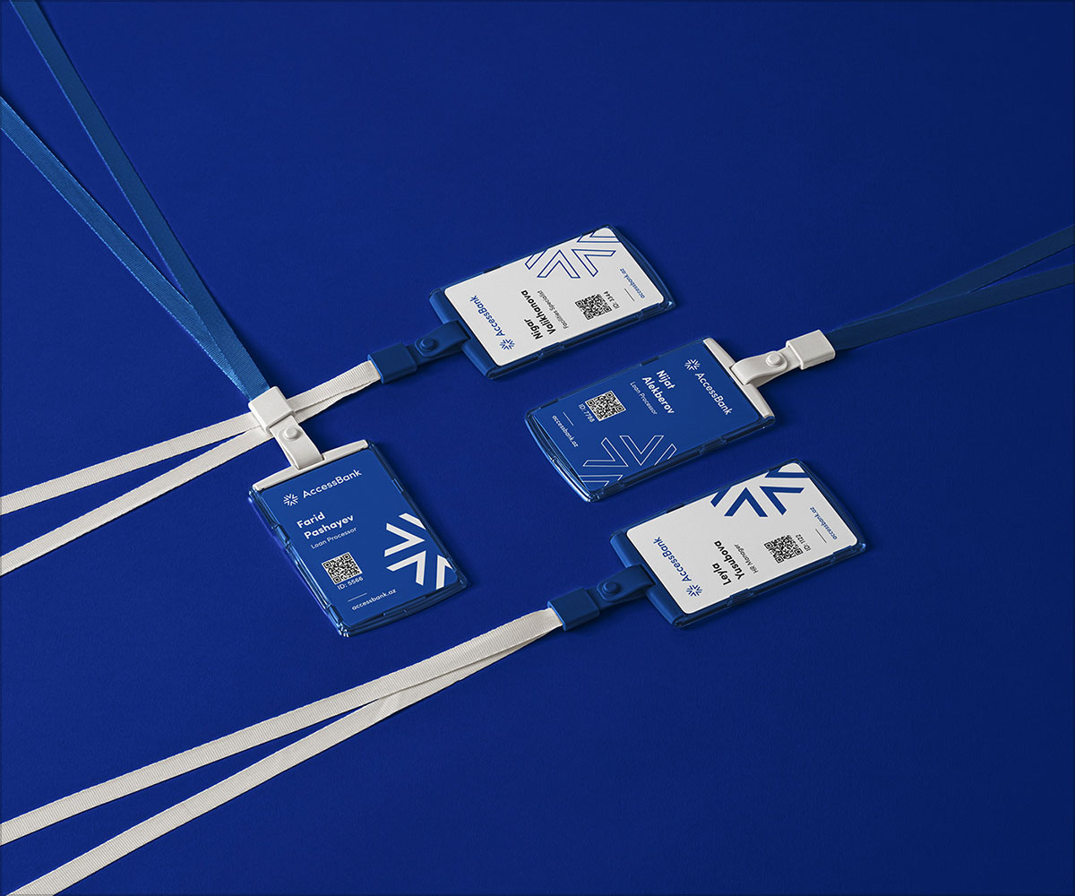
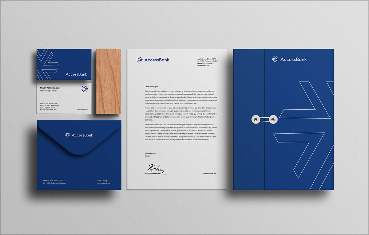
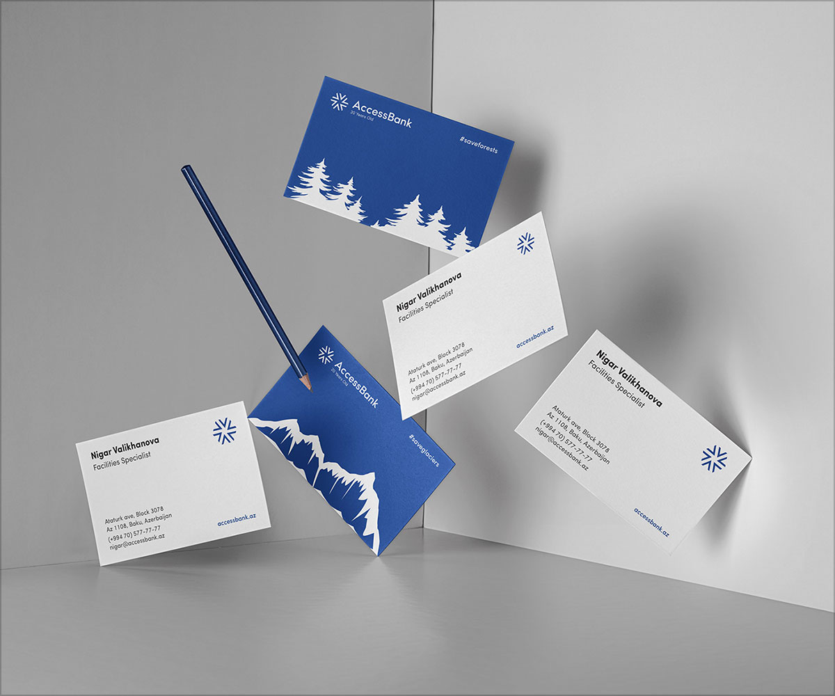
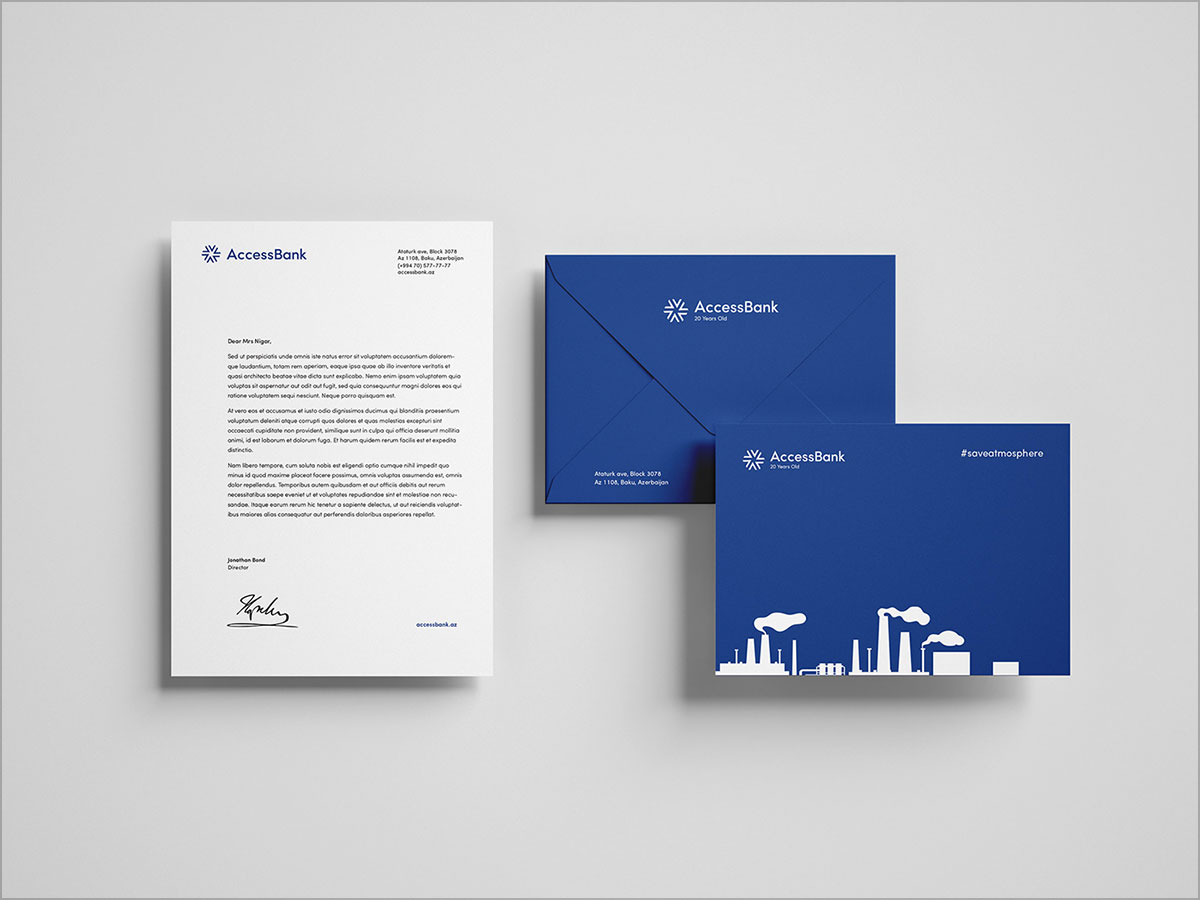
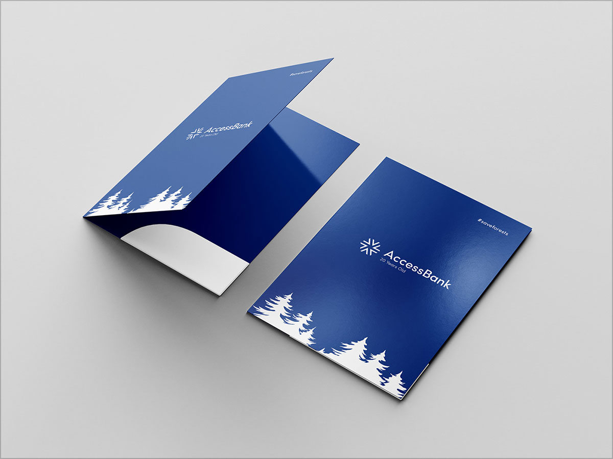
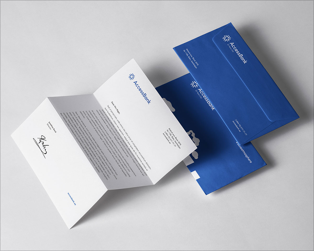
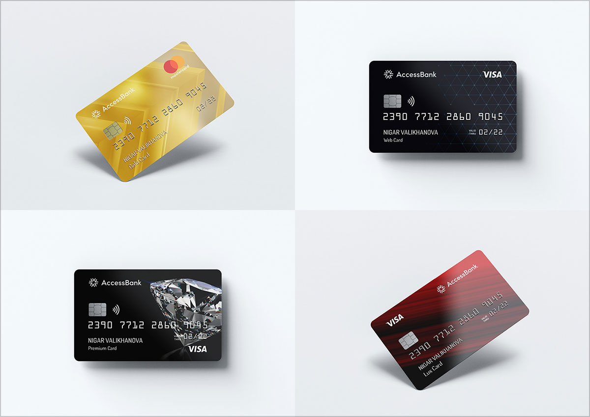
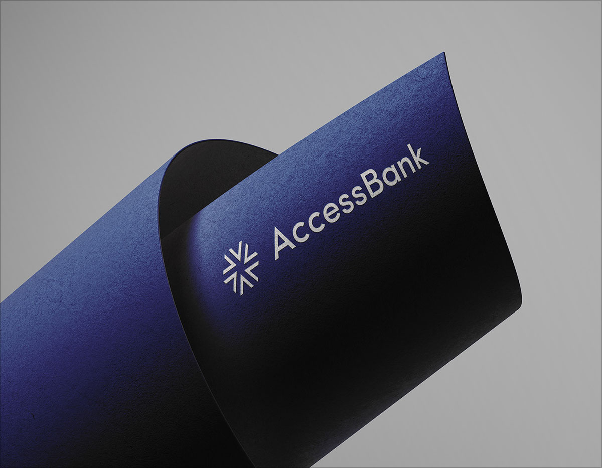
At the core of AccessBank’s rebranding design project lies a commitment to modern simplicity. The new logo features a minimalist and clean approach which is characterized by bold and streamlined letters. The simplicity of the design allows for easy recognition and enhances brand recall. The use of a monochromatic color palette; predominantly blue, evokes a sense of trust, stability, and professionalism – aligning with traditional banking associations.
The streamlined and geometric shapes within the logo convey a sense of efficiency and progressiveness which can be used to reflect AccessBank’s commitment to innovation and adaptability. This modern simplicity extends throughout the bank’s visual identity, ensuring consistency and clarity across all touchpoints.
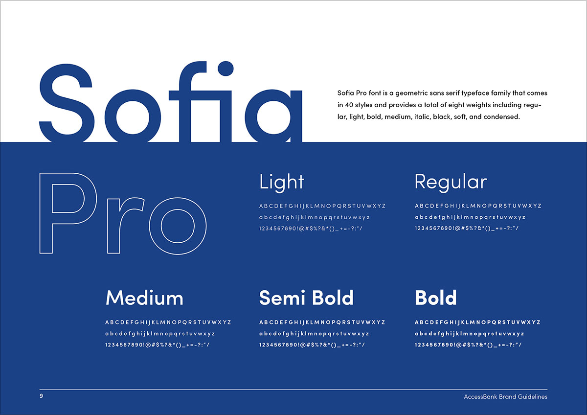
In addition, typography plays a significant role in establishing a brand’s personality and creating a memorable visual identity. AccessBank’s rebranding design project employs a bold and assertive typeface for its name and tagline. The typography depicts strength and confidence, projecting the bank’s commitment to empowering its customers and providing robust financial solutions.
Furthermore, the careful selection of fonts ensures legibility and readability, crucial factors in the banking industry where clear communication of information is absolutely important. The clean lines and balanced proportions show professionalism and trustworthiness which are essential qualities for a successful financial institution.
AccessBank’s rebranding design project incorporates imagery that emphasizes accessibility and inclusivity. The use of diverse and relatable photography represents the bank’s commitment to serving a wide range of customers. Images portraying individuals from different walks of life engaging with financial services communicate AccessBank’s dedication to providing accessible banking solutions to all segments of society.
The photography captures authentic moments, showcasing people’s emotions and highlighting the bank’s human-centric approach. By featuring real customers and employees, AccessBank fosters a sense of trust and relatability, ensuring that customers feel seen and understood.
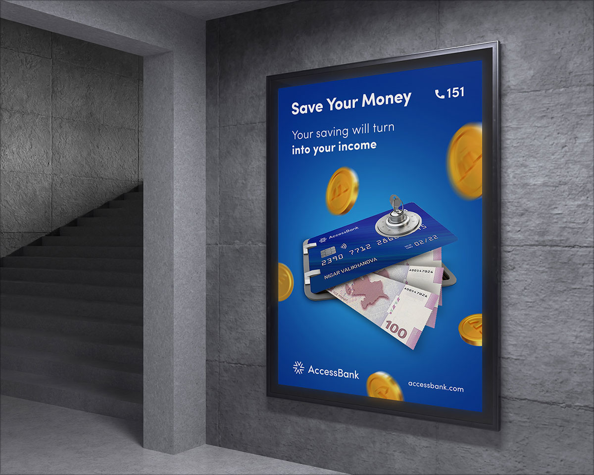
The rebranding design of AccessBank embraces a vibrant and energetic color palette; parting way with the traditionally conservative hues often associated with banks. The introduction of vibrant shades of blue, green and orange adds a touch of freshness to the brand’s visual identity.
These colors evoke feelings of growth, positivity and approachability. By incorporating vibrant tones, it is show that AccessBank can seek to differentiate itself from its competitors and position itself as a modern and forward-thinking financial institution. The carefully chosen color palette not only catches the eye but also creates an engaging and memorable brand experience for customers.
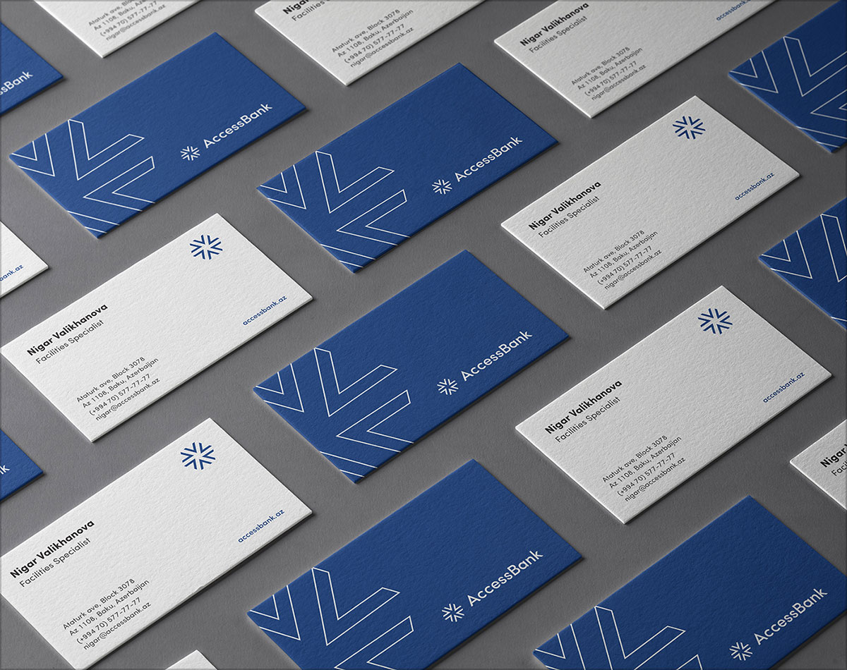
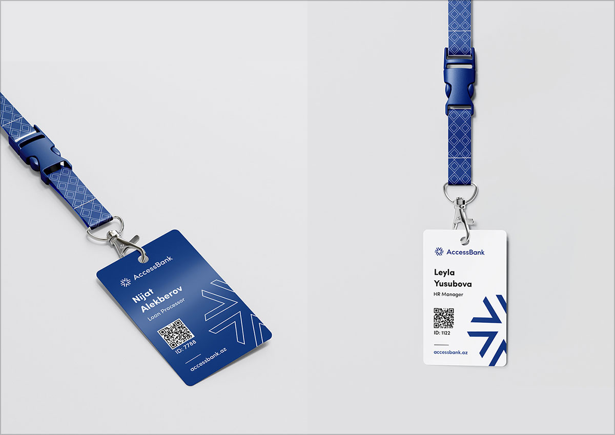
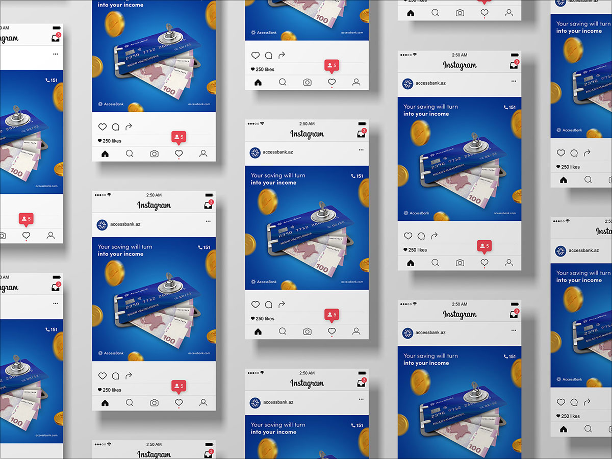
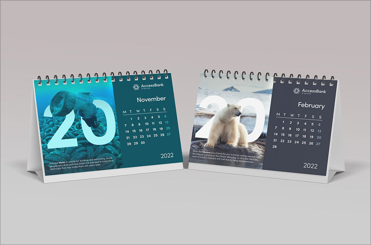
Know that a successful rebranding design requires seamless integration across various touchpoints. The rebranding design project for AccessBank has achieved this by ensuring consistency in its visual identity. The new brand elements are effectively applied to all customer-facing channels, including physical branches, digital platforms and other marketing collateral.
By maintaining consistency in logo placement, color usage, and typography across different mediums, the design project for AccessBank creates a unified and cohesive brand experience. This integration allows customers to recognize and engage with the brand effortlessly; enhancing their trust and familiarity with the institution.
That is all for today, you guys! We not only hope that you had a great time reading this blog but that you will also share it with your graphic designer friends, favorite colleagues and students, etc. as well so that they can also work on amazing ideas for their own brands or the ones that they are associated with. Also, feel free to share your feedback with us in the comments section and while you guys are at it, don’t forget to let us know about your special requests as well so that we can work on them and be back here with your requested content and more super soon.
Credit: source
AccessBank Rebranding Design For Inspiration


Recommended:
- DesignGost Rebranding | A Turkish Mentoring Website
- What Is The Difference Between Brand Refresh, Rebranding & Redesign?
- Evolutionary Rebranding For WWW Conferences
- 7-Eleven Rebranding Design
- Freshleaf Teas Stunning Rebranding For Inspiration
- ZMORPH 3D Printer | Rebranding & Webdesign
- Rebranding of Destination Canada