A quick guide to creating website wireframes
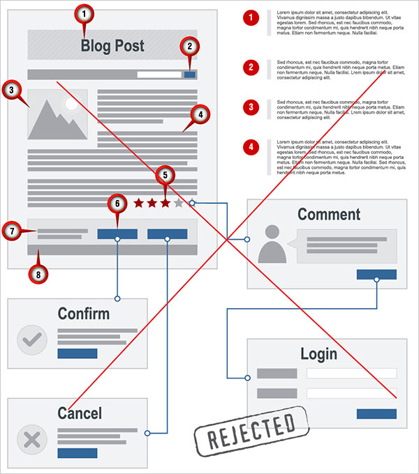
When you have to show your client how the users will be interacting with the future website, using website wireframes is the perfect solution. There is no need to play with fonts and colors at this point, it’s just about creating a prototype including all components of the website interface.
There are three ways of creating a wireframe:
Go old school: When discussing the layout of the prospective website with a client, use a pencil and simply draw the elements of the future interface on paper.
Go classic: Use lines, shapes and other basic tools of the graphic software you are most used to (Adobe Photoshop, Illustrator etc.)
Go simple: If you’ve ever used Photoshop or Illustrator to create a wireframe and thought that they are way too complex for such a simple process, then using specific wireframes creation software may be the perfect option for you. Mockup Builder is a good example of such software. It offers various ready-to-use website tools like text boxes, buttons, frames etc, making wireframe creation simple and efficient. The Mockup Gallery contains whole parts of websites that can be easily added into your wireframe.
Remember that your website wireframe has to contain the following elements:
- Company logo box
- Search box
- User login box
- Navigation
- Content area
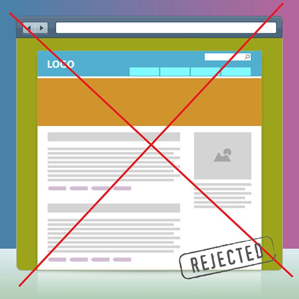
Here are 5 Mistakes in the Mockup Creation Process
Creating a mockup is hardly a difficult process. But there are people who still make a couple of mistakes. Below is the list of six mistakes that happen most frequently in the process of mockup creation.
1. Failing to use the color scheme
Creating a mockup, you may play with color as much as you want. However, it is highly advisable to make use of the color scheme. There are many resources that can help you can pick the best color: Color Scheme Designer, ColorHexa, Adobe Kuler etc.
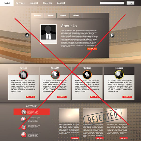
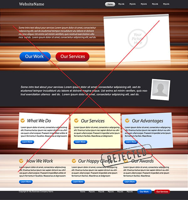
2. Too many effects and/or details
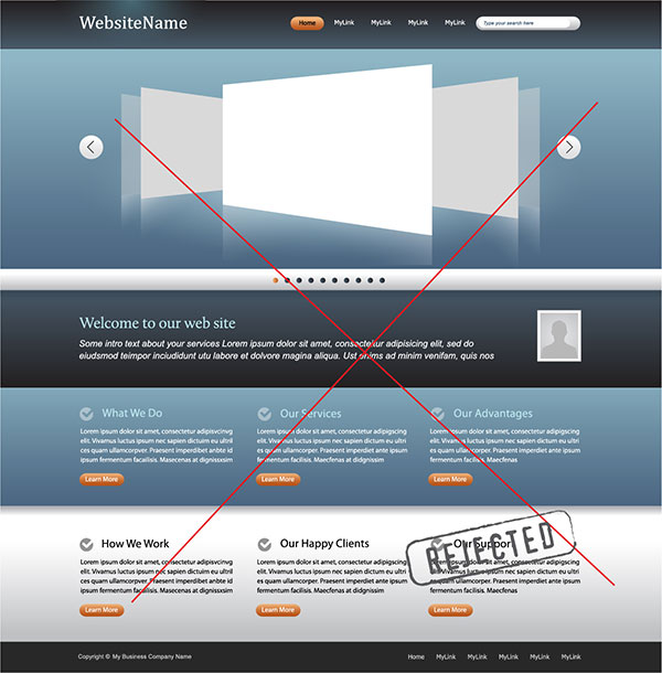
If a detail doesn’t bring any value to your design, then you shouldn’t include it in the mockup. Using shadows and gradients in one element is not a great idea either.
3. Your client doesn’t understand the idea of your mockup instantly
The aim of the mockup is to make the communication between the designer and the client easier. If the customer doesn’t get the concept of your mockup instantly, the chances are they might opt for another team.
4. No aligning elements
Always use grids. This way you’ll know that elements are definitely making up a balanced picture instead of a mess of scattered elements.
5. Difficulties reading the text
The text in your layout should be large enough so that the user doesn’t have any difficulties reading it. The other point you should bear in mind is type. You should always use high-contrast type in your mockup. Dark color type on a very light background is the best combination. However, light type on a colored or dark background can be difficult to read.
You come across all these difficulties while making website mockup/prototypes. Keeping these queries in mind we are helping you to make online mock up through a very convenient channel, mockupbuilder which is user friendly to meet your needs. It provides you services by which you can create your own mockups, impressive website layouts, desktop software prototypes, interactive wireframes, sitemaps, website design and screen navigations.
Images credit: web wireframe, prototype, design template, blog site, web template


Thanks for the mockup builder