Hello everyone! We are back with yet another super amazing and useful blog of ours and we can bet that you are going to have a very nice time reading it especially if you are someone who is about to work on a new web design or if you are planning to revamp your website in the coming year. And we cannot wait to share everything that you guys need to know about our today’s blog. Before we do that, we would like to take a moment to thank you all for the love and support that you send our way and for always making sure that you are also sharing our blogs within your personal and professional circles so that everyone you know can make the most of all what we share here. Know that we would love to see more of that happening in the future as well.
We would like to come clean with you guys so that you can know and understand where we are coming from when we say that creating a web design is a tricky business. Okay so, we shop online a lot. Like a lot, a lot! And some websites just do their thing and we are convinced to buy an item or two from that online store immediately. On the other hand, there are websites that we do not like so much at first glance, so that we just close that tab. What we are getting to is that colors and the overall look & feel of a web design are extremely crucial aspects because they impact the user experience of your potential customers as well as anyone and everyone who will visit your website to get information, to read your blog or do what you want them to do.
And while there is nothing wrong about one’s personal preferences when it comes to having a favorite color or two but when it comes to creating a web design for the masses, it is important that you guys not only keep the context of the website, that you are creating in mind but that you also follow a couple of guidelines to avoid elements that can scare your potential customers or visitors so much that they will never want to visit your website again.
In this part of our blog, we are going to be talking about the colors that you must avoid in web design at all times – even if you have a quirky business to run or a funky kinda blog that your audience loves to read. We will also share why you must avoid those colors so that it becomes clear for you guys to make informed decisions.
- Neon colors
- Flashy colors
- Dark on dark colors
- Bright on bright colors
- Inconsistent color palettes
- Jet Black
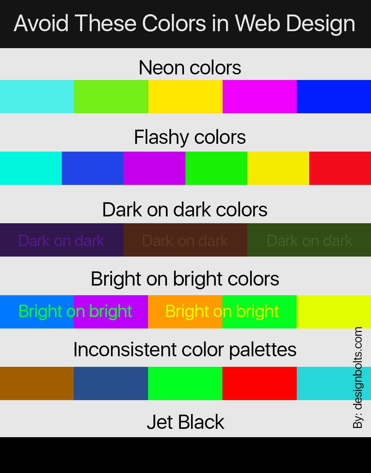
We know that neon colors look full of life and whenever you come across a design that has neon colors, you feel intrigued to find out more about whatever is being presented to you. In a web design, neon colors can be visually fatiguing and you do not want your visitors to feel that way while they are trying to make up their minds to purchase a thing or two from you. Similarly, flashy or vibrating colors must also be avoided for web designs because they can overwhelm your visitors. Dark on dark colors is not a great idea either as it will make the text a little too hard to read and then what’s the point, right?!
The same is the case with bright on bright colors as they won’t look appealing and will make it impossible for your visitors to do anything on your website. You must also know that inconsistent color palettes can make your websites look unorganized which is a good enough reason for your visitors to move away to something better than you are offering to them. In addition to that, you guys must also keep in mind that you do not overuse jet black as well as grey color, and by doing so, you will end up creating a web design that is dull and unappealing.
That’s all for today! If you liked reading this blog, feel free to share your thoughts with us in the comments section below. And while you are at it, do not forget to share the blog with your favorite colleagues, and family members who have their businesses running as well as with your students so that they can utilize the blog for their personal and commercial projects. We will be seeing you all next time with something more exciting and fun to read and work on. Until then continue reading our blogs and sharing them with the people that you love and care for.
Recommended:
- 10 Best Summer 5 Color Combinations for 2022
- 10 Good 2 Color Combinations 2021 That Look Great Together
- What Color Attracts Human Eye the Most
- Difference Between CMYK, Spot Color & Process Color for Printing?
- Do You Want To Know The Most Favorite Colors Of 2019?
- 8 Awesome Color Combinations / Schemes for Your 2016 Graphic Design Projects