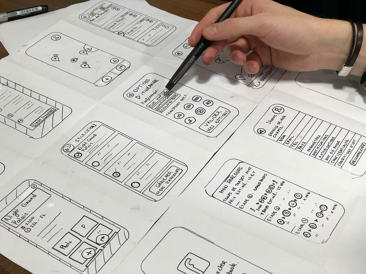
Hi there, you guys! We are back with yet another super amazing blog of ours and we are sure that you will have a really nice time reading this too as we are going to be talking about the future of responsive web design and how you must make decisions as per the insights that you will read here. Know that we can’t wait to share everything that you guys need to know to make informed decisions but before doing that, we would like to take a moment to thank you all for the love and support that you guys send our way and for also making sure that your friends, family members, and favorite colleagues are not only reading our blogs but they are utilizing them for their personal and professional needs as well.
To get to know about the future of responsive web design, it is important that we also talk about what exactly is responsive web design – especially for those of you guys who are still learning these terms in your field of work.
Basic Introduction:
Okay so, a responsive web design is a web design that is created to respond to the behavior and environment of a user. This can include the screen size (of the digital devices that are being used to view a website or two), orientation as well as the platform.
When you create a responsive web design, you ensure that your users are provided with an excellent usability experience and as a result, they will be satisfied to visit your website and if you are good, then they will keep coming back too. Now, that’s a win-win situation, right? But let’s have a look at the benefits of a responsive web design so that we can also share the predictions regarding such websites in the latter part of our blog.
Responsive vs Adaptive:
If you compare responsive web design with adaptive web design, you will notice that a responsive web design dynamically changes the layout of a page based on the type of device that is being used to view the website, its type and width, etc. On the other hand, an adaptive web design detects the screen size and then loads the appropriate layout for the user(s). For a responsive web design, the designers will only have to create one layout of the design that will change as per the device and to be a little more specific only CSS files will change but for an adaptive web design, the design team will have to create different layouts for different devices and both the HTML version, images CSS, JS will load from the start and we all know that is not a very good practice in terms of loading pages. It won’t only require more time to design stuff, than reviewing it and if there are any changes, then there are going to be more rounds of creating designs and reviews and the list goes on so we do not advise you guys to go for adaptive web designs (also, it’s 2024 now, so you have got to keep up with the modern trends and techniques of doing things!).
Future of Responsive Web Design
Let’s now talk about the future of responsive web design after seeing a couple of trends that suggest that this type of web design while is here to stay, will also continue to evolve in this year and beyond that too!
As you guys must be noticing digital devices are becoming smarter with every passing day and giant tech companies around the globe are improving the devices by equipping them with the latest technology and features that web designers will have to evolve their designs accordingly for businesses that are keen to providing best of the best services to their loyal customers; be it happens at a store or on their websites. We would also like to mention here that in 2024 and beyond that as well, web designs will be more focused on a mobile-first approach so that the user experience of mobile users can be improved, AMP is a perfect example. Also, designing web designs for mobile devices first and then moving to larger screens ensures an excellent user experience (UX) across all the devices that will be used to visit the websites.
That is all for today, everyone! If you liked reading the blog and you found it informative then don’t forget to share your valuable feedback with us in the comments section down below. And while you are at it, feel free to share the blog with the people that you love and care for so that they can also utilize the information for their upcoming projects and tasks. Lastly, we would also like you guys to send in your special requests so that we can start working on them and be back here with your requested content and more super soon. Until next time, continue reading our blogs and sharing them within your personal and professional circles.
Recommended:
- Free Apple MacBook Pro 16″ & iPhone 13 Pro Max Responsive Web Design Mockup PSD
- How To Create A Good Looking Website?
- Top 5 Web Design Tips 2023
- 5 Essential Design Tips For Creating More Effective Emails
- 5 Tips For Getting Your Web Design Career Off To A Flying Start
- 9 Tips For Designing Teenager-Friendly Websites


