The web design industry keep on evolving, and each passing year we witness the emergence of some great web trends. The upcoming year is no different, and you’ll get to see a lot of existing web trends flourishing even more. Here are
Top 10 expected web design trends 2015
Growing Usage of Card Design Pattern
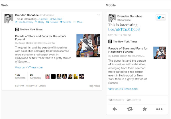
Card design seems to have become a useful and productive tool for designing websites optimized for mobile devices. In fact, card design pattern is used for creating sites for mobile devices. Cards help organize information into columns linked together with related content. What’s more? A card design is a great example of user-centered design, as it allows users to choose what they’re actually interested in, instead of encouraging them to pick something that the website designer intends them to choose. For example, Twitter has moved to the card design pattern and has recently released Cards, a way that enable users to attach multimedia items (like images, videos etc.) to tweets so as to drive more traffic to a website. In the upcoming year, you’ll notice an increase in the usage of card design in several other places as well.
Example
The Rise of Material Design
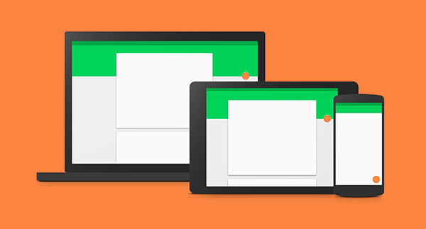
In 2014, Google unveiled a new visual language – called as Material Design – that was designed to be used on Android new operating system. Material design is Google new direction to design mobile websites. However, material design has become one of the hottest trend as a large number of websites have already implemented this design principles into their layout. Material design is nothing more than a flat design with some simple effects including gradients, layering, and animation. In fact, it is because of the growing popularity of Material design that has helped in the evolution and growth of a card design.
Use of Ghost Buttons Will Rise
You might have come across some websites that contains transparent buttons in the form of squares or perhaps rectangles – that performs a certain function as they are clicked – these buttons are called ghost buttons. Also, you’ll notice that ghost buttons are a little larger compared to the standard colored buttons placed somewhere in your site. Since these buttons take a significant amount of space, they are ideal to be used for landing page of a website and best-suited for sites with a large-size photo background, as they easily grab attention of the viewers. These buttons helps to encourage visitors to take some action, and thus, you can expect to see a rise in the use of ghost buttons in the coming year.
25 Examples of Website using Ghost Buttons
As you can see in the screen shot above, HECKFORD website features two ghost buttons: “View our work” and “Why HECKFORD”; that easily captures our attention.
Focus on SVG (Scalable Vector Graphics) Will Increase
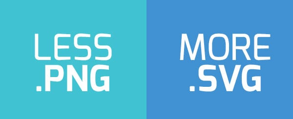
Responsive design isn’t just about making your website layout re-sizing the design blocks to fit the mobile device screen it is being accessed on; the need to make images adapt to the different screen sizes (especially the smaller screens) is also increasing. SVG (also referred to as Scalable Vector Graphics) is a viable solution that helps to scale images perfectly according to the device screen – be it small-size Smartphone screens or high-resolution displays. Since SVG isn’t used for pixel manipulation, a lot of web designers are using it to create some cool looking vector graphics in clean style.
More Preference on Scrolling Over Clicking
You probably have stumble across websites that uses scrolling over clicking. For example, some niche brands such as Apple make use of parallax-scrolling on its product pages instead of clicking. According to some online survey, website engagement increase up to 70 percent by adding parallax scrolling effects. Using scrolling to navigate the website rather than using clicking as part of the navigation technique provides several benefits. It helps to load web pages quickly. Most importantly, it helps to switch from one page to another without refreshing the page again and again. And so, in 2015 you can expect more designers adopting parallax-scrolling over clicking navigation technique.
Responsive Design Will Evolve
It is predicted that mobile will rule the web, as more people will adopt mobile devices for Internet use than desktop. And so, it makes sense that businesses should make their sites mobile-friendly. This is where responsive design comes into the picture. Responsively designed sites provide consistent user experience whether the sites are being viewed from a mobile, tablet or desktop. With the introduction of new technologies like Smart watches, Smart TVs etc., you can expect a lot of exciting improvements coming up with responsive designs in the future.
Better Typography
The time has gone when fonts such as “Arial” or “Times new roman” ruled websites. In fact, over the paste few years, we’ve experienced increase in high-quality, more creative and reasonably-priced web fonts. And as a result, more and more designs are focusing on better typography. You’ll see rise in the accessibility of unique web fonts in 2015. Besides, with the increase in usage of devices with smaller screens and popularity of minimalistic designs, typography will certainly become better than ever before.
More Focus Will be on UI Animation
This year, we saw a rapid increase in use of video backgrounds, simple icon animations and more. Most importantly, although the Flash era has gone, you might have observed how CSS animation is becoming a key element of user-friendly mobile and desktop interfaces. In 2015 you will see a rise in use of animation and an increase in the tools that will be used for creating animations.
Large Background Videos
In 2014, we witnessed an increase in the use large-size, quality images in websites. In the coming year, you will see rise in the use of large-size background videos in a number of sites. Moreover, with faster Internet speeds, it makes sense to add videos to deliver a great user experience. Adding videos to web design will greatly improve your visitors’ experience, as they help convey your message in a shorter time.
More Attention to Micro Interactions
Every product comprises of two main parts: features and details. While features help drive users towards your product, details is what keep them engaged. And microinteractions are the details. When you perform one small task like rate an app, change your app password etc., you’re engaging with a microinteraction. Microinteractions are a part of website and even apps. They are triggered when a user clicks a button or any icon and so on. Micro interaction keep visitors engaged to a website. Unfortunately, micro interactions haven’t received much attention. But they shouldn’t be ignored. Especially, if you want to enhance user experience, you should pay attention to microinteractions. You can expect this web design trend to pervade in the coming years.
Let’s Wrap Up!
We saw emergence of some great web trends in 2014, and it seems that those trends will remain dominant in 2015 as well. However, a few of them will mature offering better user experience. The aforementioned key points will give you a basic idea of some of web design trends you can expect to see in 2015.
About Author:
Ben Wilson is a professional WordPress developer for a leading PSD to WordPress company. He also provides conversion services like HTML to WordPress theme and many more. If you are looking for the aforesaid services feel free to contact him.
Tags: web trends 2015, website design trends 2015, web design trends 2015


Editing content text for grammar should please become a web design trend in 2015.
Parallax is a visual effect where you have one or multiple background layers scrolling in a different speed. That does not affect navigation though. I wonder how google will play with endless scrolling etc.
Nice article for web design trends. Thanks for sharing information…
WordPress web development is the new trend and plugin development is also.