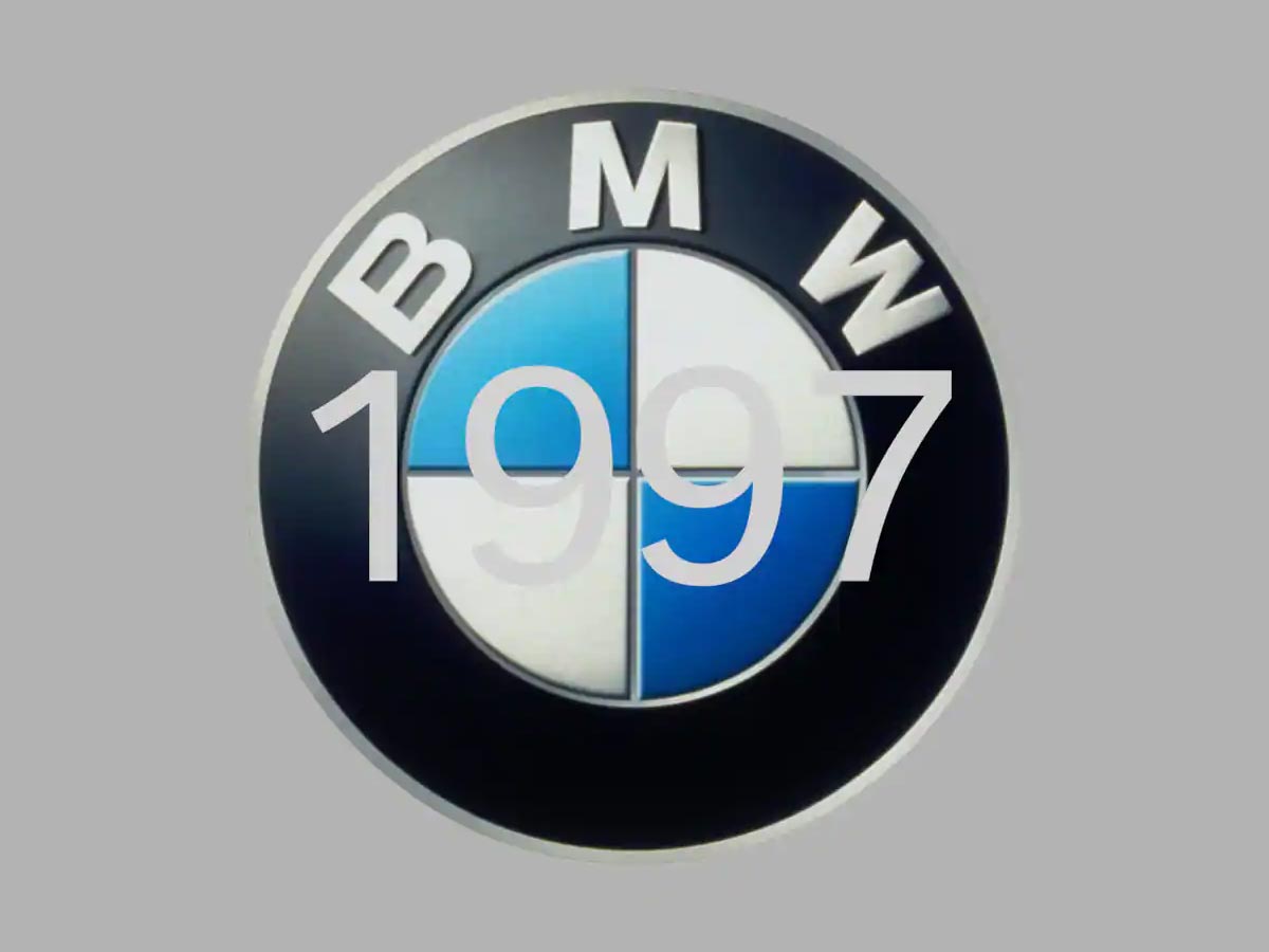
Hey there friends! We would like to thank each one of you for sharing your positive feedback with us and for also sending in your requests on which you want to read more. So, for our today’s blog, we decided to share an interesting piece of writing with you guys and if you are a fan of BMW cars then stick around as we are going to be talking about BMW logo price, its meaning, history as well as a new flat logo update for the year 2020. Let’s get started!
BMW Logo Price is $35.00: Buy from here
Fred Jakobs (Archive Director, BMW Group Classic) says and to quote; “Many people believe the BMW logo is a stylized propeller. But the truth is a little different.” It is also said that there was no need of a BMW logo at first but the history of the name itself goes back to 1917 which emerged when an aircraft engine manufacturer Rapp Motorenwerke but then the company name got changed and the technical equipment, assets as well as the workforce (initially) remained the same.
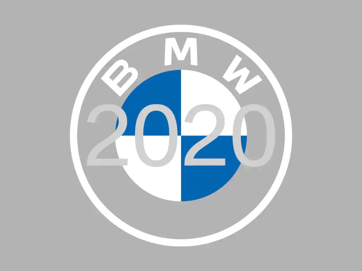
BMW 2020 Flat Logo:
There was also a time in July 1917 when the first commercial register included the name BMW but there was no logos present. Then the ad also did not have the logo or the emblem although it was released in the same month, but the advertisers took a brilliant route and mentioned their range of products which included engines for automobiles, agriculture as well as for boats. Fred says that the initial plan was to produce and to take care of the maintenance of aircraft engines for the German Air Force.
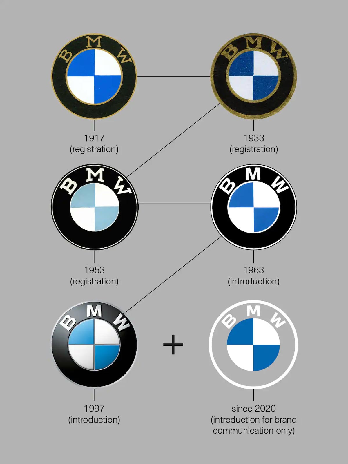
BMW Logo History:
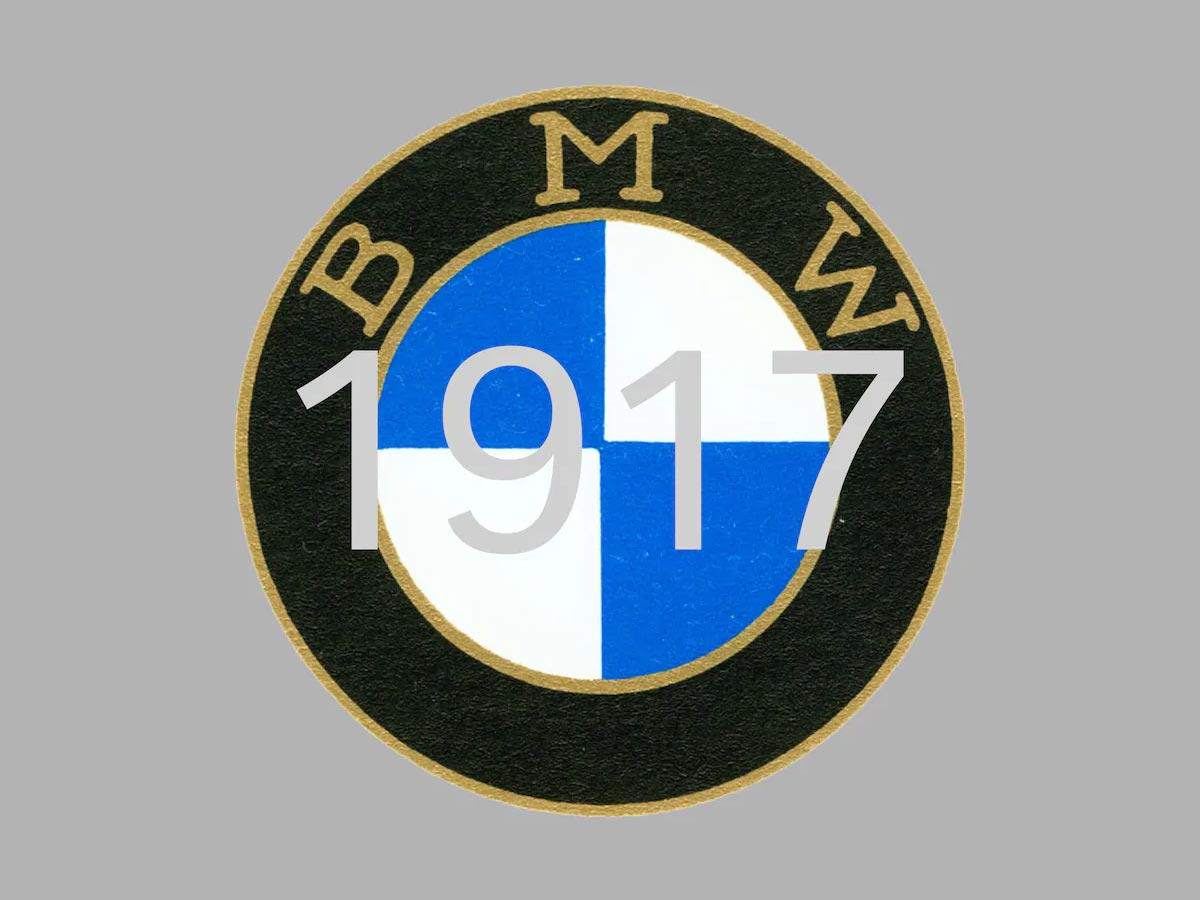
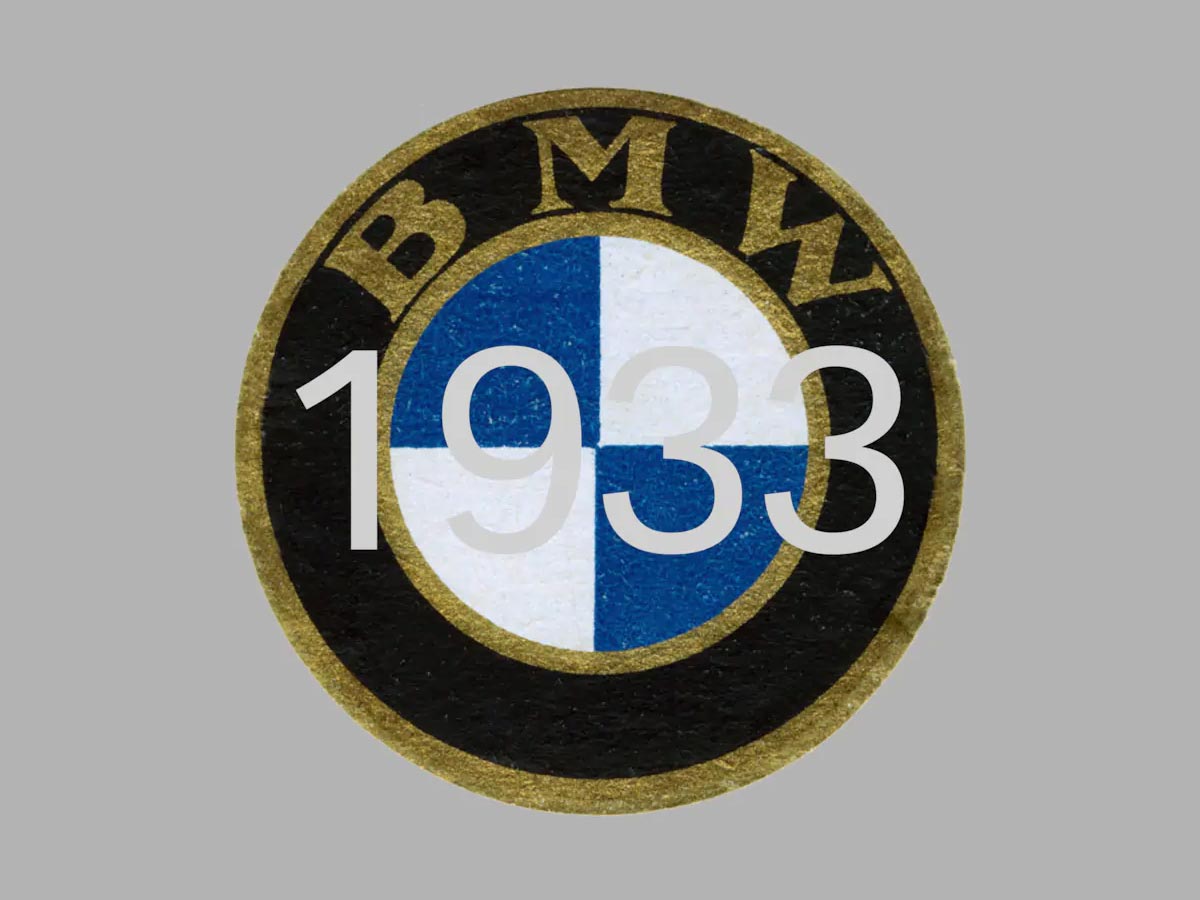
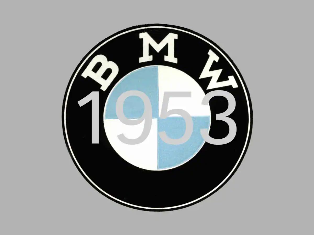
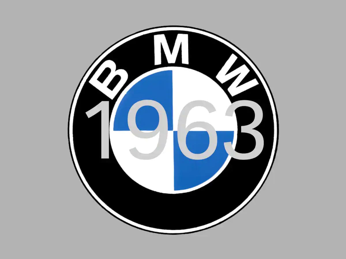
In October 1917, the firm received a logo which served as the badge for the company and was registered in the German Imperial Register of Trademarks. This badge retained the round shape of the old logo of Rapp and the outer ring of the symbol was bounded by two gold lines and bore the letters BMW. It is also important to mention here that the company’s home state Bavaria colors were also added to the symbol which enhanced the aesthetics and gave life to the branding. Another interesting thing to mention here is that the logo had the state colors in reverse as the law (at that time) forbade the advertisers to use state coats of arms etc. on commercial logos.
BMW Meaning (Abbreviation):
Bayerische Motoren Werke AG | Bavarian Motor Works
BMW Logo Meaning:
So, what does the logo mean? Well, the white & blue color in the logo stand for the colors of the state Bavaria (Germany) which is also known as home of BMW. The emblem depicts four colored quadrants in a spinning airplane propeller. There is a widely accepted interpretation of the BMW logo that it represents a propeller and it started from there – right from the start.
In early days, the airplane’s propeller was considered a myth as BMW made an ad in 1929 that showed an airplane with its rotating propeller and this depiction fit well with the company’s product range and how they were committed to provide engines and maintenance etc. to the aircrafts. Later on, the company decided to explicitly link their propeller ad to the symbol. It is also said that BMW did not make any efforts to unlink the myth from their symbols etc. and it only backed the idea which we think was a wise move.
Now, it was time to give more meaning to the logo and the company made this brand a relationship which resulted in more and more customers as they were ready to put in their trust in BMW but such huge things do not matter in days or weeks, it can take up to several years to come to a point where your name becomes more than just a brand that sells stuff. The new logo of BMW represents openness and clarity ,and this was said by the Jens Thiemer who happens to be the Senior Vice President Customer & Brand BMW.
Through the new logo, the customers are more than welcome to become a part of the BMW world – this was the intention and ideology behind the new “transparent variant”. As the world is becoming digitalized with each passing day, it became important for the company to take a step and create an identity that can resonate with the audience which wants to see newer and better stuff, branding that is relatable, branding that is easy to connect with.
We are sure that you can notice that the logo also depicts mobility & driving pleasure too and we think that’s another smart move which was made by the advertisers to stay connected and relevant with their audience.
And that’s all for today, guys! We hope that you will enjoy reading this blog and the information that we have shared here will also help you in understanding how brands think and create their identity for their audience. Don’t forget to share this blog with your friends too!
Recommended:
- Why Are Line Art Logos Preferred by Clients?
- 10+ Perfect Examples of Logo Animations For Instant Approval
- 66 Clever Wordmarks | Inspiration for Amateur Logo Designers
- 25 Modern Cow Animal Logo Design Examples For Inspiration


