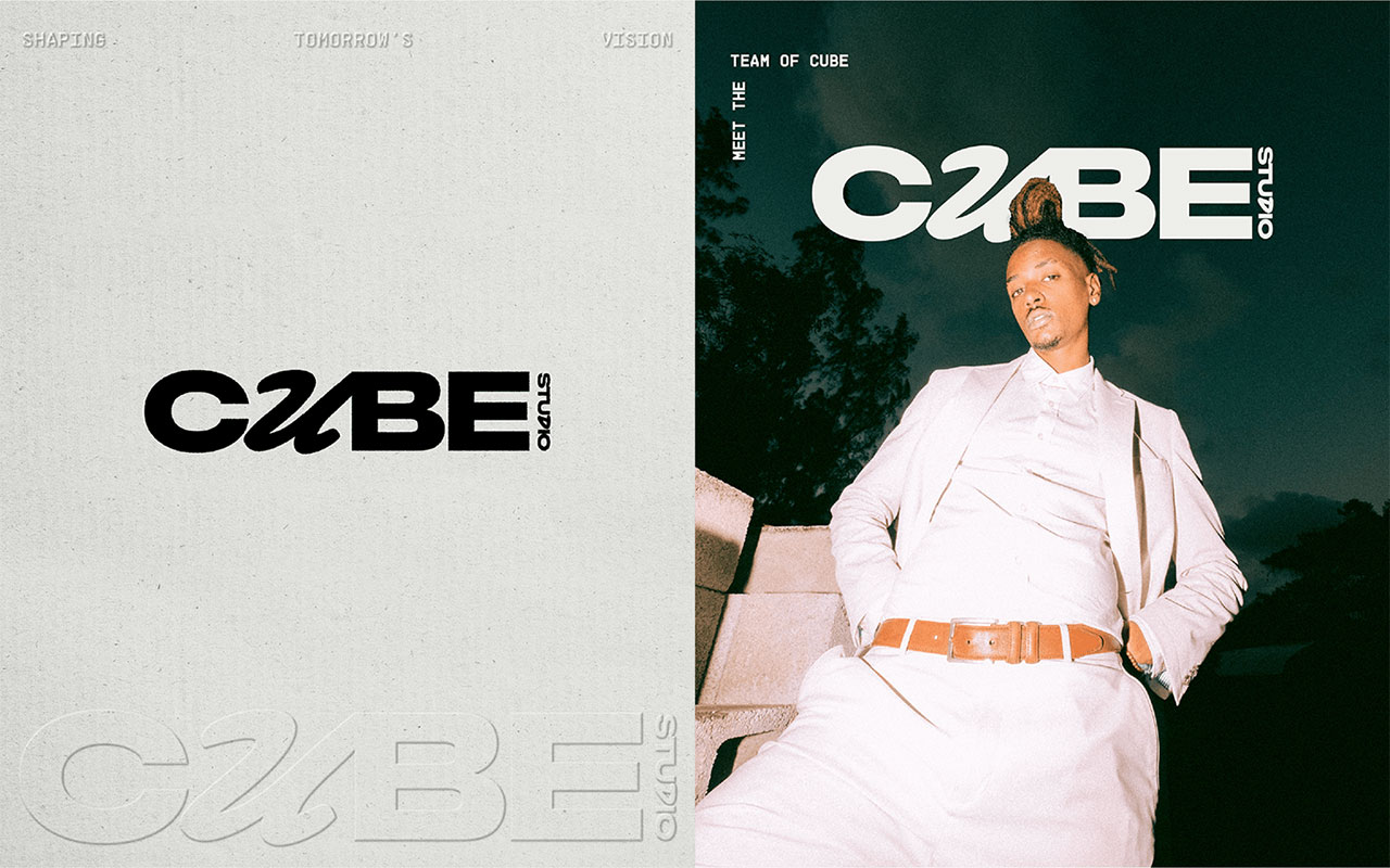
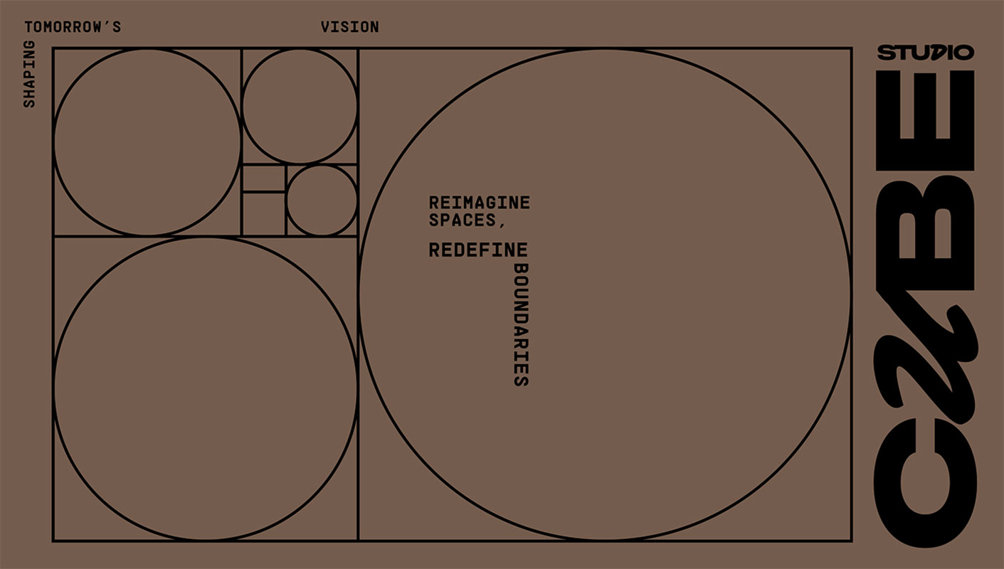
Hi there, you guys! We are back with yet another super useful and interesting blog of ours and we know that you all are going to love reading it as we have paired it with the identity design of an architect brand ‘Cube Studio’ which will not only be an amazing read for you guys but you will also be able to think of a couple of great ideas to work on brand identity designs as well. We can’t wait to share the essential information that you guys will require to work on a kickass brand identity design but before we do that, we would like to take a moment to thank you all for the love and support that you send our way and for always making sure that you are utilizing the blogs for your personal and commercial projects as well.
Okay so, a brand’s identity design refers to the visual representation and overall look and feel of a brand. It encompasses various elements such as the logo, color palette, typography, imagery and overall design system that is used consistently across all brand touchpoints. Here are some key aspects of brand identity design that you must always keep in mind while working on creating a brand identity design:
LOGO:
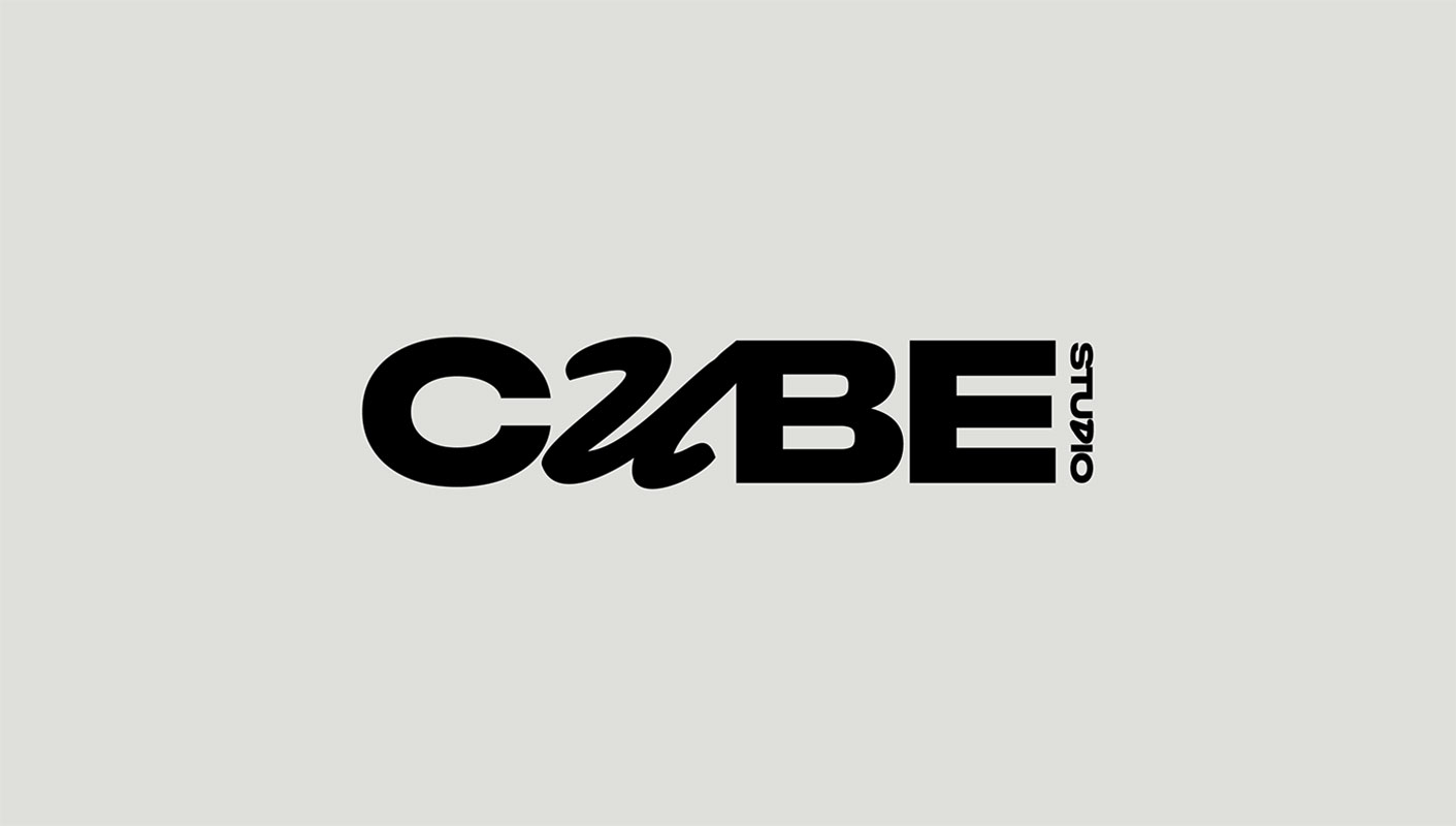
The logo is a visual symbol that represents the brand and serves as its recognizable mark. It should be unique, memorable and reflect the brand’s values, personality and positioning efficiently.
COLOR PALETTE:
The selection of colors used in a brand’s identity design is crucial as colors evoke specific emotions and associations. A well-defined color palette helps create a cohesive and recognizable brand identity. Brands often have primary and secondary colors that work harmoniously and are used consistently in various applications.
TYPOGRAPHY:
The choice of fonts and typography plays a significant role in brand identity design. Fonts can convey different tones and personalities whether they are modern, traditional, elegant or playful. Brands typically select a primary font for headings and titles and a secondary font for body text to maintain consistency.
IMAGERY AND VISUAL STYLE:
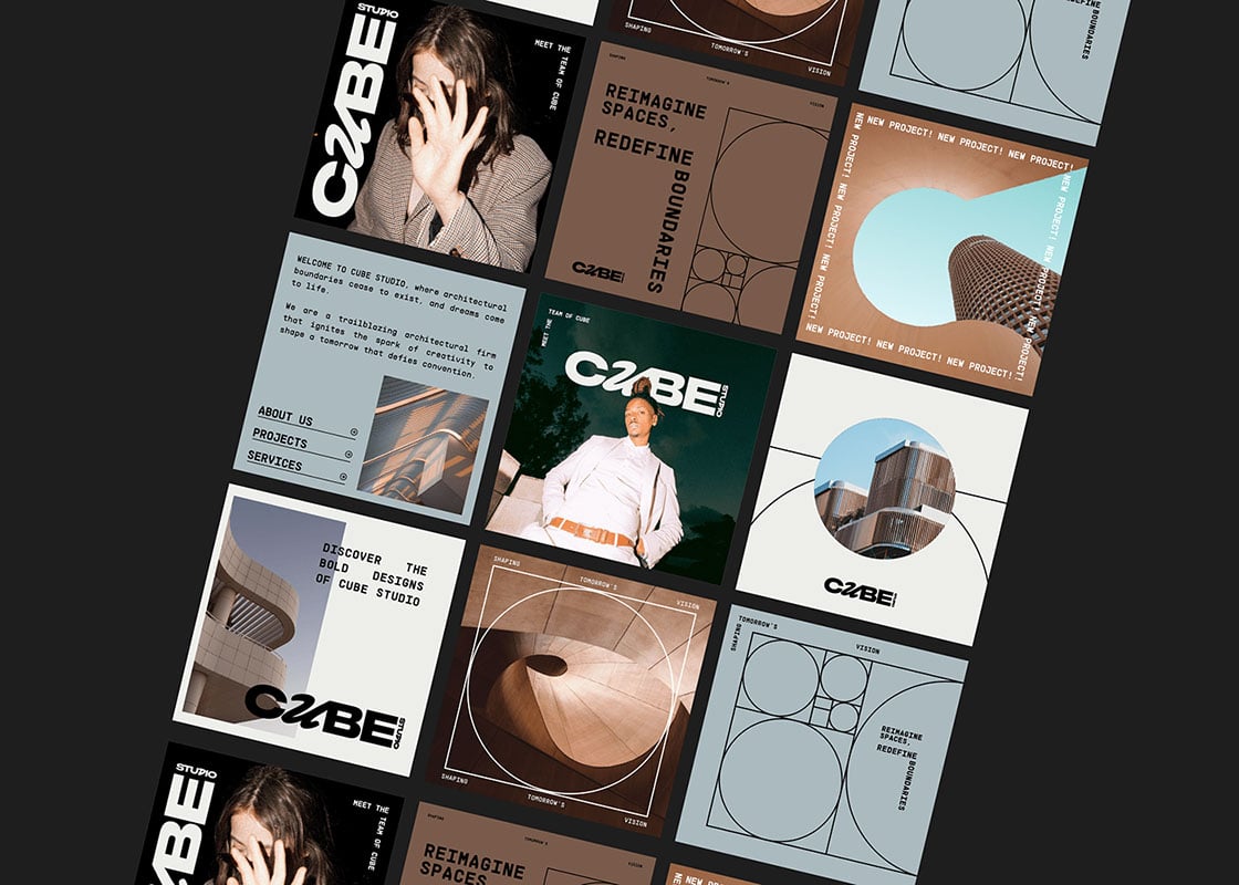
The use of imagery, photography and illustrations in brand identity design contributes to the brand’s visual language. The style of visuals should align with the brand’s personality and target audience; whether it’s clean and minimalist, bold and energetic or warm and organic.
DESIGN SYSTEM:
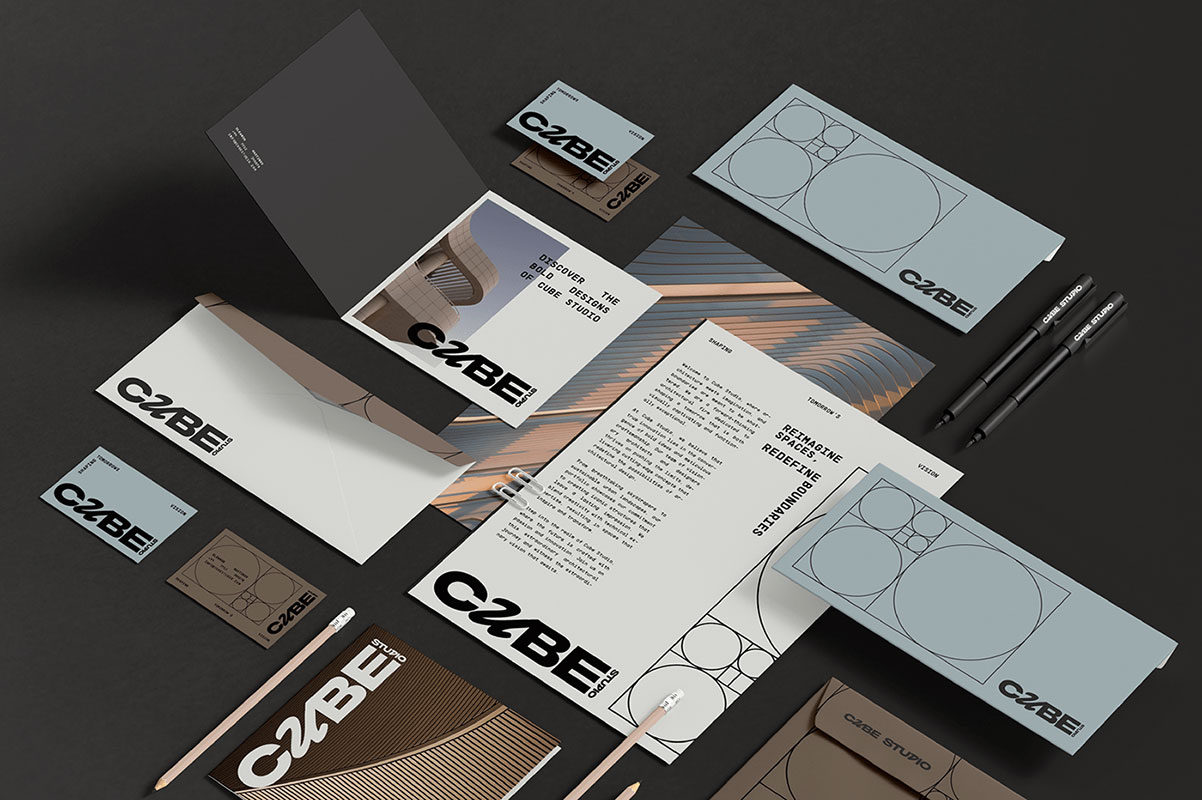
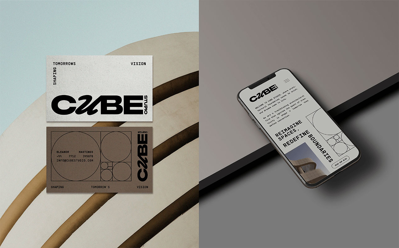
A comprehensive brand identity design often includes guidelines or a design system that outlines how all visual elements should be used. These guidelines cover logo usage, color codes, typography rules, spacing guidelines and other specifications to ensure consistency across various brand touchpoints such as packaging, websites, advertisements and social media. And if you are working on a brand identity design that is yet to be launched, we suggest you pay full attention to the design system and keep it in the record for current and new hirings as well.
BRAND VOICE AND TONE:
Although not visual elements, the brand’s voice and tone are integral parts of its identity. They define the language, messaging style and overall personality conveyed in written communication. Consistency in voice and tone helps create a cohesive brand experience.
Always keep in mind that a well-crafted brand identity design captures the essence of a brand and helps establish recognition, build trust and differentiate it from competitors. It is essential for creating a consistent and memorable brand experience across all interactions with customers and stakeholders. That is what the creative and design agency for the Cube Studio has tried to achieve through their brilliant and unique approach. The logo stands out efficiently and effectively while the color palette is powerful enough to make a long lasting impression. And when you look at the imagery and other visuals, you will notice how clean the overall look and feel of the brand identity design is yet it is so convincing that you can’t look away but have to pause for a second a check out what the brand is about. That’s the beauty of an attractive brand identity design; that is not only pretty for the eyes but it also makes sense too.
That is all for today, you guys! We hope that you enjoyed reading the blog and that you will also take out some time from your busy schedules and go through the brand identity design of the Cube Studio and allow yourself to get fully inspired too. We also hope that once you have taken down all the learnings, you will also be able to work on amazing things in the near future as well. We would also like you all to drop in your feedback in the comments section down below and while you are at it, we would also like to know if you have special requests to make then feel free to send them our way too and we will be back super soon with your requested content and more.
Credit: source
Cube Studio | Architect Brand Identity for Inspiration
Recommended:
- Good News | A Good Coffee Brand Identity Design
- A Playful Berlim Timtim Pastry Brand Identity For Inspiration
- AI-Powered Home Automation Brand Identity Design
- Brand Identity Inspiration 2023 | Digital Health Platform Nphies
- Baraa Creative Studio Brand Identity for Inspiration
- The Hermitage Hotel Brand Identity for Inspiration
- Woodwork Brand Identity Design | Varti By Ukrainian Crafters


