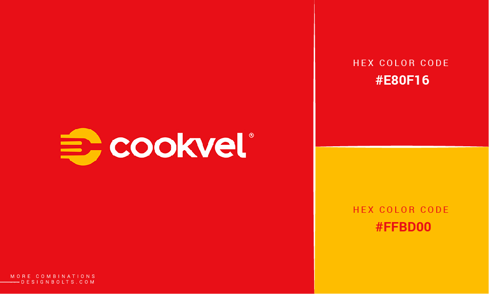
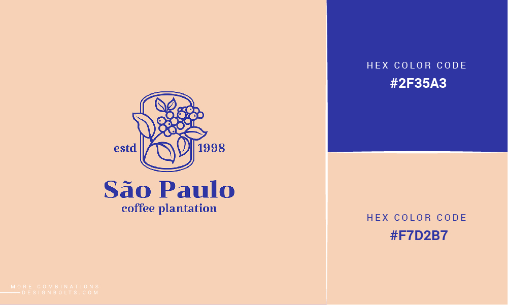
Hi there everybody! We hope that you enjoyed reading our previous blog and that our free, yet highly editable mock-up PSD files are also helping you create awesome content for your personal and commercial design projects. In our today’s blog, we will discuss Color psychology, its impacts and we will also share 10 good 2 color combinations that look great together.
As basic as it may sound but we would love to share it here that color psychology is basically the study of colors and how they impact human behavior. You haven’t realized it till now but know that colors have a certain impact on perceptions (that are not too obvious but are there) for example; a food item and how it would taste or the fact that colors have characteristics that can cause a certain set of emotions in different people.
Not just taste, but colors also have the power to increase our blood pressure level. And interestingly, certain colors can also activate metabolism as well and while we are at it, we would also mention that colors are and can cause eyestrain too so, if you are looking at darker colors for a long time, chances are you will feel a pressure on your eyes and, on a side note; you need to stop looking at such colors. It could be you playing a video game, or reading a book or solving a puzzle maybe, but whatever it is, allow yourself to take a break.
Marketers and advertisers are well aware with how colors can be used to signal an action and that is why all of us see things happening around us that make us do something – we are going for a walk and we get fascinated to see the colors on a billboard or we feel compelled to check out a business after looking at one of their sponsored creative posts on our news feed, and we also want to spend our money on their products because, well the colors and the communication used by the business is so intriguing and attractive that we feel that we need to purchase this and that product for ourselves or for our loved ones.
Recommended: 10 Best 2 Color Combinations For Logo Design with Free Swatches
Anything and everything that you guys happen to see around you is a result of (many) well thought processes including the process in which it is decided that this color will be suitable to convince the potential customers to take an action and that color and its tones must be ruled out as they are not as influential as the already chosen colors. So, when you happen to look at a stunning hoarding/billboard or a streamer that you cannot forget, that is because the marketers and advertisers knew what sort of an impact, they were planning to make on you.
Design teams as well as the ones who are supposed to market the content know which buttons to push (and when) and they create designs that depict harmony and only those visual aids are used that are eyes friendly so much so that the colors are designed so carefully that you look at the main color and the most striking color first and then notice the other color(s) and design elements that are there but have less significance than the main message.
That was for the ones who are at the receiving end of ads and communication that is created for them so that they can engage with the content etc. Now, let’s talk about businesses that are working in the market but are not (really) keeping up with the trends and techniques to attract their potential audiences. Always remember that whatever you will design for yourself will also reflect as the brand values and commitments too so, when you sit down with your team members from the creative, design, and advertising departments; make sure that all of you are well versed and aware of the color psychology, its impacts and how you can make the most of it in the right way so that whatever you are doing is not going to get wasted, you know.
Recommended: 7 Color Trends for 2021 Every Design Student Should Be Aware Of
Here is a simple trick to make sure that your strategies are on point: make sure that you have the data and insights of the audiences that you are going to market your business, services and products. Their age groups, genders, interests, etc. will help you determine what sort of color palettes will attract them, and the ones that do not fall in the category of being liked/praised, drop them immediately.
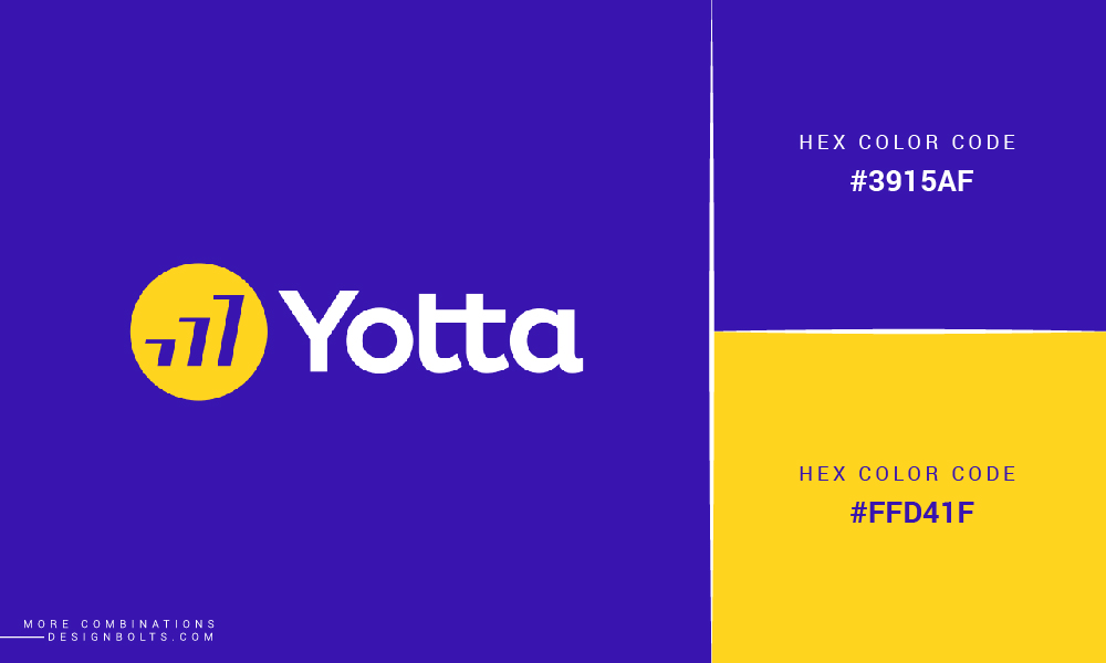
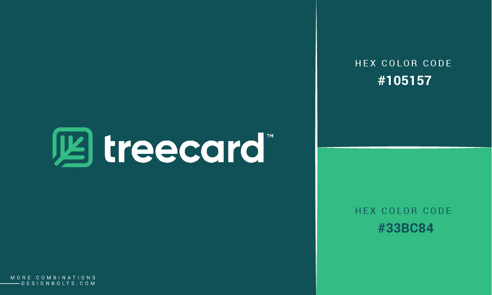
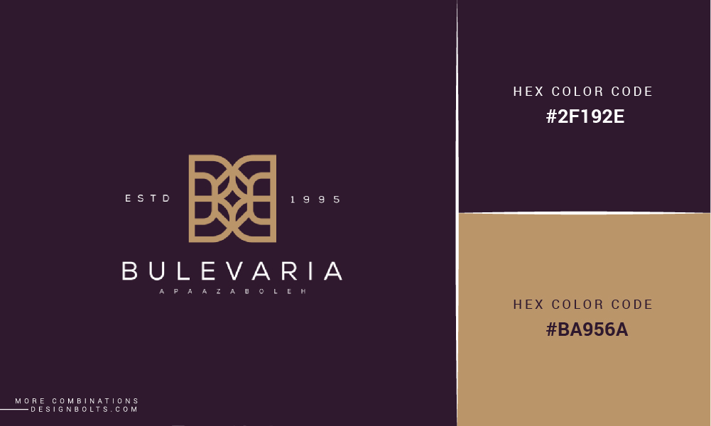
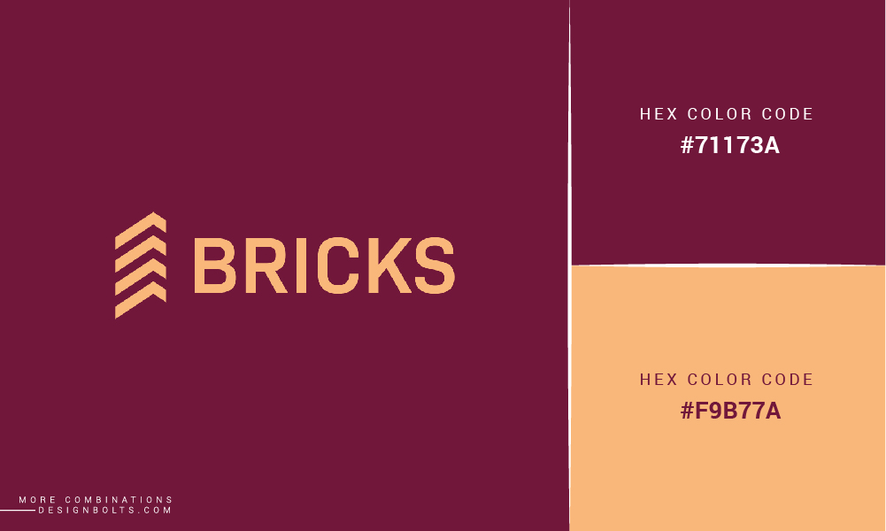
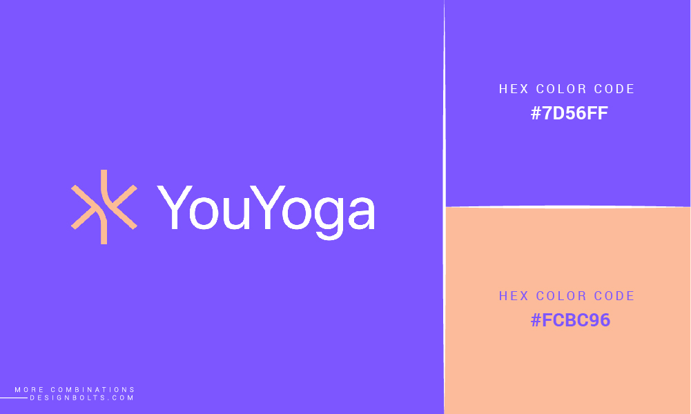
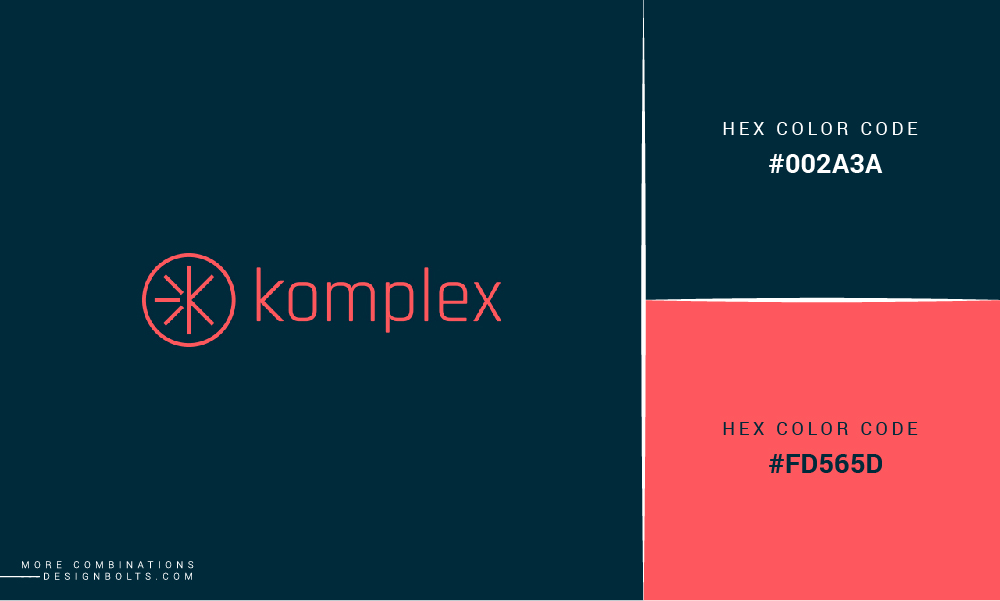
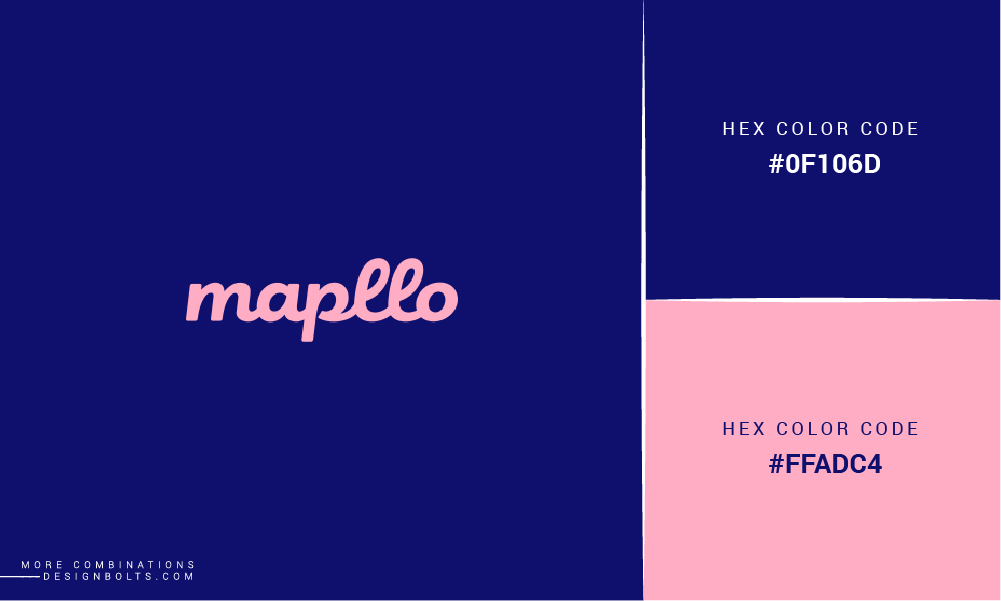
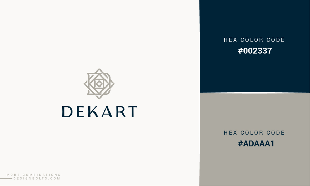
Now, it is time for us to leave you guys with 10 good color combinations that look great together! Feel free to share your feedback with us in the comments section and don’t forget to invite your friends to read our blog as well.
10 Good 2 Color Combinations That Look Great Together
Credits: 1, 2, 3, 4, 5, 6, 7, 8
Recommended:
- 50+ Best Pastel Color Combinations for Fabrics To Attract More People
- 100+ Best Cool Color Combinations for Summer by Color Palettes
- 10 Free Best Trendy Camo Clothing Army Seamless Patterns & 4 Color Combinations
- 20 Awesome Free Gradient Color Combinations For Web Based Logo Designs
- 8 Awesome Color Combinations / Schemes for Your 2016 Graphic Design Projects
- 10 Best 3 Color Combinations For Logo Design with Free Swatches
- 50 Best Color Combinations for Graphic Design Projects by Designseeds
- 5 Best Color Schemes for Branding With Examples
- Do You Want To Know The Most Favorite Colors Of 2019?


