Hi there, hello there! We hope that you guys had a great time reading our previous blog and that this one will help you understand a number of things too but before we start talking about what we have for you today, we would like to thank you all for sharing your feedback and suggestions on our content and for also making sure that your friends get to read our blogs and use our free mock-ups and design templates as well.
Have you ever wondered what is that color attracts the human eye the most? We can bet that you have because that is like the core of any design that you plan to create for yourself or for your commercial projects. We know that whenever we sit down to initiate a creative thought process of any design task whatsoever and while finalizing the design elements at the same time we also work on the color palette so that we do not get overwhelmed with the presence of these stunningly beautiful colors that we happen to see around us, or on the tools that we are using, etc.
Anyone and everyone who is associated with the design world in one way or the other would know and understand what we are talking about, but if you are new to all of this or if you are an enthusiast and want to know how colors are picked, then you must know the thought process behind it. Any color, design element, font, and styles that are picked to create a design are chosen for a reason and that is to attract the audiences.
If whatever you have created does not or cannot attract the target market or masses in general, then the designs have to be revisited, the strategies have to be made again and they must work in accordance with (not only) the liking and disliking of the masses but also the facts that have been researched on and prove to bring meaningful insights and data. Having said that; we would like to share it with you guys that the green color is the color that attracts the human eye the most. I bet you must be thinking about red. Now, let us dig a little deeper and know what exactly we are going to offer in this article.
Recommended: 2021 Should Be The End Of Flat Design
Sure, you would have many different colors that you call your favorite or that you must be wondering that red would be that color or even black, yellow or gold but it is the color green that attracts the eyes. Now, we are not saying that you should start using bright greens or any sorts of green color for creating billboards, banners, posters, and even your digital content, but we would like to suggest you guys to include this color as it can help you get the views that you want both on the ground as well as online.
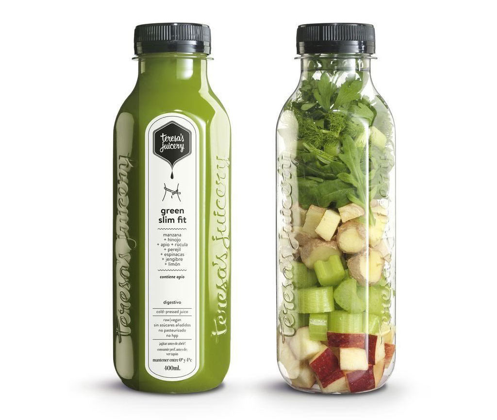
Allow us to now share what green color is used to represent so that it becomes easier for you to pick it for your upcoming design projects! Green is considered to be the color of life and renewal – as simple as that but there is more to it. It is also used to depict positive energy and nature as well, you must have seen many businesses that use green color in their packaging designs and those businesses normally are those that sell organic foods, juices and other drinks like coffees, beers etc.

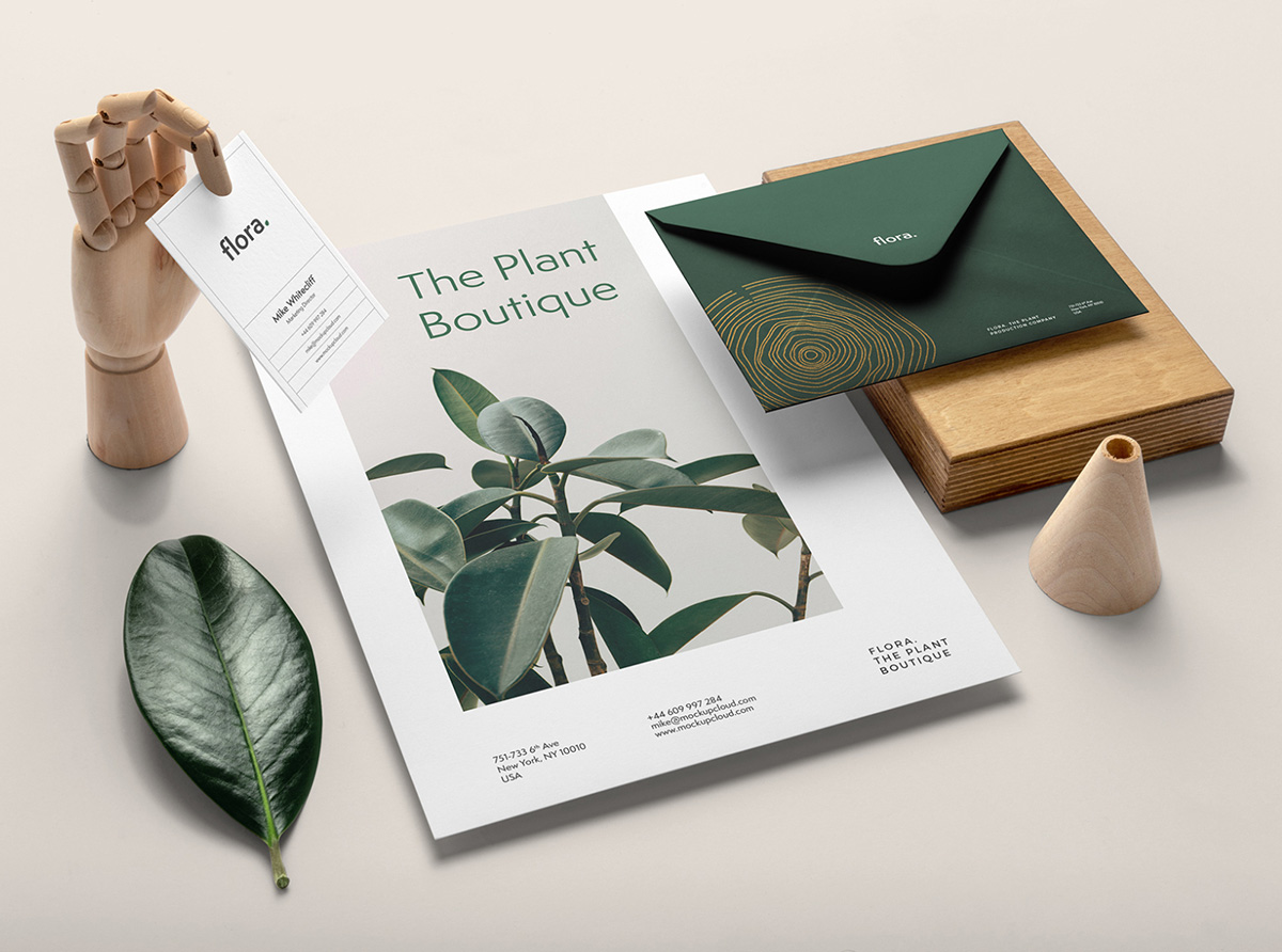
Green color is also used by apparel brands as well to represent growth, harmony, freshness, as well as safety and then there are businesses that are constantly working for the well-being of the planet and the living beings that live on the planet to create environment-friendly content, and products. This color is also used to depict peace and health as well so you can figure out how to use it for your brands and business in one way or the other. It won’t be too hard to analyze what tones and palettes to use for your own designs and communication but whatever you do, make sure that you have taken into consideration the effectiveness and long term plan and results as well and only then you will be able to stay on the right track.
Recommended: 10 Good 2 Color Combinations 2021 That Look Great Together
That’s all for today, friends! We hope that will be able to pick and choose the perfect colors for your communication on all the platforms that you and your businesses use to promote the products and services. If you liked reading it, don’t forget to share it with your favorite colleagues and friends as well and while you are at it, we would love to hear your thoughts so, feel free to share them in our comments section.
Also, if you guys have any particular requests related to design and creativity, do let us know and we will share them in respective blogs here – until then, stay safe and keep creating amazing designs.
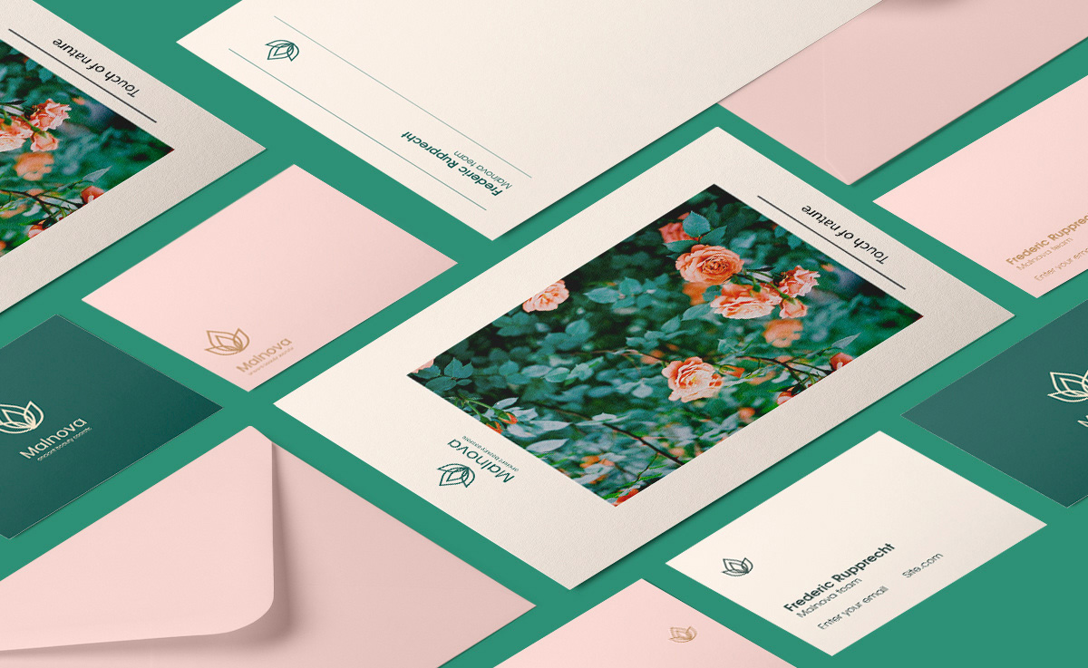
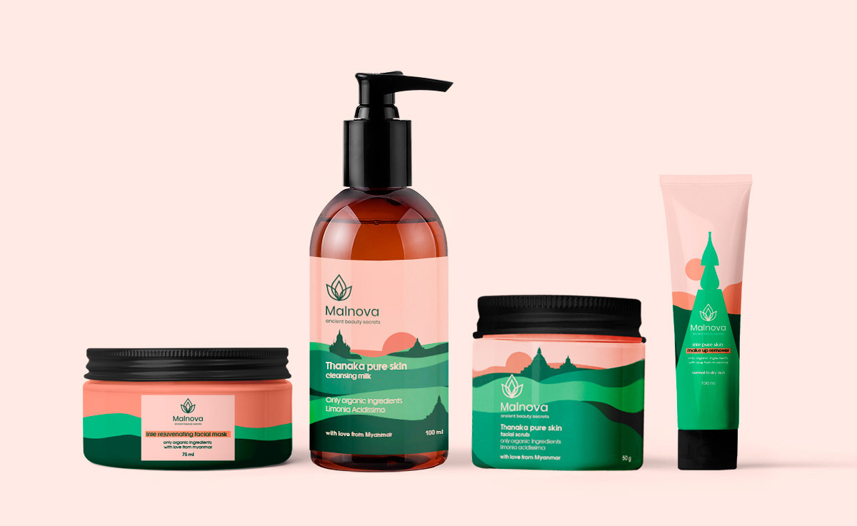
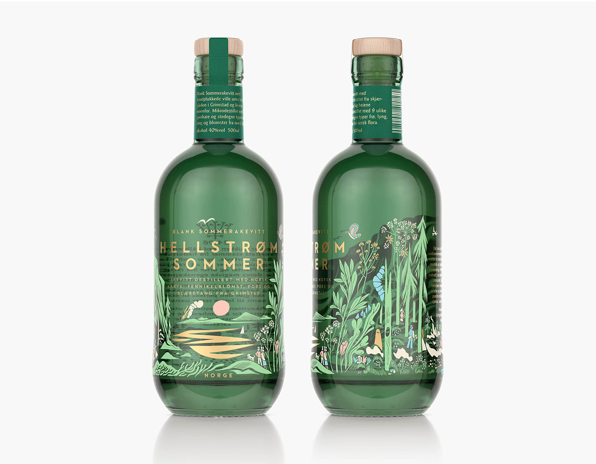
Some Commercial Projects With Green Colors:
Recommended:
- 5 Best Color Schemes for Branding With Examples
- 7 Color Trends for 2021 Every Design Student Should Be Aware Of
- Difference Between CMYK, Spot Color & Process Color for Printing?
- Do You Want To Know The Most Favorite Colors Of 2019?
- 10 Best 4 Color Combination Ideas for Logo Design + Free Swatches
- 50+ Best Pastel Color Combinations for Fabrics To Attract More People
- 100+ Best Cool Color Combinations for Summer by Color Palettes
- 10 Best 2 Color Combination Ideas for Logo Design + Free Swatches