Typography is a dexterous art that is learnt with utmost practice and repetitive try on part of the artist. Obviously unless you make it your passion, you can never bring beauty and perfection into it. So always love what you do and do what you love, either way chances of success are mighty.
Skill is obtained with focus, determination and a lot of mental strength that a person has to give in, otherwise it will only be a stale thing that nobody would like to watch it again. Designers are carefree, they never know what they might be lacking so they need to be extra alert, open eyed and open ears as well. They might be missing out on so many opportunities just because they might not be having any guidelines about an art genre to go about.
Today I am unfolding before you a post which is a must read typography guide for all types of designers. This guide is apt for all the designers and amateurs who are going through a learning phase where knowing the tools and techniques are mandatory. This post has the guidelines that you may not know or perhaps that are in your subconscious but you don’t know the exact way to proceed ahead.
Credit: Pixel77
21 Illustrations to learn the secrets of typography
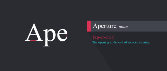
1. Aperture
Opening of the letter open counter
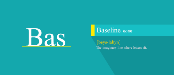
2. Baseline
Baseline is a line on which the letters are being written upon (on which letters sit) and below which descenders extend.
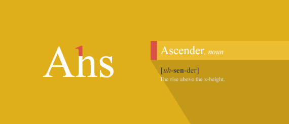
3. Asender
Ascender in typography tells the mean line of a font. It makes the font more impressive and readable.
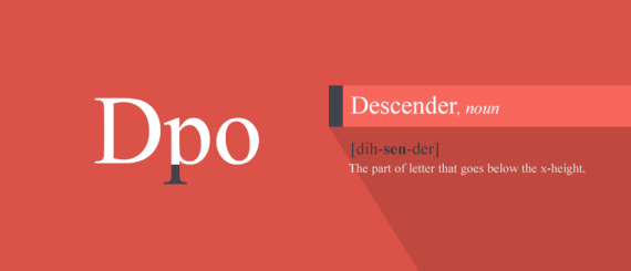
4. Descender
Descender is that part of the letter that goes below the x-height.
5. Uppercase / Cap Height
Uppercase is just another name of capital letters.
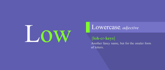
6. Lowercase
Lowercase is used for smaller letters.
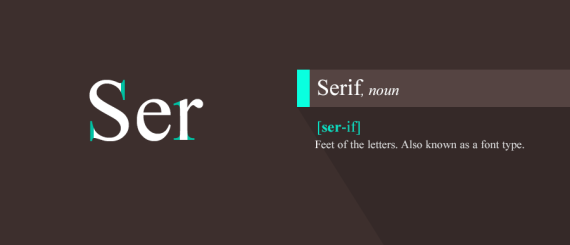
7. Serif
Serif is feet of the letters, shoulder comes from of a stem, stem is primary vertical stroke and so forth.
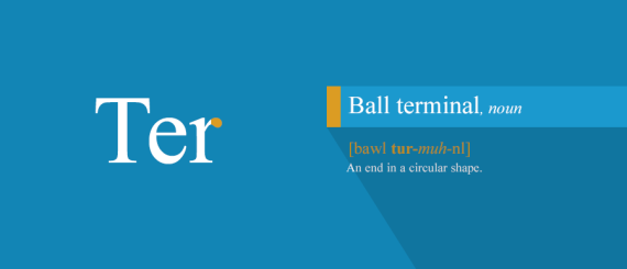
8. Ball Terminal
End and starting point of the letter “r” or “a”
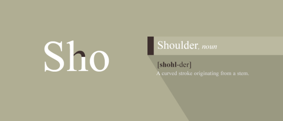
9. Shoulder
A curved stroke coming from a stem.
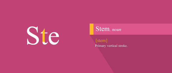
10. Stem
Very first stoke when typography start
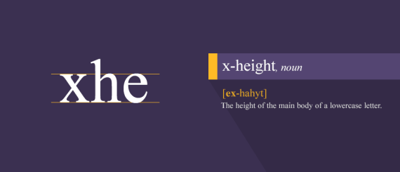
11. x-height
Height of the lowercase letter
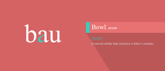
12. Bowl
Curved stroke that made letter counter
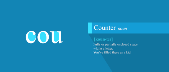
13. Counter
Space inside letters
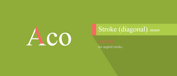
14. Stroke (Diagonal)
Any diagonal or angular stoke
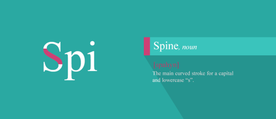
15. Spine
The middle or the most significant part of the letter
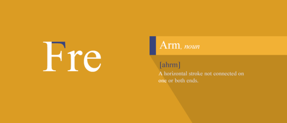
16. Arm
Horizontal stoke that is connected with stem
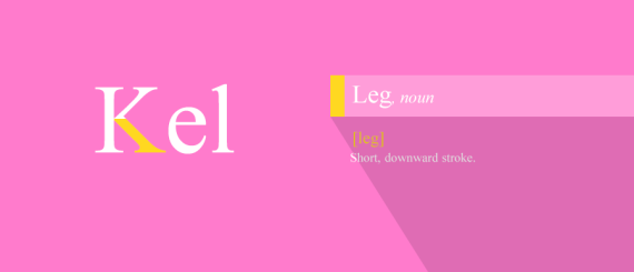
17. Leg
Small stokes that go down and touch the baseline or even cross them
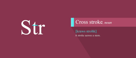
18. Cross Stroke
Stroke across stem
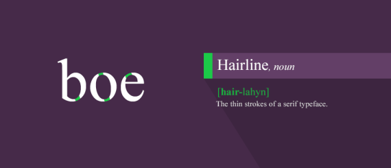
19. Hairline
Thin part of the stoke helps to connect the bowl part of the type
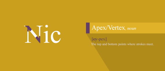
20. Apex / Vertex
Top and bottom pints where strokes meet
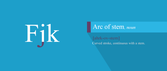
21. Arc of Stem
Curved stoke that comes or continues with a stem
Hope you get the clue, that “what is what” and how it helps in knowing the art of typography. The implementation becomes easy this way to be understood.
Share it with your mates who want to attain the knowledge of graphic designing and typography art. Subscribe us for more interesting posts.
More Inspiring Typography You would love share:
- 40 Beautiful Inspiring Typography & Logotype Examples by Wells Collins
- 50+ Beautiful Inspiring Typography Collection from Instagram
- 20+ Inspiring Typography & Lettering Work by Lucas Young
- 50+ Inspiring Typography Hand Lettering Quotes by Eugenia Clara
- 30+ Inspiring Typography Quotes For Creative Professionals
- 20+ Inspiring Handwritten Typography Quotes by Joao Neves
- 30+ Absolutely Stunning Yet Inspiring Hand Lettering Examples By Nim Ben-Reuven
- 100+ Beautiful Inspirational Typography Quotes Collection from Instagram
- 50+ Inspiring Brushpen & Crayola Lettering Examples by David Milan
- My Most Favorite 30 Inspirational Typography Quotes For Graphic Designers


