Your brand’s colours are so important when it comes to business. The psychology behind the colours you use is way more significant than you may believe, helping establish a variety of core values and ultimately setting your customers on a path to using them.
They should be consistent across all areas of your business, from your logo to your website. The latter of which can prove hugely influential, so it’s vital that you get that element right. That can be tricky, especially if you aren’t well versed in web design.
Help is at hand though with dozens of great website builders that can help keep your design, colour scheme and branding consistent in order to keep your messages consistent. Take Duda, for example, hundreds of brands and agencies have trusted the website builder and from that they have countless success stories and a big part of that is getting the brand colours right.
Studies have found that brand colours can influence as much as 80% of customers purchasing decision, but what does each colour say about you as a brand? We delve into the various colours to give you insight on what your business may be saying about you…
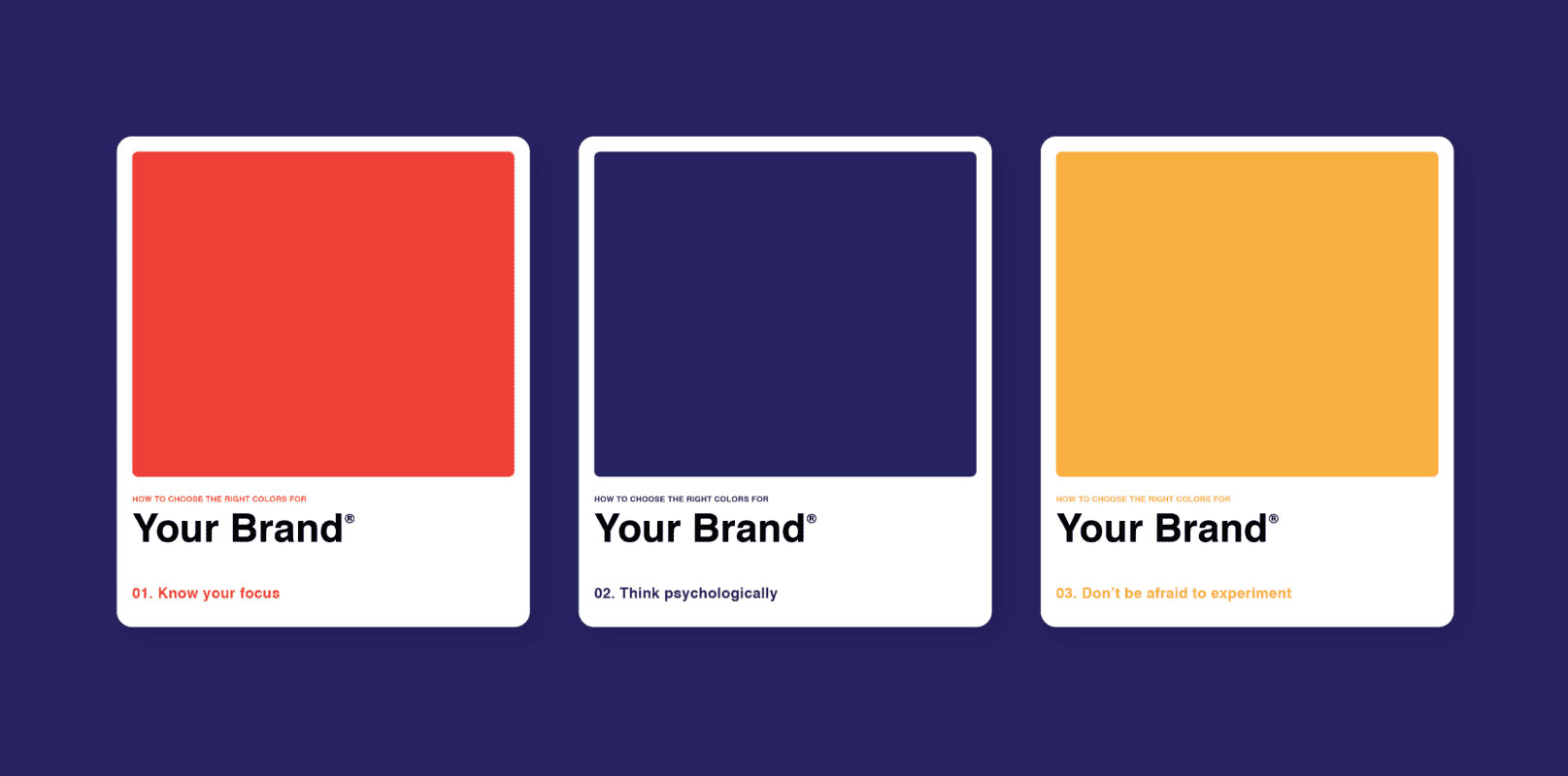
Red
Red is a colour you see on a huge range of brands, from the likes of McDonalds to Vodafone, to many, many more. It’s said that red is a colour that evokes passion, energy and is one of the more attention-grabbing colours within a brand. You’ll also find that it delivers great energy and excitement within people.
Blue
On the other hand, blue is a colour that is more likely to put someone at ease. Reminiscent of the ocean and the sky, it’s a largely calming colour that suggests trust and dependability, which is naturally an important trait for any business.
Think of the brands that use the colour blue. What do you think about them? Security and confidence most likely.
Purple
Purple is an interesting colour to use with a brand. While you don’t see it as often, there’s a true sense of sophistication and royalty with the colour, which is why you tend to see it on more luxurious brands. There’s also an air of spirituality and mystery to it which again offers a little more intrigue and magic to your brand.
Green
Like blue, green is a natural and calming colour. Its association with the grass and the trees offer notes of freshness, which is why you see the colour so often in the food industry. It’s a colour that also signifies health and wellbeing, while you’ll also be more likely to see a brand as safe and trustworthy when it has green in the branding.
Yellow
Yellow is one of the colours that can really stand out within branding due to its brightness and there’s a lot of positive energy that comes from the colour. Most reminiscent of the sun, it is a colour that symbolises hope and optimism, while it’s also most associated with happiness, light and creativity.
Orange
Similarly, orange is another optimistic colour that brings out the more playful side of a brand. It’s outgoing and cheerful and is likely to put more of a spring in the step of your brand. A brand that uses orange will often portray a more adventurous feeling combining the brightness and creativity of yellow with the true passion of red.
Brown
As is the case with green, brown is a more natural and earthy colour and many of the brands that use it will want to promote values of sustainability and nature. It’s a much trickier colour to integrate in branding, but get it right and you can really promote your ethics and morals with it.
Recommended:
- What Color Attracts Human Eye the Most
- 5 Best Color Schemes for Branding With Examples
- 10 Best 4 Color Combination Ideas for Logo Design + Free Swatches
- Do Certain Colors Increase Online Conversions?
- 10 Best 3 Color Combinations For Logo Design with Free Swatches