Hey there awesome fans! Happy New Year to all of you and we know that in this year too, we all will be working on amazing designs and will create mind blowing campaigns for our own brands as well as for our clients and we really hope and pray that this year is full of creativity and nothing else but that.
Recommended: 50+ Creative Barcode Design For Inspiration
Also, now that we are literally ‘in’ 2020, we must know that design trends will also change and evolve (and for the good) but what is it going to be about?! Or is it too soon to decide or say? Well, no matter what happens, we are sure that something new is in the pipeline and we are about to see it very soon. But before we get to see what 2020 holds especially in the context of graphic designing, let’s have a look on all the things (that matter) when it comes to deciding between colorful or minimalistic packaging design!
Colorful Packaging Designs
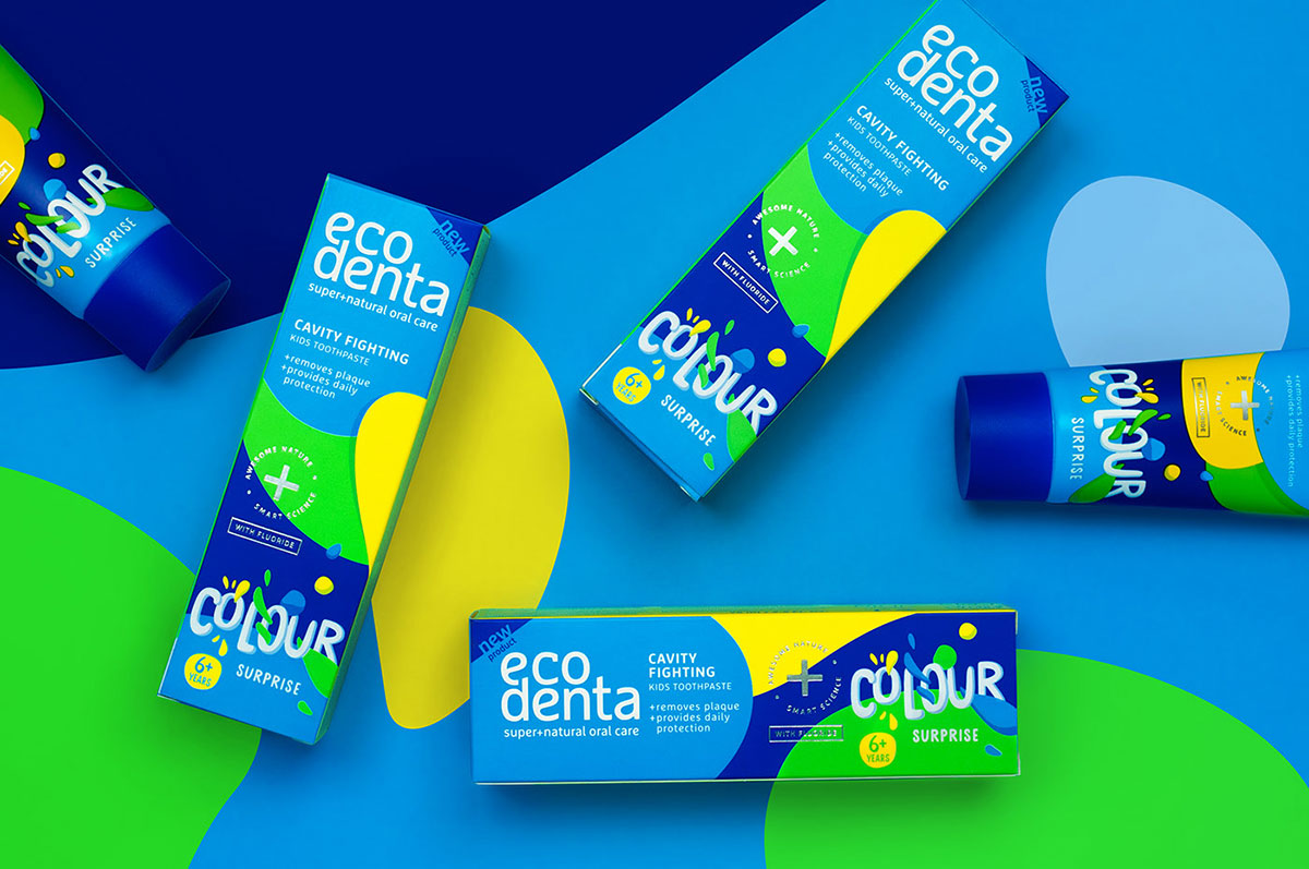
Colorful packaging design has always been the go to design approach for years and for all the right reasons – to be honest! We are sure that you would have seen multiple colorful packaging designs almost every day and the reason of that approach being so common is that the audience needed to see that. Also, colors have always meant that the design has been brought to life and it is in the heads and hands of the creative thinkers and designers that they make sure they are achieving their marketing and branding goals like pros.
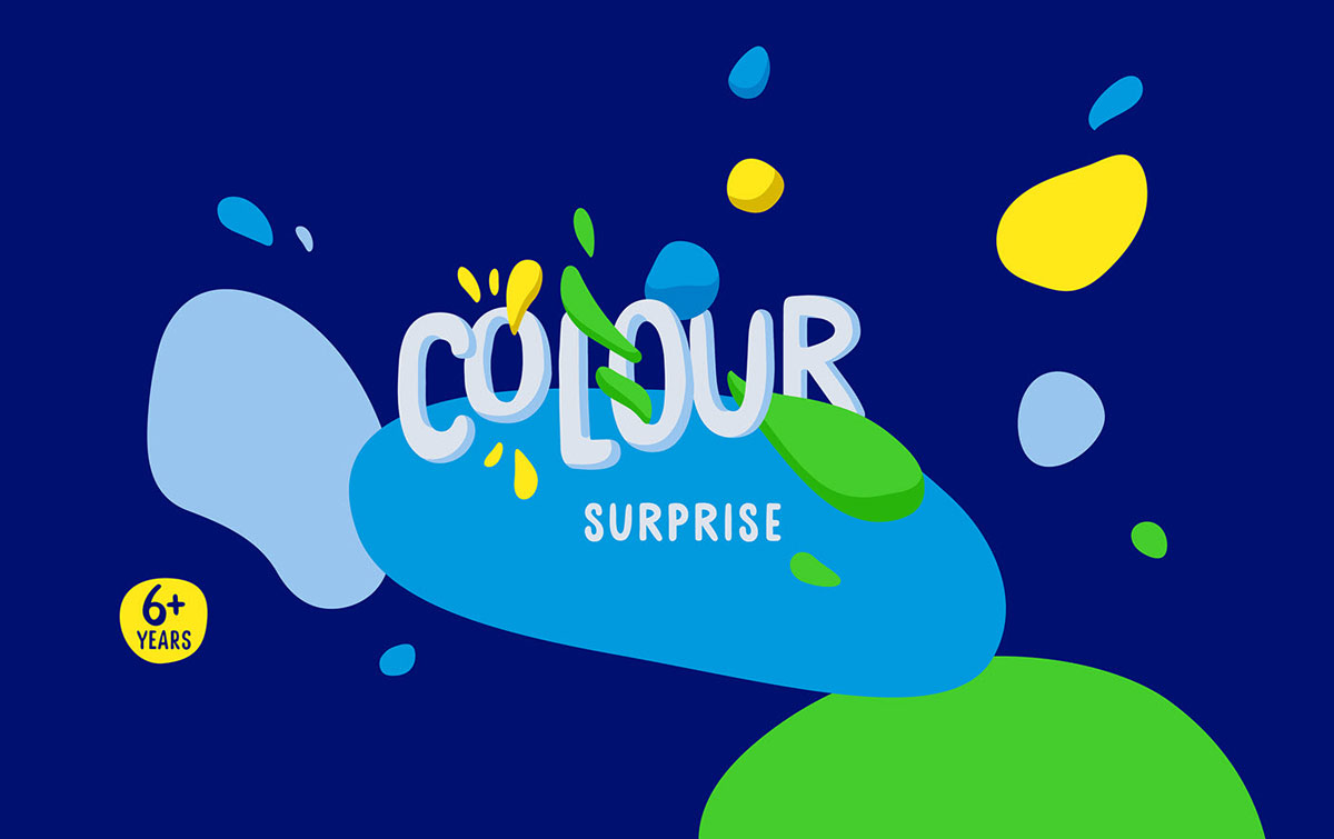
Source: ECODENTA colour surprise
But what is it that entices the audience or kept enticing the audience to secretly love the packaging (while it was still the main and perhaps the only design approach liked by almost everyone)?! Some of the main reasons could be that the colors have a direct influence on the mind of a consumer which convinces them to consider that very product and also pay for it so that they can use it. In addition to that; you can feel that the brand is speaking to you through their packaging and you know that in your heart that you want to purchase that thing from the shelf.
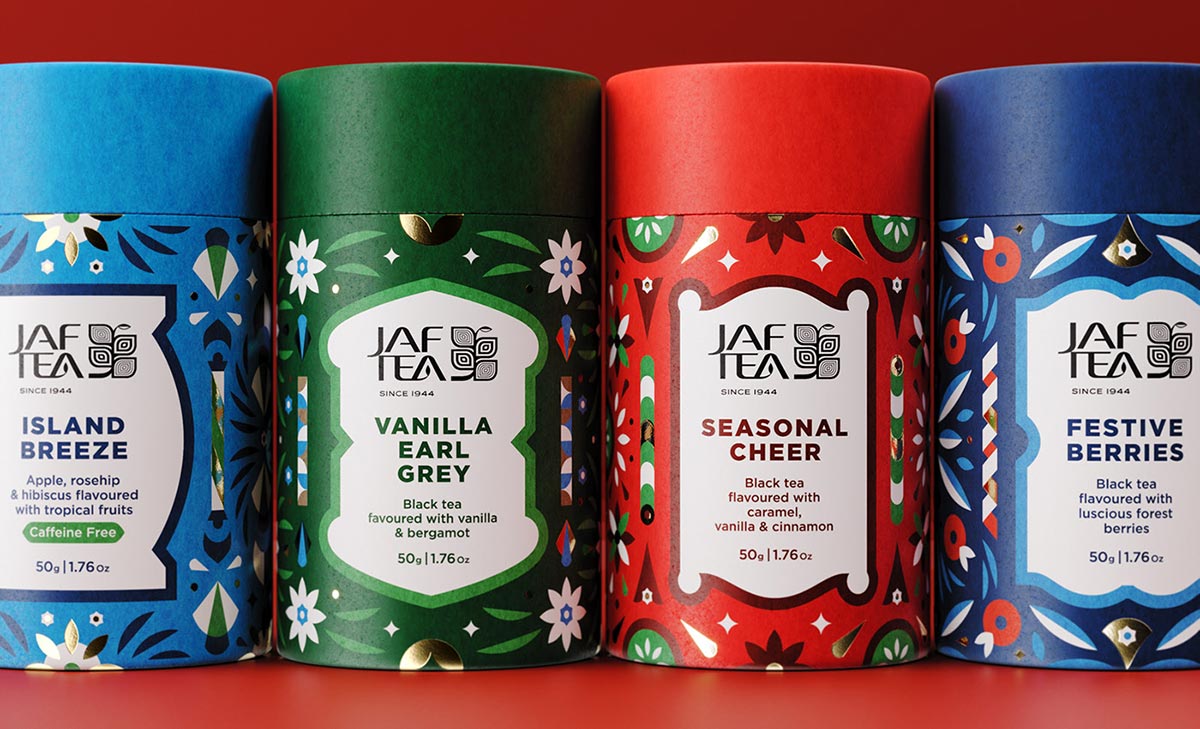
Source: Jaf Tea Packaging Design
And then of course; brand architects only choose those colors which are meant to influence the audience in the right direction for example; the color red is full of passion and whatever you will put on the table in the color red has to leave an impact on the viewer – here, we are not talking about the negative or the positive impact but it is for sure that you just cannot ignore the red color or anything that is packaged using that it. Green color, on the other hand is widely accepted as the color of growth and life and that is the main reason why most make up brands incorporate green color into their packaging.
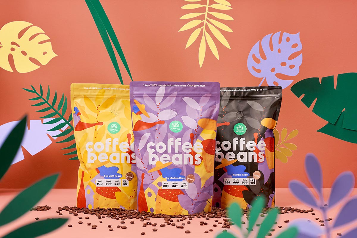
Source: Coffee Beans Colorful Packaging Design
Similarly; orange, blue and brown colors represent optimism, calmness and warmth. And if we were to briefly explain the usage of these colors then know that any brand that makes energy drinks will use orange in their branding whereas; blue is seen being incorporated by luxurious or high end brands and brownish tones are used for the packaging of organic foods.
Minimalistic Packaging Designs:
Now, let’s have a look at the trend of going all minimalistic. First things first; you keep your consumer in mind and not just the one who is a direct consumer but also the consumer that can be your secondary target audience. So, when the millennials started to sort of take over almost everything out there, it was felt like a need to brand and design the stuff that is minimal but speaks louder than anything.
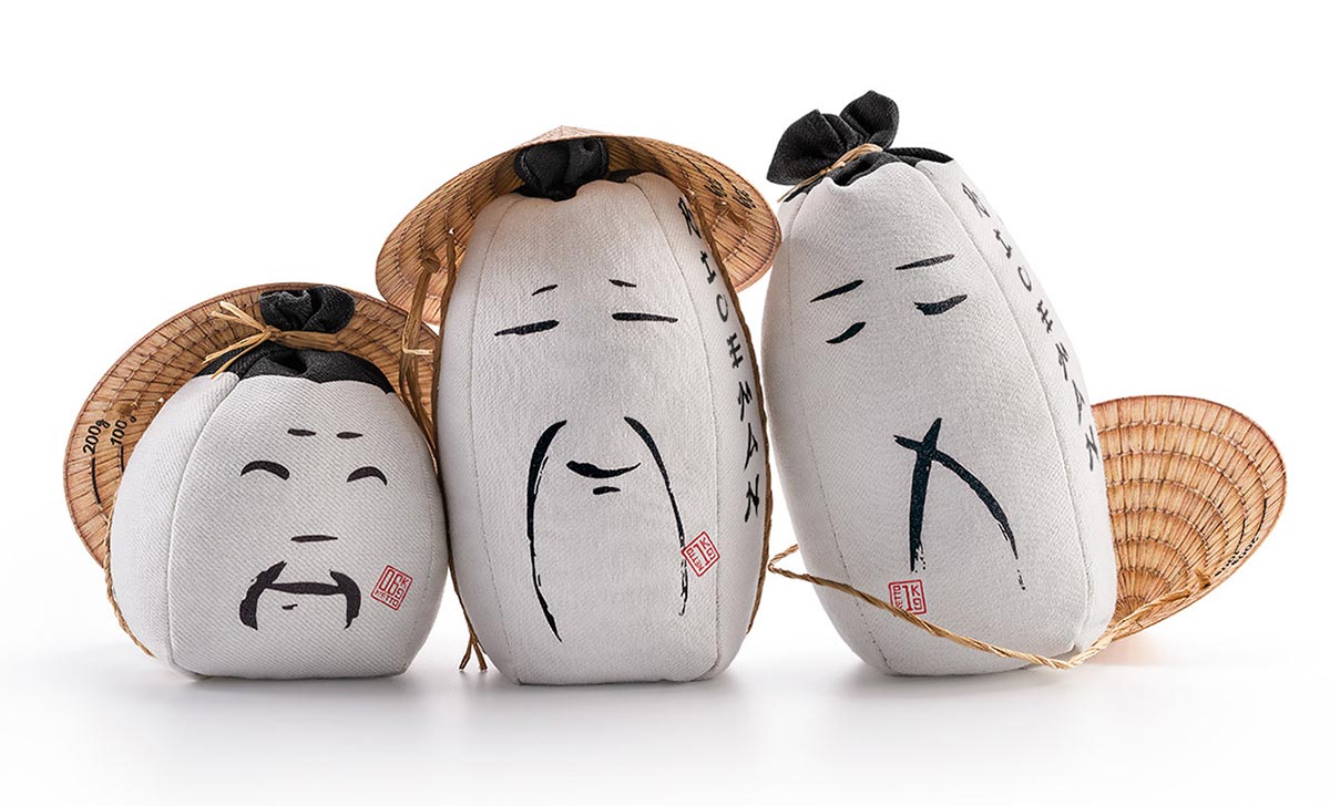
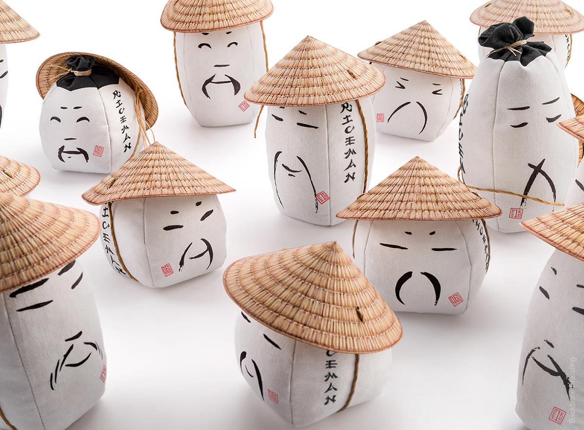
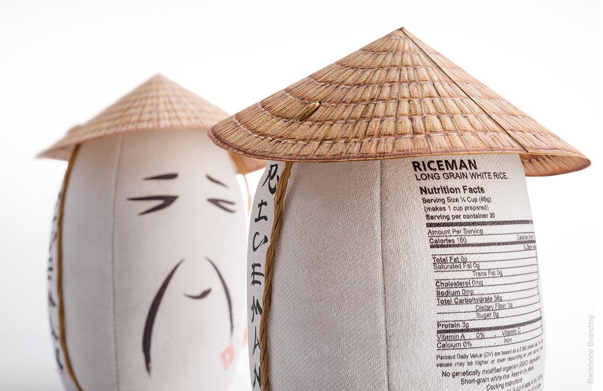
Source: Riceman Minimalistic Packaging Design
Creative departments, art directors and graphic designers took the minimalistic route and it became the trend or we should say THE trend – which is (still) going strong with each passing day and we are glad that almost everyone could (finally) understand the meaning of saying more through less design elements or copy for that matter.
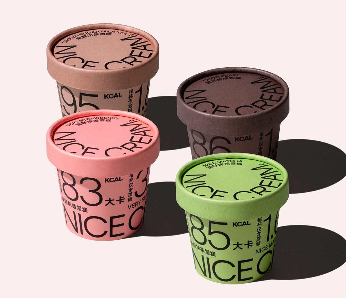
Here is a perfect example of less design elements and a creative copy:
Source: Nice Cream packaging design
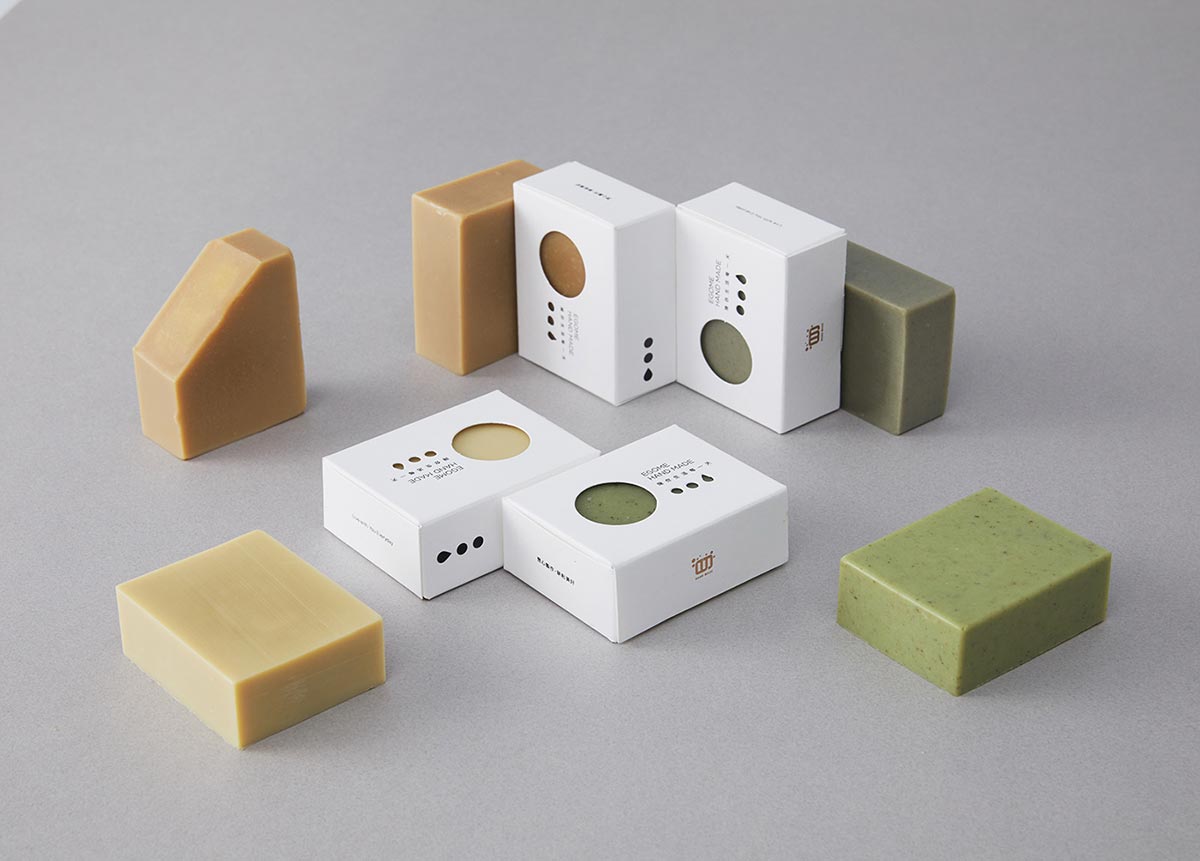
Now all you see is solid backgrounds (which we feel have more depth than anything else in the design world at the moment), you see more of typography and allow us to say that most of the art works are so brilliant that they leave us in awe and of course; the textures have become more realistic which creates a great aesthetic experience.
Source: Handmade soap packaging
So, if you want to become that brand which grabs the attention right away and the focus stays on you and your packaging then it is important for you to ensure that your designed packaging has shifted to being minimalistic because you know what, by re-routing everything (in terms of your design approaches), you will be making content that is built and is fit for every medium, you will also break the clutter and know that you will be staying there for a longer period of time.
And that is all for today guys! We hope that this blog will help you in defining or may be re-defining your brand and its packaging design approaches for your consumers. Oh, and don’t forget to share the information with your friends and colleagues too and we will see you all next time.
More Awesome Packaging Designs For inspiration:
- 20+ Awesome Food Packaging Design Ideas of 2019 for Inspiration
- 50+ Exquisite Packaging Design Concepts for Inspiration
- 40+ Latest Modern Food Creative Packaging Design Ideas
- 45+ Latest Modern Food Packaging Design Ideas
- 50+ All Time Best Product Packaging Design Ideas for Designers
- 20+ Exquisite Best Cool Product Packaging Design Inspiration
- 20 Fresh Cool & Creative Food Packaging Design Assemblage For Inspiration
- 10 Best Transparent & See-Through Packaging Design Ideas
- 45+ Simple Yet Modern Packaging Designs & Product Photography Examples for Inspiration
- 20+ Cool & Creative Modern Packaging Designs of 2015 For Inspiration


